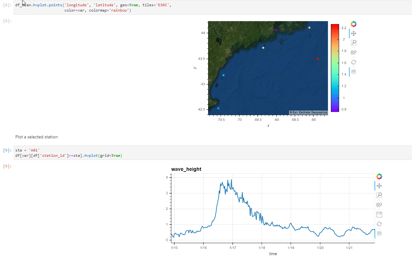
I’ve got a notebook using hvplot that extracts the latest 7 days of wave height data in the Gulf of Maine from an ERDDAP server, displays the mean wave height at each station as colored dots on a map, and plots a time series of wave height from a specified station.
Below are screen grabs from reproducible Jupyter notebook.
I’d like the user to click on a dot and get the time series.
What would be the best way to connect the map to the time series plots with Panel?
This should do it:
points = df_mean.hvplot.points('longitude', 'latitude', geo=True, tiles='ESRI',
color=var, colormap='rainbow', tools=['tap'])
s = hv.streams.Selection1D(source=points, index=[])
def timeseries_cb(index):
if index:
sta = df_mean.index.values[index[0]]
selected = df[df['station_id']==sta]
else:
selected = df.iloc[:0]
return selected[var].hvplot(grid=True)
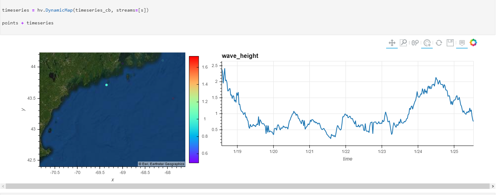
timeseries = hv.DynamicMap(timeseries_cb, streams=[s])
points + timeseries
@philippjfr, thanks so much!
This worked, but all the rest of the stations disappear upon selection. Which I don’t understand because the “points” object seems unmodified.
It would be great to highlight the selected station and leave the rest of the stations showing on the map, but maybe that’s what is supposed to be happening and this is a bug?
Here’s my full notebook: https://nbviewer.jupyter.org/gist/rsignell-usgs/bd20ccad28d617a6c57cf9678ba387bf
The rendering doesn’t capture what my screen is showing for some reason. Here’s what I see:
I think this is just down to the default alpha for unselected points being very low. Could you add nonselection_alpha=0.5 to call to .hvplot.points(?
Whoa – that worked! Super cool! (And I’m glad I asked because I wouldn’t have figured that out!)
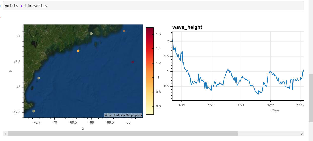
Here is the SOLUTION: working notebook
Screengrab to prove it working:
1 Like