Hello everyone,
I’m actually not sure if it’s a bug - that’s why I’m posting it here @philippjfr - but I can reproduce it with version 1.14.2 for holoviews and bokeh 2.3.0.
import holoviews as hv
import skimage
import numpy as np
hv.extension('bokeh')
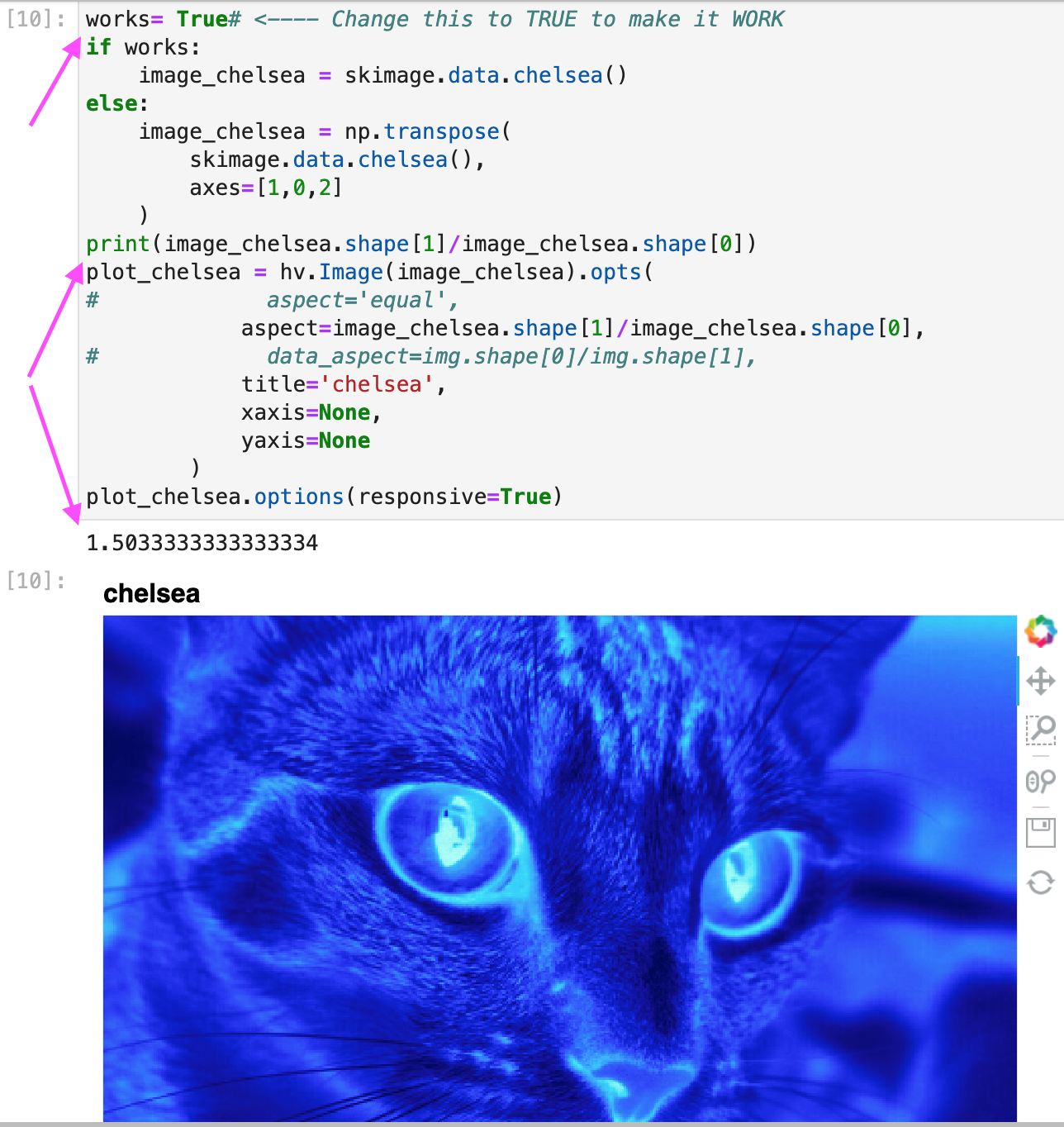
works= False# <---- Change this to TRUE to make it WORK
if works:
image_chelsea = skimage.data.chelsea()
else:
image_chelsea = np.transpose(
skimage.data.chelsea(),
axes=[1,0,2]
)
print(image_chelsea.shape[1]/image_chelsea.shape[0])
plot_chelsea = hv.Image(image_chelsea).opts(
# aspect='equal',
aspect=image_chelsea.shape[1]/image_chelsea.shape[0],
# data_aspect=img.shape[0]/img.shape[1],
title='chelsea',
xaxis=None,
yaxis=None
)
plot_chelsea.options(responsive=True)
With watch=True - it will keep original height to be smaller than width and then everything works as expected.
With watch=False it stops working.
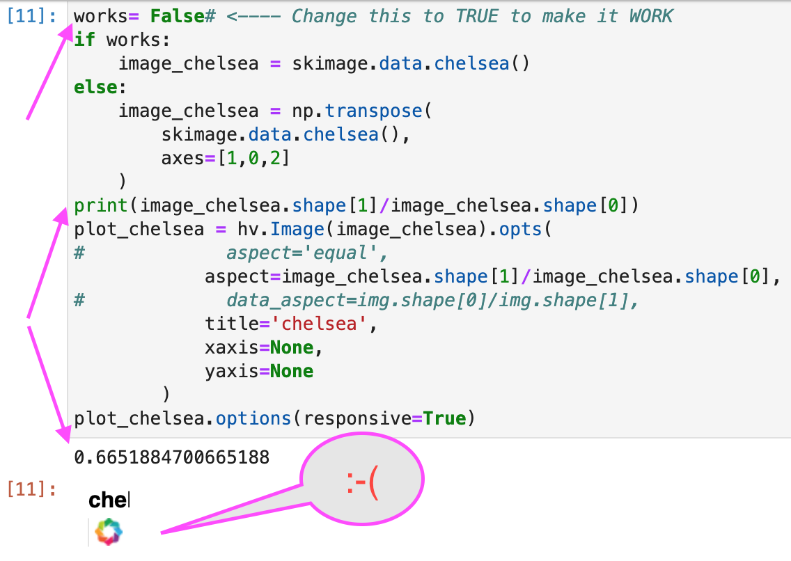
Please note that removing responsive=True allows it to plot - but the picture is obviously not correct (in terms of not being stretched to fill the frame).
Please help, I’m really puzzled at this point.
Thanks in Advance!