So this is an unfortunate quirk of the Bars element in HoloViews which is always categorical and secondarily an issue with categorical axes in bokeh, which do not allow reducing the tick frequency. All I can suggest for the time being is to make use of the Histogram element in HoloViews:
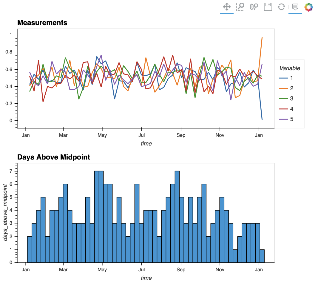
lines = df_weekly.hvplot.line(x='time', y=columnLabels, title='Measurements', xformatter=formatter)
hist  = hv.Histogram(df_weekly.hvplot.bar(x='time', y='days_above_midpoint')).opts(title='Days Above Midpoint', xformatter=formatter, width=700)

(lines + hist).cols(1)
That said, I would appreciate it if you could file an issue about this in hvPlot.