5 year range ; color area inbetween - might be simple?

hey guys I have a dataframe like this ; the 5 yr avg is only on 2nd row bcuz of space ; but its all in 1 dataframe… horizontally…

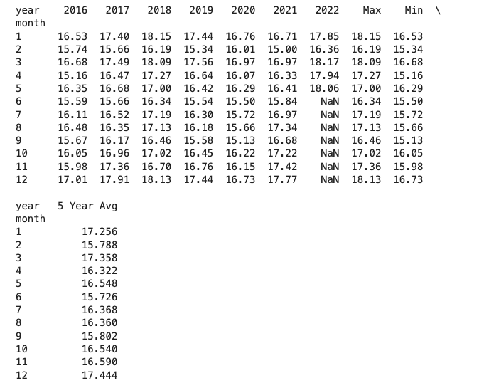
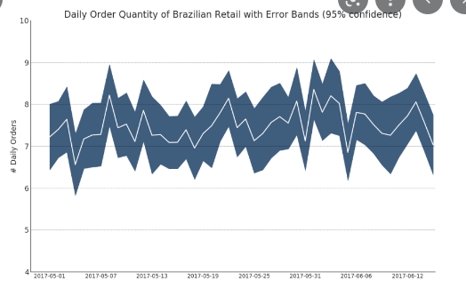
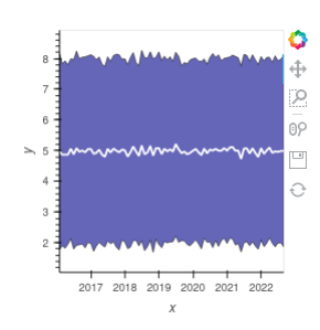
I would like to create something like this:
where I have the 5 yr max at the top, 5 year min at bottom ; area is shaded… and then have the 5 year average line… I also want the current year and the previous year lines … soo all on the same plot… I’ve seen super long matplotlib examples and was wondering if hvplot has some magic or more concise code I could look at / learn from / get help with . Thank you .
image

You can’t create the plot with the data you have. The plot you have shown is properly created from the statistical values of a time series.

If you have time series data, an example of how it could be done is shown below.

import holoviews as hv
import numpy as np
import pandas as pd

hv.extension("bokeh")

# Creating time series data
dates = pd.date_range("2016-01-01", "2022-08-22", freq="H")
data = np.random.normal(5, 3, dates.size)
df = pd.DataFrame(data=data, columns=["data"], index=dates)

# Getting statistical values of data
df_stat = df.resample("M").mean().rename({"data": "mean"}, axis=1)
df_stat["std"] = df.resample("M").std().rename({"data": "std"}, axis=1)
df_stat

# creating the plot
error = hv.Spread((df_stat.index, df_stat["mean"], df_stat["std"])).opts(
    color="darkblue"
)
curve = hv.Curve((df_stat.index, df_stat["mean"])).opts(color="white")

error * curve

image

2 Likes

wicked, thanks Hoxbro !

1 Like