Hello,
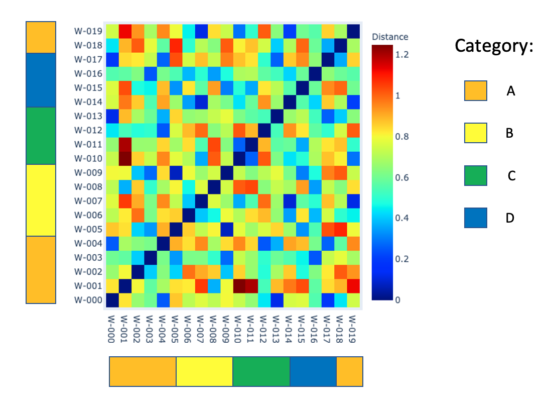
I am trying add a colored category keys on the axes of a heat map. I have been able to create a heat map that plots the distance of one point from another using hv.HeatMap() with extension plotly. The points I am working with (labeled W-XXX) are three dimensional and the distance I am plotting is the Euclidian distance between the 3D points. Each point also corresponds to a category A, B, C, or D. I would like to know which category the points labeled on the heat map correspond to, so I can see if points in the same or similar category are close together or far apart. Bellow is an example image of what I want my plot to look like. I am currently working with plotly, but I can easily switch to bokeh if it is easier. If anyone has any ideas how to achieve such an image, I would greatly appreciate it.
Thank you!