Adjust Javascript Linked brushing unselected alpha or color DataLink

Is there a way to adjust the alpha or color of unselected or selected points in a Scatter plot that is linked to another plot when the link is created with DataLink? Or, is there a way to create javascript based linked brushing and adjust the alpha of unselected points or color of selected points?

Making these types of styling adjustments with with python backed linked brushing is discussed in the docs, but I haven’t found where there are options to adjust styling for javascript backed linked brushing, if there are.

I’d like to use the javascript backed brushing because I often save my notebooks that use this functionality as html files and would like the linked brushing to work in that format.

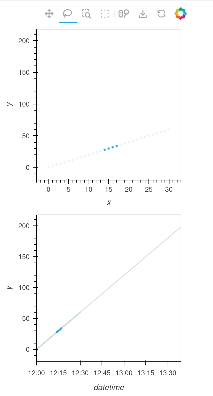
Here is a minimal example. This replicates the current plots I have, but doesn’t show so well how hard it is to see the difference between the selected and unselected points in the bottom plot in my real plots. Looking at my real plots closer, I think the issue there is overplotting. The unselected points are overlapping and therefore appear as a higher alpha until I zoom in. Given that is the real issue, I think the solution I’m looking for is a way to make the selected points a different color.

import pandas as pd
import numpy as np
import holoviews as hv
from holoviews import opts
from holoviews.plotting.links import DataLink
hv.extension('bokeh', logo=False)

df = pd.DataFrame({'x':np.arange(100), 'y':np.arange(100) * 2, 'datetime':pd.date_range('2/1/24 12:00', freq='1min', periods=100)})
df2 = df.loc[0:30, :]
scatter1 = hv.Scatter(df2, ['x'], ['y'])
scatter2 = hv.Scatter(df2, ['datetime'], ['y'])
curve1 = hv.Curve(df, 'datetime', ['y', 'x']).opts(line_color='gray', line_width=1, line_alpha=0.4)

dlink = DataLink(scatter1, scatter2)

(scatter1 + curve1 * scatter2).opts(
    opts.Scatter(tools=['box_select', 'lasso_select'])).cols(1)

I think what you’re looking for is under hv.help(hv.Scatter), maybe selection_fill_color

hv.Scatter().opts(selection_fill_color="red")

alpha, angle, cmap, color, fill_alpha, fill_color, hover_alpha, hover_color, hover_fill_alpha, hover_fill_color, hover_line_alpha, hover_line_cap, hover_line_color, hover_line_dash, hover_line_join, hover_line_width, line_alpha, line_cap, line_color, line_dash, line_join, line_width, marker, muted, muted_alpha, muted_color, muted_fill_alpha, muted_fill_color, muted_line_alpha, muted_line_cap, muted_line_color, muted_line_dash, muted_line_join, muted_line_width, nonselection_alpha, nonselection_color, nonselection_fill_alpha, nonselection_fill_color, nonselection_line_alpha, nonselection_line_cap, nonselection_line_color, nonselection_line_dash, nonselection_line_join, nonselection_line_width, palette, selection_alpha, selection_color, selection_fill_alpha, selection_fill_color, selection_line_alpha, selection_line_cap, selection_line_color, selection_line_dash, selection_line_join, selection_line_width, size, visible

Yes, that worked. I thought I might be missing something easy.

Changing selection_fill_color and selection_line_color achieved what I wanted.

Thank you!

Here is a version of the code with those added for anyone else who may look at this.

import pandas as pd
import numpy as np
import holoviews as hv
from holoviews import opts
from holoviews.plotting.links import DataLink
hv.extension('bokeh', logo=False)

df = pd.DataFrame({'x':np.arange(100), 'y':np.arange(100) * 2, 'datetime':pd.date_range('2/1/24 12:00', freq='1min', periods=100)})
df2 = df.loc[0:30, :]
scatter1 = hv.Scatter(df2, ['x'], ['y']).opts(selection_fill_color='red', selection_line_color='red')
scatter2 = hv.Scatter(df2, ['datetime'], ['y']).opts(selection_fill_color='red', selection_line_color='red')
curve1 = hv.Curve(df, 'datetime', ['y', 'x']).opts(line_color='gray', line_width=1, line_alpha=0.4)

dlink = DataLink(scatter1, scatter2)

(scatter1 + curve1 * scatter2).opts(
    opts.Scatter(tools=['box_select', 'lasso_select'])).cols(1)
1 Like