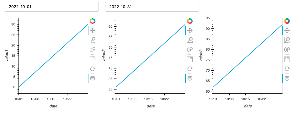
I have a situation like what I show below, where I’m struggling to get the x-axis range to adjust sensibly when selecting a different date range. If I start with the full month it looks fine, if I change the start date to 2022-10-12 then the x-axis range doesn’t change with it and leaves the October 1 - 12 empty gap.
If I plot a view alone it is fine.
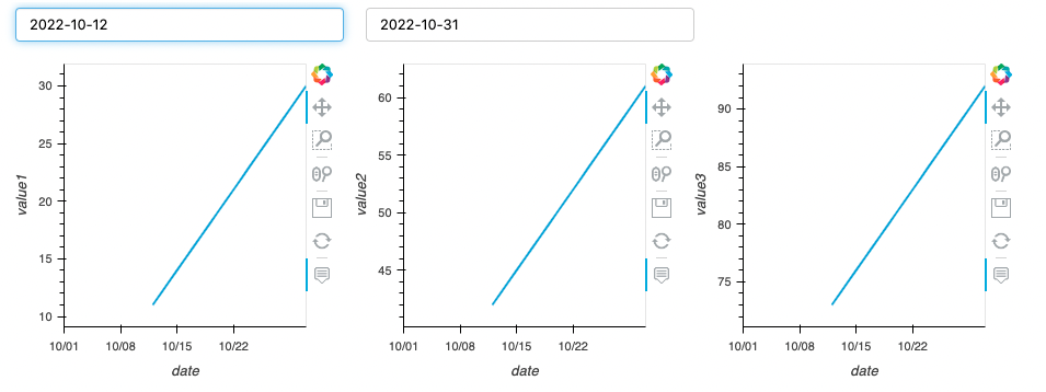
I know I could put all the plots into one view and do return (plot1 + plot2 + plot3) but I’m seeing this issue on a different dashboard where I have complex plots where I’d rather keep the code separate but the first plot of 3 is suffering from the same effect I show here.
Am I missing something to make sure they update nicely? Or should I really be putting them into a layout? Thanks!
import hvplot.pandas  # noqa
import pandas as pd
import panel as pn
import datetime as dt

test = pd.DataFrame({
    'date': pd.date_range('2022-10-01', '2022-10-31', freq='D').date,
    'value1': list(range(31)),
    'value2': list(range(31, 62)),
    'value3': list(range(62, 93)),
})

date_start = pn.widgets.DatePicker(value=dt.date(2022, 10, 1), start=dt.date(2022, 10, 1), end=dt.date(2022, 10, 31))
date_end = pn.widgets.DatePicker(value=dt.date(2022, 10, 31), start=dt.date(2022, 10, 1), end=dt.date(2022, 10, 31))

@pn.depends(s=date_start, e=date_end)
def view1(s, e):
    return test[test['date'].between(s, e)].hvplot.line(x='date', y='value1')

@pn.depends(s=date_start, e=date_end)
def view2(s, e):
    return test[test['date'].between(s, e)].hvplot.line(x='date', y='value2')

@pn.depends(s=date_start, e=date_end)
def view3(s, e):
    return test[test['date'].between(s, e)].hvplot.line(x='date', y='value3')

pn.Column(pn.Row(date_start, date_end), pn.Row(view1, view2, view3))