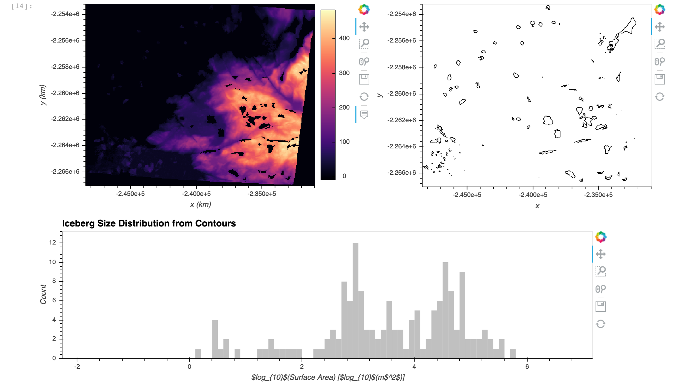
I’ve got a raster dataset (read into a DataArray) that I’m trying to manipulate and generate a figure with multiple plots (apologies if my HoloViz terminology is off - I’m new to the package and Bokeh!). I got the figure to generate more or less the way I wanted, but I can’t figure out how to get the plots to align properly vertically so that it looks like a presentation quality figure:
(right hand side of bottom plot should align vertically with the right hand side of the top right plot).
# top left plot
dem = data.hvplot.image(rasterize=True, aspect="equal", cmap='magma',
                       xlabel="x (km)", ylabel="y (km)")

# top right plot
berglines = hv.Contours(bergs)
berglines.opts(aspect="equal", color='k')

# bottom plot
freq, bins = np.histogram(np.log10(areas), np.arange(-2,7,0.1))
bergszdist = hv.Histogram((freq,bins))
bergszdist.opts(xlabel='$log_{10}$(Surface Area) [$log_{10}$(m$^2$)]', ylabel='Count',
                title='Iceberg Size Distribution from Contours',
               fill_color='silver', line_width=0, width=1000)

# panel figure with all three plots
pnfig = pn.Column(
    pn.Row(
        dem,
        berglines),
    bergszdist.opts(shared_axes=False))
I’ve tried playing with the width and frame_width options for all three subplots, but so far the only way I’ve come close is through a guess and check and visual inspection that they appear to align well (which is clearly labor intensive and not robust if I want to resize the figure). Is there an easy way to get the plots to align well within a figure/panel?
You mention bokeh in the opening sentence of your post.
Bokeh models have an align property that is an enum with possible choices of (start, center, end) as described in Bokeh Layouts.
If the Holoviews hvplot Histogram exposes this property for the Bokeh plotting backend, you could try to accomplish the right-justified alignment by setting the property align='end' as part of your bergszdist plot.
DISCLAIMER I typically work with bokeh models embedded directly in panel, but don’t use hvplot.
Hi, I had something similar and althought this will not help align your plots on the right side, it might help you.
I have two bokeh figures in panel panes, and although the panes were aligned, the bokeh figures were not, because for one of them the y labels took up more space (such as in your example figure).
I’ve solved this by setting the min_border_left property on the bokeh figure. This way you can shift the position of the y axis of both figures to the right and make sure they are aligned.
As @_jm said, this solution is also not using hvplot, but bokeh directly, so I’m not sure how to do this with hvplot.
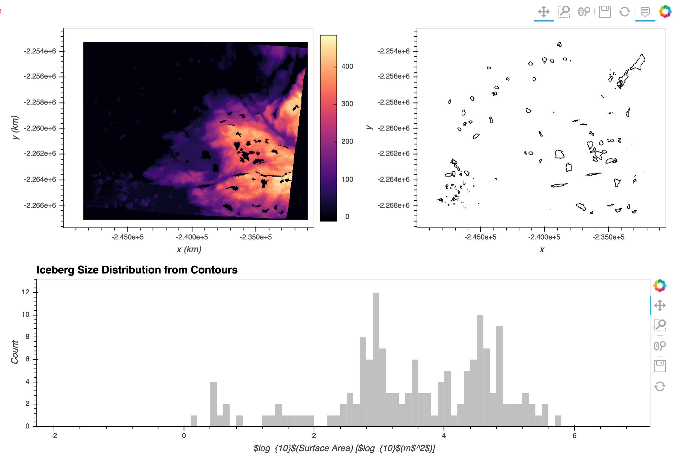
Thanks all (I can only tag two people in a post right now) for your feedback and suggestions! While playing some more with the alignment and other properties you suggested, I came across the clone property and realized that part of the problem was that as I tried various sizing options they were being stored with the object and thus continuing to affect my output. Once I added clone=True I was able to troubleshoot more easily.
My ultimate solution to get things lined up the way I wanted was to create an intermediate object that combined dem and berglines and allowed me to specify a combined width for both of them. So my code is updated to:
# top left plot
dem = data.hvplot.image(rasterize=True, aspect="equal", cmap='magma',
                       xlabel="x (km)", ylabel="y (km)")

# top right plot
berglines = hv.Contours(bergs)
berglines.opts(aspect="equal", color='k')

# top row
bergsr = dem + berglines

# bottom plot
freq, bins = np.histogram(np.log10(areas), np.arange(-2,7,0.1))
bergszdist = hv.Histogram((freq,bins))
bergszdist.opts(xlabel='$log_{10}$(Surface Area) [$log_{10}$(m$^2$)]', ylabel='Count',
                title='Iceberg Size Distribution from Contours',
               fill_color='silver', line_width=0)

# panel figure with all three plots
pnfig = pn.Column(
    pn.Row(
        bergsr.opts(width=1000, clone=True),
    bergszdist.opts(width=1000, shared_axes=False, clone=True))