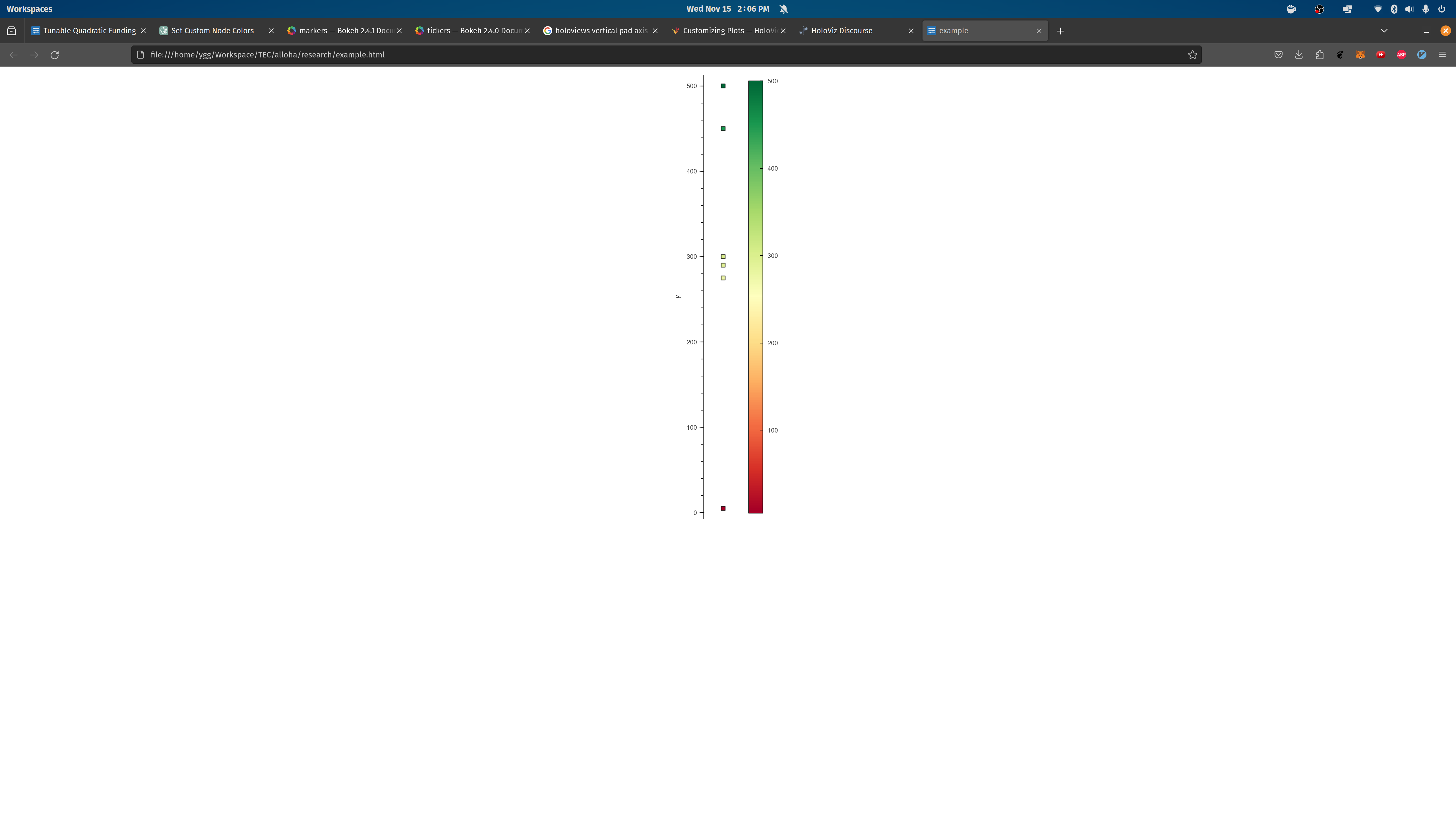
Minimum Viable Example:
import holoviews as hv
import networkx as nx
import numpy as np
import pandas as pd
from bokeh.models import HoverTool
from holoviews import opts

hv.extension('bokeh')

# Sample data
data = {
    'Grant Name': ['1', 'A', 'B', 'C', 'D', 'E'],
    'Total Donations': [5, 275, 290, 300, 500, 450],
}
public_goods_data = pd.DataFrame(data)

# Add 'x' and 'y' columns for scatter plot
public_goods_data['x'] = np.zeros(len(public_goods_data))  # Example: [0, 1, 2]
public_goods_data['y'] = public_goods_data['Total Donations']

# Scatter plot with colorbar
points = hv.Points(
    public_goods_data, kdims=['x', 'y'], vdims=['Grant Name', 'Total Donations']
).opts(
    size=7,
    marker='square',
    color='y',
    line_color='black',
    cmap='RdYlGn',  # Use a colormap name
    colorbar=True,
    width=200,
    height=800,
    xaxis=None,
    toolbar=None,
    show_frame=False,
    tools=[
        HoverTool(
            tooltips=[
                ('Grant Name', '@{Grant Name}'),
                ('Total Donations', '@{Total Donations}'),
            ]
        )
    ],
)

# Display
hv.save(points, 'example.html')
Yields:
But in a more complex version here: https://github.com/CommonsBuild/alloha/blob/73e7d87dff993d47355624699122c7774989b66d/app/tqf/donations_dashboard.py#L383C35-L383C35
Yields:
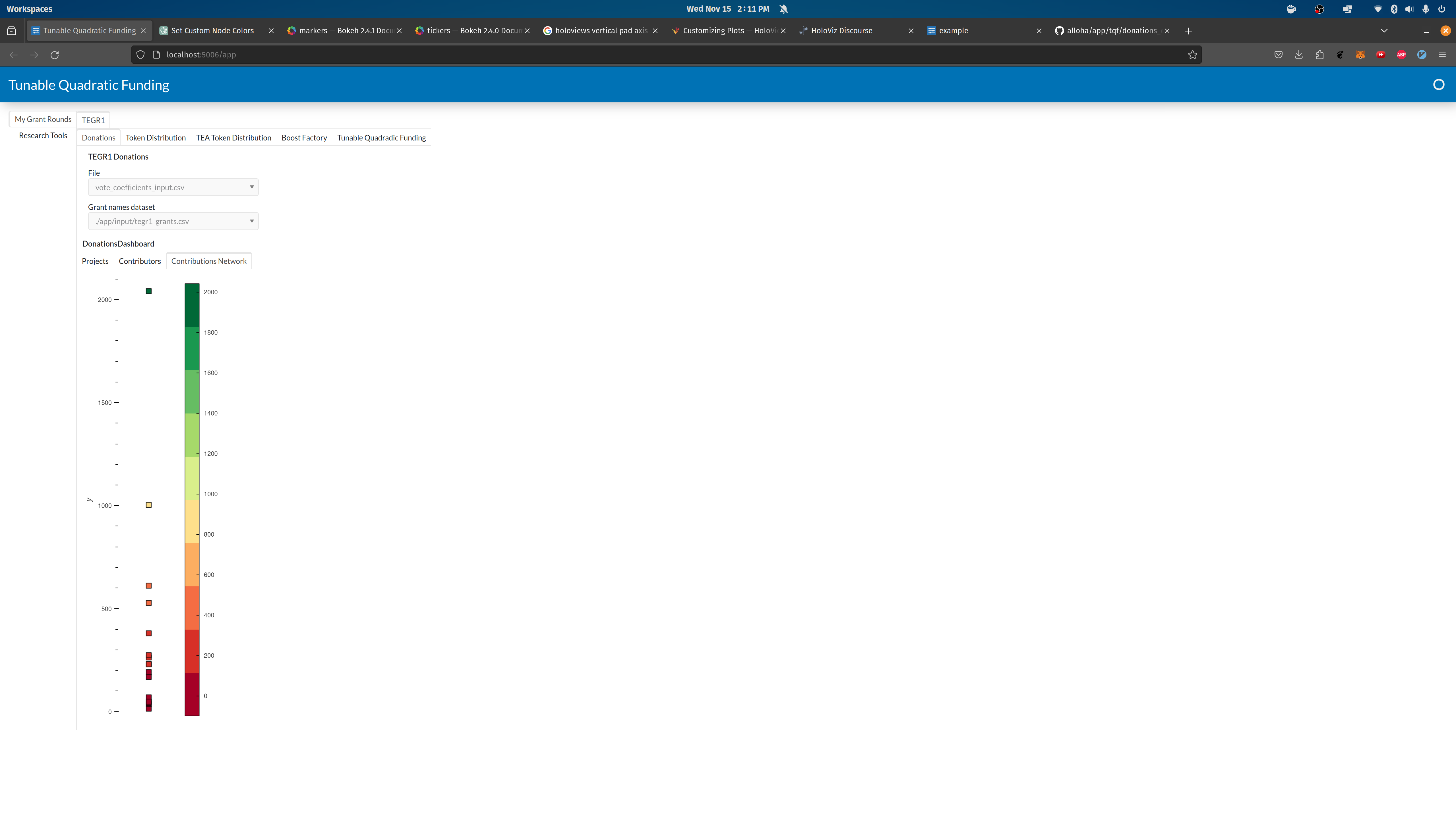
I’m wondering why the y-axis and colorbar as misaligned in the tqf app.
I’m curious if there is a general pattern for aligning colorbars with axis. Thanks Holoviz ![]()
![]()