Hi HoloViz discourse,
I’m trying to use a Bokeh Ticker in a hvplot or holoviews plot but the error I get seems to indicate that it does not recognize the ticker as the correct input. I am using hvplot in this example but I produced the exact same error with an hv.QuadMesh, and using FixedTicker also had the same issue. I am unsure if I am using it wrong or if it is a bug. Can anyone confirm this or point me in the right direction?
from bokeh.models import FixedTicker
from bokeh.models import CategoricalTicker
import xarray as xr
import hvplot
import holoviews as hv

d = xr.tutorial.open_dataset('air_temperature').isel(time=0)

d.hvplot.quadmesh(x='lon', y='lat').opts(cformatter=CategoricalTicker())
The error I get is:
From my understand, this should be right as Categorical ticker is an instance of a TickFormatter?
Appreciate any help.
Thanks
A CategoricalTicker is a subclass of Ticker, not TickFormatter. A Ticker generates tick locations, while a TickFormatter formats the label for the ticks. You can see the inheritance hierarchy by doing hv.help() on each of the two classes and looking at the method resolution order. You’ll see that both are Bokeh models but are otherwise independent of each other.
I’m not sure what you’re trying to achieve with such a ticker in this case, given that cformatter is for the color axis; do you just want to discretize the colorbar? If so, that’s probably easier done by simply constructing a cmap from a smaller number of colors:
Thanks for your reply and clearing that up for me. I see from your explanation it seems I am going the wrong way trying to solve my problem. Sorry, I should have been more direct about what I am trying to accomplish. What I actually need is for the colorbar ticks on a contour plot to be fixed to the color levels, which is why I thought I needed a FixedTicker or CategoricalTicker. Below is a better example.
import xarray as xr
import hvplot
import holoviews as hv
d = xr.tutorial.open_dataset('air_temperature').isel(time=0)
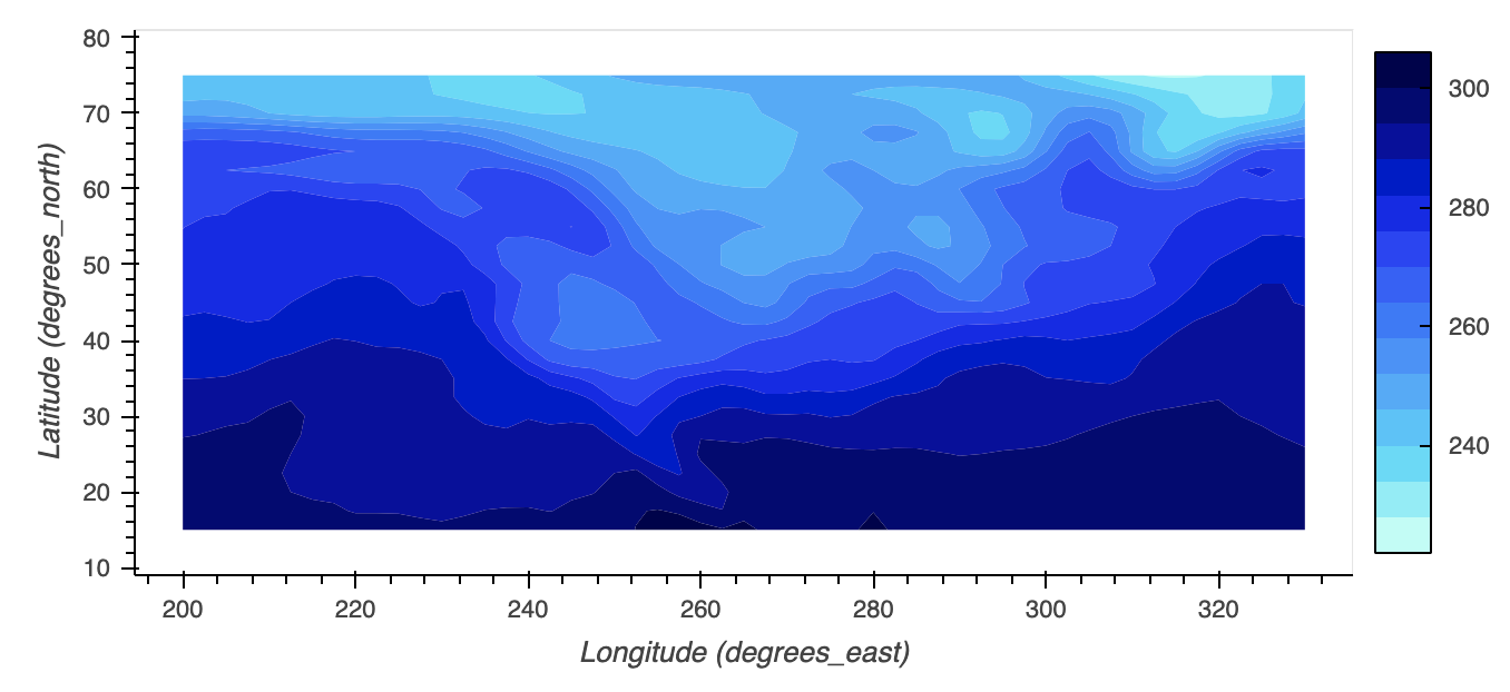
d.hvplot.contourf(x='lon', y='lat', levels=14)
In this plot, I have set 14 color levels, but without the colobar ticks fixed to each color level, the plot doesn’t convey properly the values being shown by contour level and color in the plot. the colorbar ticks that are shown, there’s only 4 yet there’s 14 levels depicted, and they’re off base from where the color level actually begins and ends. The viewer can’t get an idea of what value range each contour level is depicting. I haven’t seen this specific issue come up on the HoloViz discourse before. This is a matplotlib colorbar that shows what I am trying to do:
Thanks and appreciate any help.
There are some improvements in the works for Bokeh color bars, and I think some of those would be necessary before you can do this with a Bokeh plot. I don’t know all the details, but searching open Bokeh PRs and issues will probably clarify.
Thanks for that suggestion - I looked through the Bokeh issues for categorical colorbars. It still doesn’t quite address exactly what I think would be a really great improvement to the holoviews contour plots. It seems like in order for a contour plot to accurately convey the values being presented in the colorbar is to have the colorbar ticks match each contour/color levels’ actual value range. This way the viewer can actually understand what values each color is depicting. It’s not just being able to format ticks or place them at certain values, but to actually match the color levels within the holoviews plot. Does that make sense? I can create a custom Ticker now with your suggestions, and created an imperfect workaround where I use the holoviews plots range and the number of color levels depicted to guess at where each contour level begins and ends but its not always cleanly on each level. I think an improvement to holoviews and hvplot contours is that when creating a colorbar for these plots to automatically use each color level value to create colorbar ticks. Would that be a reasonable feature request? Or would that still be a Bokeh issue?
There’s code below that shows my workaround and how it can be imperfect. I took a guess at how holoviews/hvplot creates the color level intervals. The first time selection appears to solve the problem, but then the next time selection is imperfect - the ticks don’t match each color level value cleanly. Let me know what you think.
import hvplot.xarray
from bokeh.models import FixedTicker
import xarray as xr

data = xr.tutorial.open_dataset('air_temperature')

d = data.air.isel(time=0)#time=1 for imperfection

c = d.hvplot.contourf(x='lon', y='lat', levels=14)

def colorbar_ticks(img):
    info = img.vdims[0]
    r = info.range
    begin = r[0]
    end = r[1]

    sub = end - begin
    cl = sub / 14 #divide by number of color levels in plot

    ticks = []

    for i in range(int(begin), int(end), int(cl)):
        ticks.append(i)

    ticker = FixedTicker(ticks=ticks)

    return ticker

ticker = colorbar_ticks(c)

d.hvplot.contourf(x='lon', y='lat', levels=14, cmap='rainbow').opts(colorbar_opts={'ticker': ticker})
Don’t know if it can help but some times ago I had to produce a figure like this:
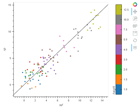
Here is the code with dummy data to produce it:
import pandas as pd
import numpy as np
from bokeh.models import FixedTicker, FuncTickFormatter
from bokeh.palettes import Category10
from sklearn.preprocessing import LabelEncoder
import holoviews as hv
hv.extension("bokeh")

def simu_vs_xp(df):
    df = df.copy()
    le = LabelEncoder()
    le.fit(df.height.unique())
    ticker = FixedTicker(ticks=le.transform(le.classes_))
    df['class'] = le.transform(df.height)
    ftf = FuncTickFormatter(code="""
        return {:s}[tick]
    """.format('{' + ', '.join(['{:d}'.format(code) + ': ' '"{:.1f}"'.format(cl) for code,cl in zip(le.transform(le.classes_), le.classes_)]) + '}'))
    return (
        hv.Scatter(df, kdims='ref', vdims=["xp","height","class"]).opts(cmap=Category10[le.classes_.size], clim=(-0.5,le.classes_.size-0.5), frame_width=400, frame_height=400, color='class', size=4, colorbar=True, tools=['hover'],colorbar_opts={'ticker':ticker, 'formatter': ftf, 'title': 'height', })
        * hv.Slope(slope=1, y_intercept=0).opts(color='k', line_width=1))
df = pd.DataFrame()
possible_height = [1, 1.5, 2, 3, 4, 5, 7.5, 10, 12.5]
df["height"] = np.random.choice(possible_height, size=100)
df["ref"] = df["height"] + np.random.randn(df.shape[0])
df["xp"] = df["height"] + np.random.randn(df.shape[0])
simu_vs_xp(df)
1 Like