I’ve been attempting to use some of the wonderful streaming and selection capabilities in holoviews to create an interactive annotation tool for time series data. Unfortunately, I’ve hit a bit of a snag trying to display already-annotated segments of a given curve.
Using the * operator overload with more than one segment results on a different colour per overlay (ideally the yellow segment would also be red):
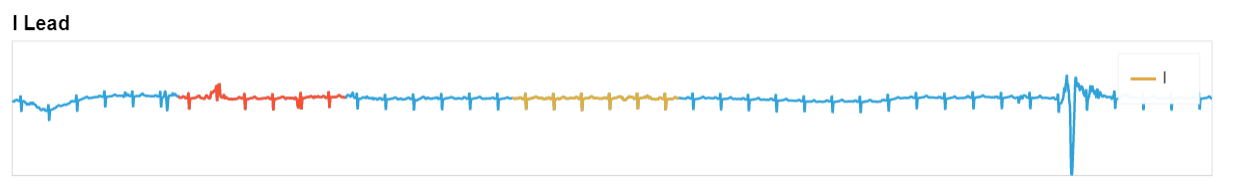
Trying to use a DataFrame with an extra column to indicate the colour at each point results in the following error:
Mapping a dimension to the "color" style option is not supported by the Curve element using the bokeh backend. To map the "annotation" dimension to the color use a groupby operation to overlay your data along the dimension.
Is there a straightforward way to colour different segments of a curve based on some class and/or a set of indices/coordinates?