I have created a panel following code to display graph trends based on selection and save the html file using inline and embed options. But the second selection i.e Complaint change the graph when first selection RBU cursor is in its last option . Kindly guide if missing some thing .
RBU_select = pn.widgets.Select(name='RBUs', options=list(cust_group_by_work_projected.RBU.unique()))

Complaint_select = pn.widgets.Select(name='Complaints', options=list(cust_group_by_work_projected.complaint_type.unique()))

cust_group_RBU_wise_b=RBU_line.apply.select(RBU=RBU_select.param.value)

cust_group_CCT_wise_b=CCT_line.apply.select(complaint_type=Complaint_select.param.value)

panel_save=pn.Row(pn.Column(cust_group_RBU_wise_b,cust_group_CCT_wise_b), pn.Column(RBU_select,Complaint_select))
Display:-
Hi @khannaum,
I am very sorry but I have a hard time understanding your problem. It would be great if you could provide a minimal reproducible example that I (or anyone else) could run in a notebook. Also if your problem is more on the interactive side, it’d be great if you could post a GIF (or at least several screenshots) to help us understand what is wrong.
Cheers!
Thanks for the reply.
In server mode any selection change the respective graph. But in html file some strange behavior appear.
I have attached the some jpeg files also to have you understand the behavior
.
Code:-
rbu_comp=cust_group_by_work_projected.groupby(['ddate',
       'RBU'])['Count'].sum()

RBU_line=rbu_comp.hvplot.line(hover_cols=['RBU'],title='RBUs',x='ddate', y=['Count'],rot=70,by='RBU',dynamic=True,shared_axes=False,use_index=False,legend=False).opts(toolbar=None)


cct_comp=cust_group_by_work_projected.groupby(['ddate',
       'complaint_type'])['Count'].sum()

CCT_line=cct_comp.hvplot.line(hover_cols=['complaint_type'],title='Complaint_Type',x='ddate', y=['Count'],rot=70,by='complaint_type',dynamic=True,shared_axes=False,use_index=False,legend=False).opts(toolbar=None)

RBU_select = pn.widgets.Select(name='RBUs', options=list(cust_group_by_work_projected.RBU.unique()))

Complaint_select = pn.widgets.Select(name='Complaints', options=list(cust_group_by_work_projected.complaint_type.unique()))

cust_group_RBU_wise_b=RBU_line.apply.select(RBU=RBU_select.param.value)

cust_group_CCT_wise_b=CCT_line.apply.select(complaint_type=Complaint_select.param.value)

panel_save=pn.Row(pn.Column(cust_group_RBU_wise_b,cust_group_CCT_wise_b), pn.Column(RBU_select,Complaint_select))
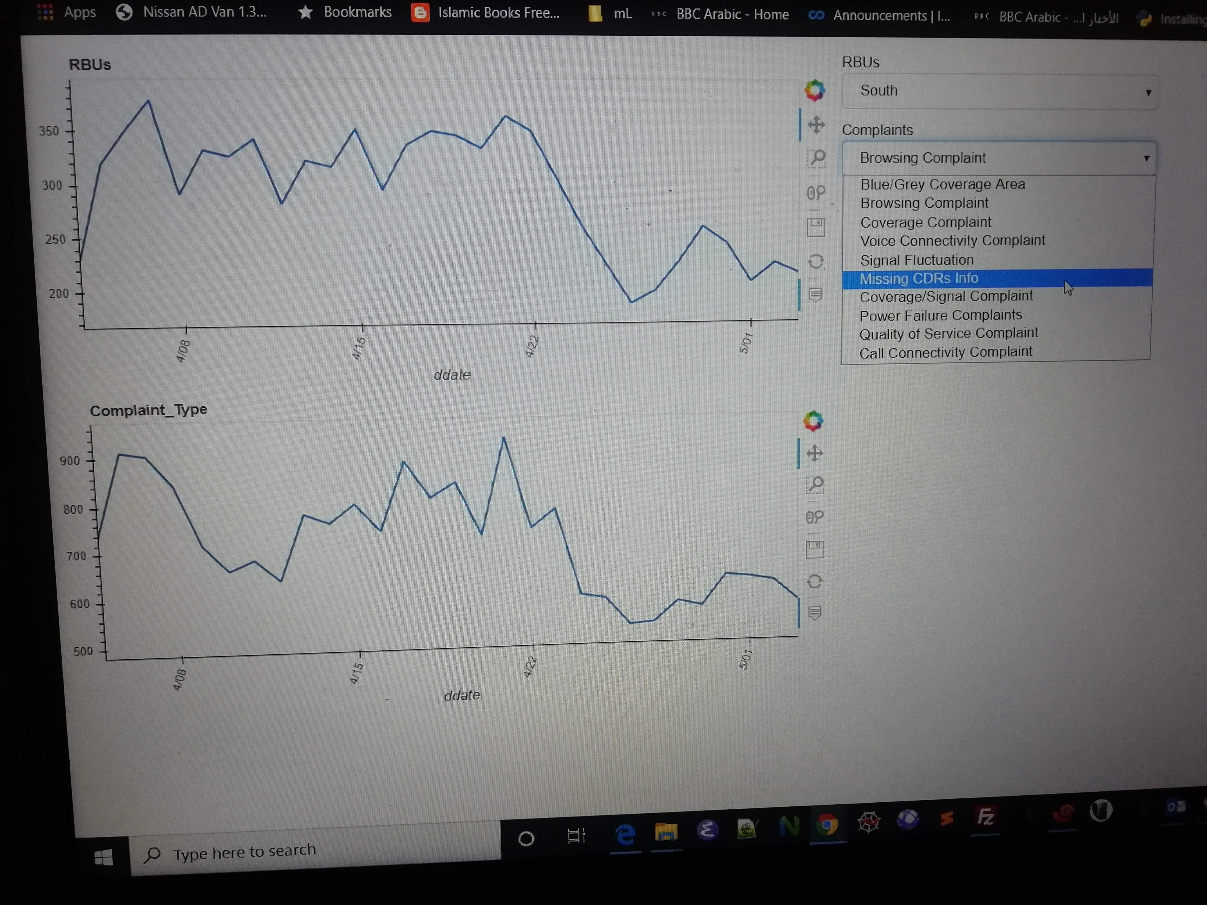
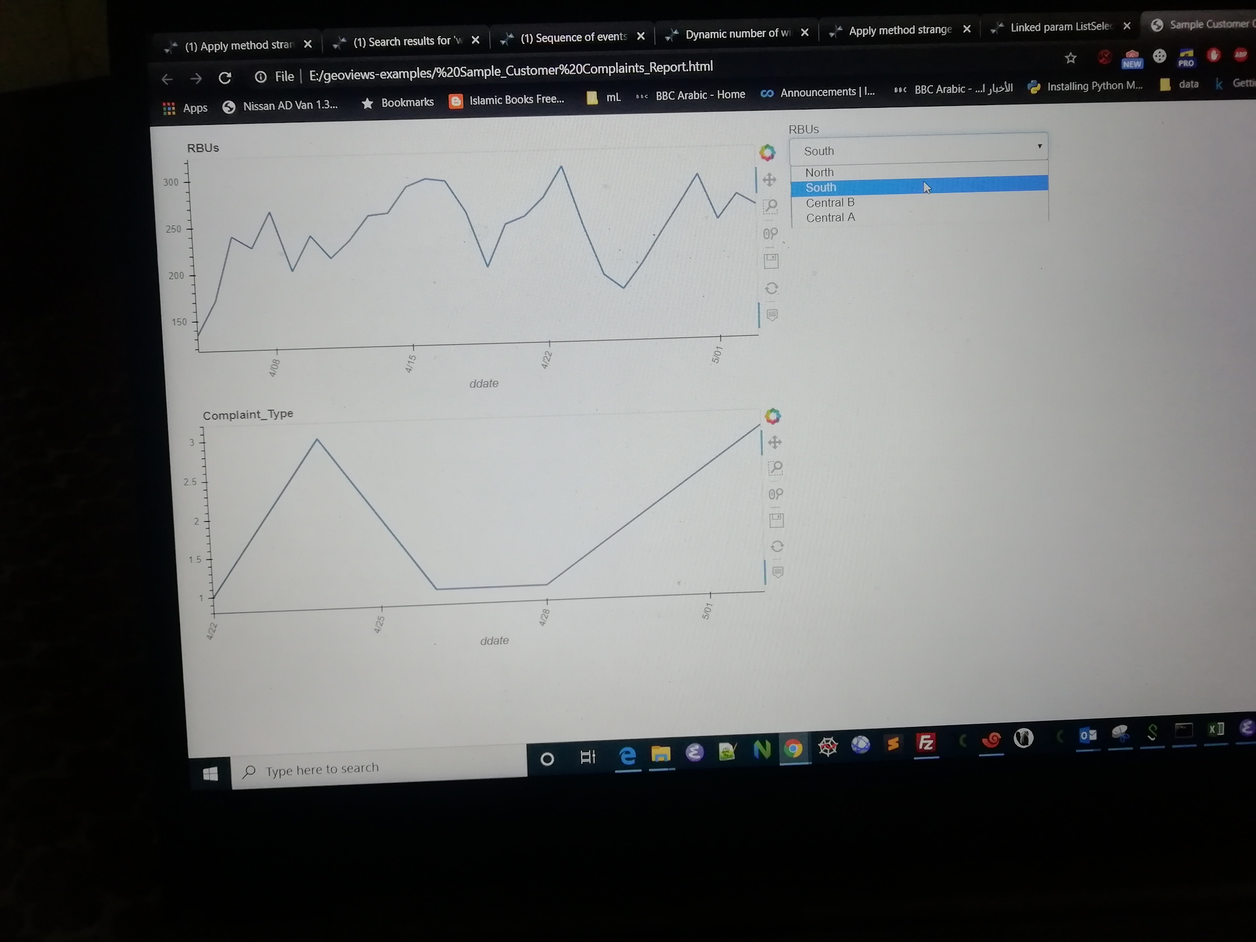
There are six option in complaint selection and four option in RBU selection:-
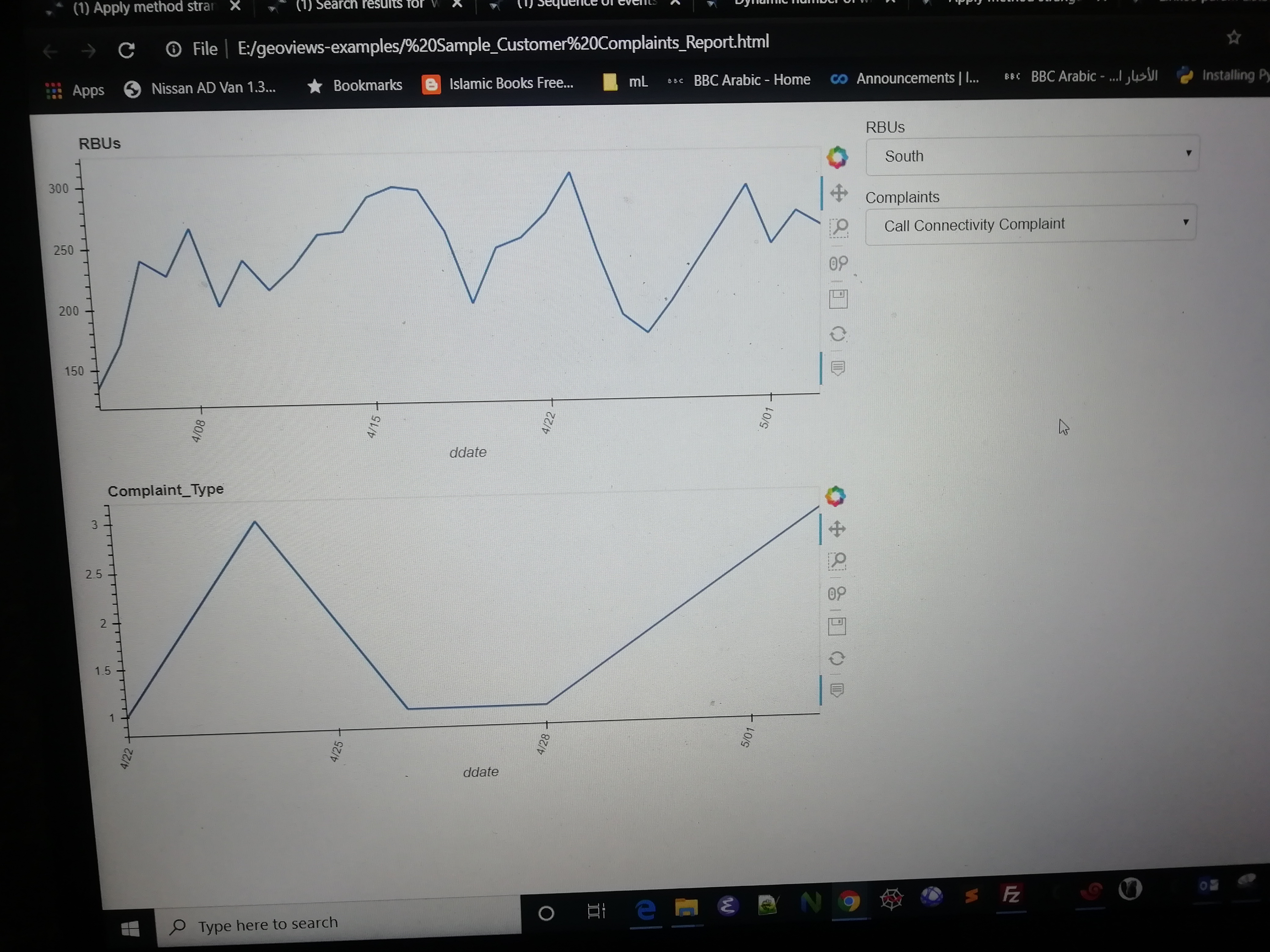
You can see the changes in RBU graph appear when pointer in the complaint selection is in "last option **Call Connectivity Complaints ** .
Yo
Now when the pointer is at ** Call Connectivity Complaints ** you can select any option in RBU selection changes appear in it graph.
As you can see in code they are independent data frame generated by groupby with there line graphs
Also vice versa. If change the order of widgets from RBU, Complaints to Complaints ,RBU then complaints graph become constant and RBU’s values select show changes in the graph.
RBU contains [‘NORTH’,‘SOUTH’,‘Central B’,‘Central A’].
When i select Central A value then select any value in Complaint selection graphs in complaint type begin to show changes.
Hope i am able to make my point
Not quite yet (at least for me, sorry!). What I meant by asking you to provide a reproducible example is a piece of code one could run directly. Here unfortunately you do not provide cust_group_by_work_projected so I can’t run your code  If it’s a DataFrame that is too large to share here or if it contains sensitive data, ideally you could provide some code that would generate beforehand a DataFrame filled with dummy data, with e.g.
 cust_group_by_work_projected = pd.DataFrame(dict(RBU=['North', 'North', 'South', 'South'], complaint_type=['some complaint', ...])). I would then be able to run your code.
Could you also provide the code you use to save the app as HTML?
Cheers!
1 Like
@maximlt
Thanks for your help and support.
I rewrite the code and make it simple for you to urderstand. and pasted below data picts. How can it send you sample notebook and sample csv data.
import numpy as np
import pandas as pd
import colorcet as cc
import holoviews as hv
import numpy as np
import panel as pn
import hvplot.pandas # noqa: API import
pn.extension()
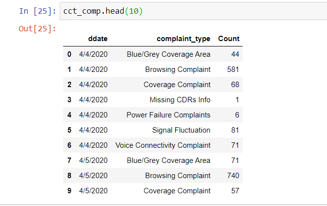
rbu_comp=pd.read_csv('rbu_comp.csv')
cct_comp=pd.read_csv('cct_comp.csv')
RBU_select = pn.widgets.Select(name='RBUs', options=list(rbu_comp.RBU.unique()))
Complaint_select=pn.widgets.Select(name='Complaints',options=list(cct_comp.complaint_type.unique()))
RBU_line=rbu_comp.hvplot.line(hover_cols=['RBU'],title='RBUs',x='ddate', y=['Count'],rot=70,by='RBU',dynamic=True,shared_axes=False,use_index=False,legend=False).opts(toolbar=None)
CCT_line=cct_comp.hvplot.line(hover_cols=['complaint_type'],title='Complaint_Type',x='ddate', y=['Count'],rot=70,by='complaint_type',dynamic=True,shared_axes=False,use_index=False,legend=False).opts(toolbar=None)
cust_group_RBU_wise_b=RBU_line.apply.select(RBU=RBU_select.param.value)
cust_group_CCT_wise_b=CCT_line.apply.select(complaint_type=Complaint_select.param.value)
sample_report=pn.Row(pn.Column(pn.layout.HSpacer(width=10),cust_group_RBU_wise_b,pn.layout.HSpacer(width=10),cust_group_CCT_wise_b), pn.Column(Complaint_select,RBU_select))
from bokeh.resources import INLINE
hv.extension('bokeh'),
sample_report.save(' Sample_Customer Complaints_Report', embed=True, resources=INLINE,title=" Sample Customer Compalints Report")
You should be able to upload a sample data file here.
@maximlt @philippjfr
I try to upload csv files with following error
Could you try again? I just allowed csvs.
data upladed . you can use it in code in read_csv file
cct_comp.csv (9.8 KB) rbu_comp.csv (2.7 KB)
Thanks, I can definitely reproduce the issue but don’t yet know what is going wrong.
When you run the resultant html file in your browser and see the results of the selection on the graphs then you understand