For users the most obvious changes are the accent color (blue) and re-organisation of the sidebar menu.
But for me as a developer a lot of simplifications has been done to speed up adding new apps to the site. Before I used pn.serve in a file app.py. Now I’ve changed to panel serve a folder of .py apps. Furthermore I maintain a .yaml file with meta data about the apps like name, author, description, url, resources, …
Furthermore I maintain a .yaml file with meta data about the apps like name, author, description, url, resources, …
You solved the issue of not maintaining a dictionary passed to pn.serve, but it seems as heavy to make a single file for all your applications.
Why couldn’t be the various metadata parameters of a main param.Parameterized class?
Then for each new app, you adapt these metadata in their own code (can still be externalized).
My only comment is it’s a shame I think I’ve read somewhere is for the gallery and list view you don’t have control of the banner / formatting I think as it takes you out of an almost seamless experience you have created right there.
That said I love this, it is just awesome work you have done!
The issue here is that this code should be as close to downloadable and useable as possible for other people. Using some non-panel framework and spending lots of code lines on this is something I would like to avoid.
I’ve tried to get some kind of meta-data handling into Panel as I believe its quite useful for anyone who develops a multipage application. So far without luck.
I guess the issue I’m pointing out is superficial in terms of content however hope this makes sense and also it’s from a perspective of I don’t know what is going on in the background to make it work.
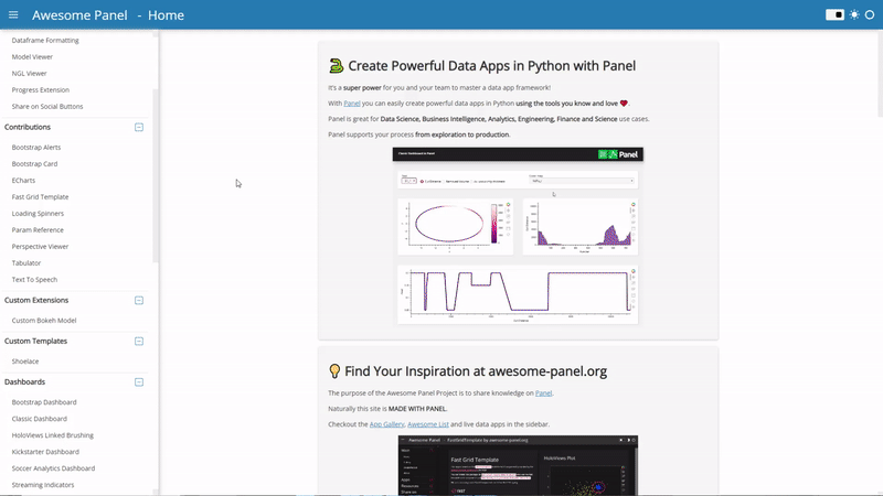
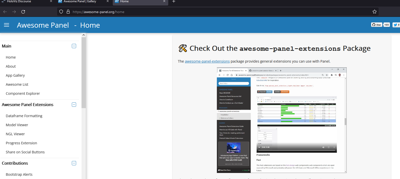
So the below picture shows the general formatting of what feels like 98% of the site with the sidebar making it super navigatable. it’s also very clear and just nice.
the formatting of this page as I understand is much fixed but it would be nice I think if somehow you can bring into the same formatting of the standard template being utilised - how easy possible that is… I make use of this serve myself and like the page for my local tools but with the layout where the site is almost completely in another format it sticks out at least to myself like whoa what just happened there.
*navigating a little bit more I feel that the gallery opening up in the same tab is good because your still in awesome-panel though when clicking on awsome-list I feel should open in a new tab so on the one hand you stay in awesome-panel to keep exploring the awesome-list and a new tab for the new site that you want to explore further - you can tell I’m in the group of like a million tabs open at once.