BI Dashboard with easy crossfiltering - also of categorical data

Inspired by a tweet in the Streamlit community I wanted to demonstrate that BI Dashboards with cross filtering are very easy to develop with the HoloViz ecosystem compared to the combination of Streamlit, Plotly, custom components, session state and experimental features in the tweet.

The complexity of the Streamlit example is just another indication to me that Streamlit not the easiest way … for lots of use cases including crossfiltering.

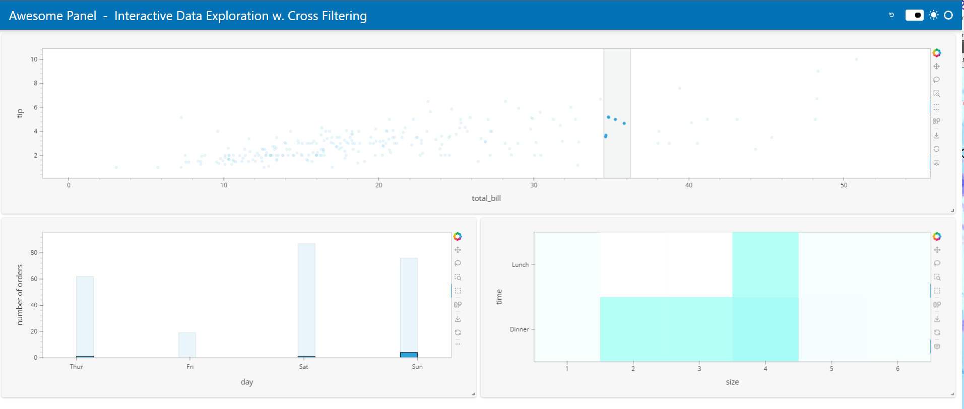
In the process I learned HoloViews linked brushing (cross filtering) bar charts/ histograms only works for numerical and datetime data. So a trick was to convert categorical data like day to numerical data and then just display the string labels on the axis.

import numpy as np
import pandas as pd
import panel as pn
import plotly.express as px
from holoviews.selection import link_selections

import hvplot.pandas

pn.extension(sizing_mode="stretch_width", template="fast")
pn.state.template.param.update(
    site="Awesome Panel", title="Interactive Data Exploration w. Cross Filtering"
)

hvplot.extension("bokeh")  # bokeh or plotly

DAY_TO_INT = {"Thur": 4, "Fri": 5, "Sat": 6, "Sun": 7,}
DAY_TICKS = [(val, key) for key, val in DAY_TO_INT.items()]
HEIGHT = 400

def load_dataset():
    df = px.data.tips()
    df["count"] = 1
    df["size"] = df["size"].astype(str)
    df["day_int"] = df["day"].map(DAY_TO_INT)
    return df

df = pn.state.as_cached("tips", load_dataset)

bill_to_tip_figure = df.hvplot.scatter(
    x="total_bill", y="tip", responsive=True, tools=["box_select"]
)
day_figure = df.hvplot.hist(
    "day_int", xlabel="day", ylabel="number of orders", responsive=True
).opts(xticks=DAY_TICKS)
size_to_time_figure = df.sort_values("size").hvplot.heatmap(
    x="size", y="time", C="count", reduce_function=np.sum, colorbar=False, responsive=True
)

selections = link_selections.instance()
layout = pn.panel(selections(bill_to_tip_figure + size_to_time_figure + day_figure), height=HEIGHT)

pn.Column(
    f"## Tips Dataset ({len(df)} orders)", layout, 
    "**Data Apps the easy way**: No need for session state, custom components, experimental features, ..."
).servable()

To run it use

panel serve name_of_script.py

I think this code is short, much simpler and works much, much better than the streamlit code which requires a lengthy youtube video to explain.

If any one knows how to make the bars wider let me know. Thanks.

2 Likes

FastGridTemplate Version

Here is a version using the FastGridTemplate.

import numpy as np
import pandas as pd
import panel as pn
import plotly.express as px
from holoviews.selection import link_selections
from holoviews import opts

import hvplot.pandas

pn.extension(sizing_mode="stretch_width")

DAY_TO_INT = {"Thur": 4, "Fri": 5, "Sat": 6, "Sun": 7,}
DAY_TICKS = [(val, key) for key, val in DAY_TO_INT.items()]
HEIGHT = 400
TOOLS = dict(tools=["hover"], active_tools=["box_select"])


def load_dataset():
    df = px.data.tips()
    df["count"] = 1
    df["size"] = df["size"].astype(str)
    df["day_int"] = df["day"].map(DAY_TO_INT)
    return df

df = pn.state.as_cached("tips", load_dataset)

bill_to_tip_figure = df.hvplot.scatter(
    x="total_bill", y="tip", responsive=True
)
day_figure = df.hvplot.hist(
    "day_int", xlabel="day", ylabel="number of orders", responsive=True
).opts(xticks=DAY_TICKS)
size_to_time_figure = df.sort_values("size").hvplot.heatmap(
    x="size", y="time", C="count", reduce_function=np.sum, colorbar=False, responsive=True
)

selections = link_selections.instance()
bill_to_tip_figure = selections(bill_to_tip_figure).opts(**TOOLS)
day_figure = selections(day_figure).opts(**TOOLS)
size_to_time_figure = selections(size_to_time_figure).opts(**TOOLS)

template = pn.template.FastGridTemplate(
    site="Awesome Panel", title="Interactive Data Exploration w. Cross Filtering",
    row_height=125,  prevent_collision=True, save_layout=True,
)
template.main[0:3,0:12]=pn.pane.HoloViews(bill_to_tip_figure, sizing_mode="stretch_both")
template.main[3:6,0:6]=pn.pane.HoloViews(day_figure, sizing_mode="stretch_both")
template.main[3:6,6:12]=pn.pane.HoloViews(size_to_time_figure, sizing_mode="stretch_both")
template.servable()

You can try the app here Interactive Data Exploration w. Cross Filtering

5 Likes

This is very nice!
Is it possible to cross filter two different DataFrames that have common columns(df1 and df2 has both the same column X)?

I’m trying to do it with hvplot(df1) + tabulator(df2), but couldn’t figure it out yet(selection on the plot updates the tabulator or vice versa).

1 Like

Hi @Mehmet

Try asking the question in a new post with a minimum, reproducible example. It’s much easier to work with. Thanks.

Hi @Marc , I just run your code but unfortunately lasso selection couldn’t work and also box selection will not get only the box selected but will be select all data from top to bottom from example I want to select only in the middle of point as I show below but data show all


kindly please advise