When making violin plots with the ‘by’ argument to make a separate violin for each data category, hvplot (plotly extension) doesn’t use the category names properly. Instead of one violin for each category, it takes the first letter of each category and stacks violins which have the same first letter. It also prints only the first letter of each category in the legend.
This seems to not happen with the bokeh extension, which creates one violin per category as expected.
An example of the expected behaviour, that occurs when using the bokeh extension
from the hvplot documentation here. As you expect from a violin plot, there is one violin for each category (in this example they start with different letters, but it also works as expected when they start with the same letter).
There is an example of the unexpected behaviour in the hvplot documentation here. The two letter carrier categories eg OO and OH are stacked because they both start with O.
Also,
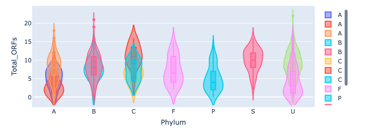
from my own data. All categories that start with the same letter are stacked instead of separate, e.g. Ascomycota and Actinobacteria don’t get their own violin with the category’s name under the x axis; instead they are all stacked on top of each other in the ‘A’ group. The legend also only lists the first letter of each category.
This can be reproduced simply with df.hvplot.violin(y=numerical_column, by=categorical/string_column). I have been trying a lot of other arguments to try and make plotly work properly, with no success.
This is surely a bug and not the intended behaviour, right? I would prefer to use the plotly extension because the graphs look a lot nicer than bokeh’s. Is there a way to make it draw the violin plot properly?
Many thanks