One suggestion in case you are interested: Explain a bit more in detail what is we are seeing in each example gif. It may not be obvious to someone that does not already know what to expect.
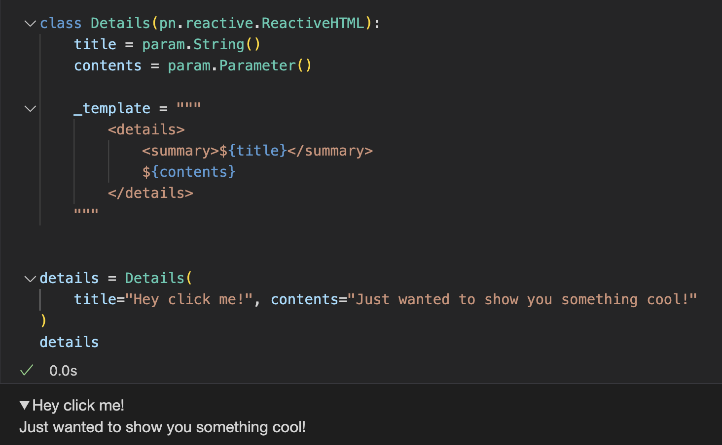
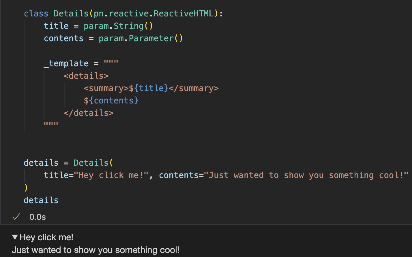
class Details(JSComponent):
    """
    A simple component wrapper for the HTML details element.

    This component provides an expandable details/summary element that can be
    used to hide/show content. It's useful for creating collapsible sections
    within a panel application.
    """

    title = param.String(default="Details", doc="""
        The text to display in the summary element (the clickable header).""")

    object = param.String(default="", doc="""
        The HTML content to display within the details element.""")

    collapsed = param.Boolean(default=True, doc="""
        Whether the details element is expanded by default.""")

    _esm = """
    export function render({ model }) {
        const details = document.createElement("details");
        const summary = document.createElement("summary");

        summary.innerHTML = model.title;
        details.innerHTML = model.object;
        details.open = !model.collapsed;
        details.insertBefore(summary, details.firstChild);

        details.addEventListener("toggle", () => {
            model.collapsed = !details.open;
        });

        model.on("title", () => {
            summary.innerHTML = model.title;
        });

        model.on("object", () => {
            const currentSummary = details.querySelector("summary");
            details.innerHTML = model.object;
            details.insertBefore(currentSummary, details.firstChild);
        });

        model.on("collapsed", () => {
            details.open = !model.collapsed;
        });

        return details;
    }
    """
import param
import panel as pn
from panel.custom import Child, JSComponent
class Details(JSComponent):
"""
A component wrapper for the HTML details element with proper content rendering.
This component provides an expandable details/summary element that can be
used to hide/show content. It supports any Panel component as content,
including Markdown panes for rendering markdown content.
"""
title = param.String(default="Details", doc="""
The text to display in the summary element (the clickable header).""")
object = Child(doc="""
The content to display within the details element. Can be any Panel component,
including a Markdown pane for rendering markdown content.""")
collapsed = param.Boolean(default=True, doc="""
Whether the details element is collapsed by default.""")
_esm = """
export function render({ model, view }) {
// Create container elements
const details = document.createElement('details');
const summary = document.createElement('summary');
const contentContainer = document.createElement('div');
summary.innerHTML = model.title;
summary.style.cursor = 'pointer';
details.appendChild(summary);
details.appendChild(contentContainer);
details.open = !model.collapsed;
contentContainer.className = 'details-content';
details.addEventListener('toggle', () => {
model.send_msg({ collapsed: !details.open });
model.collapsed = !details.open;
});
model.on('title', () => {
summary.innerHTML = model.title;
});
model.on('msg:custom', (event) => {
if (event.type === 'update_collapsed') {
details.open = !event.collapsed;
}
});
contentContainer.appendChild(model.get_child('object'));
return details;
}
"""
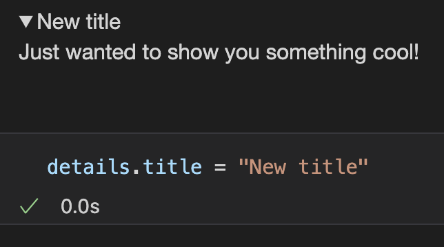
@param.depends("collapsed", watch=True)
def _send_collapsed_update(self):
"""Send message to JS when collapsed state changes in Python"""
self._send_msg({"type": "update_collapsed", "collapsed": self.collapsed})
def _handle_msg(self, msg):
"""Handle messages from JS"""
if 'collapsed' in msg:
collapsed = msg['collapsed']
with param.discard_events(self):
self.collapsed = collapsed
Details(object=pn.pane.Markdown("Check this out\n```python\nprint('Hello, World!')\n```"), collapsed=False, margin=(10, 15))