Maybe im asking a silly question but i’ve tried to adjust the x/y axis range using redim and also like its done in Bokeh
def timeseries(data):
    return hv.Curve(dict(Date=data[0], Value=data[1]), 'Date', (('Value', data[2])))

dmap = hv.DynamicMap(timeseries, streams=[pipe])

hover = HoverTool(
         tooltips=[('index', '$index'), ('datetime', '@Date{%Y-%m-%d:%H:%M:%S}'), ('Valor', '@Value{0.00}')],
         formatters={'@Date': 'datetime'},
         mode='mouse')

dsh = datashade(dmap).opts(
    width=1200,  height=600, tools=['xwheel_zoom', 'pan'],
    active_tools=['xwheel_zoom', 'pan'], default_tools= ['reset', 'save', hover, 'hover'])
hvplot = renderer.get_plot(dsh, curdoc())
        hvplot.state.y_range.start = min_plt - 2
        hvplot.state.y_range.end = max_plt + 2
        hvplot.state.y_range.bounds = (min_plt - 20, max_plt + 20)
But im not able to get it working properly.
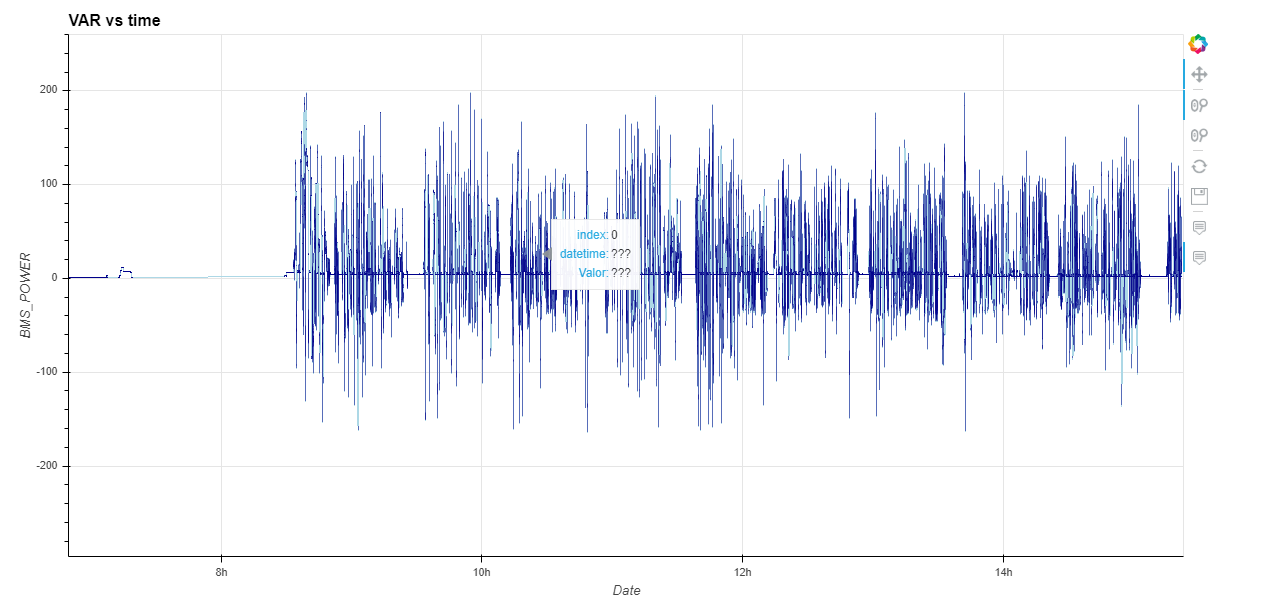
Also im not able of using a customized HoverTool:
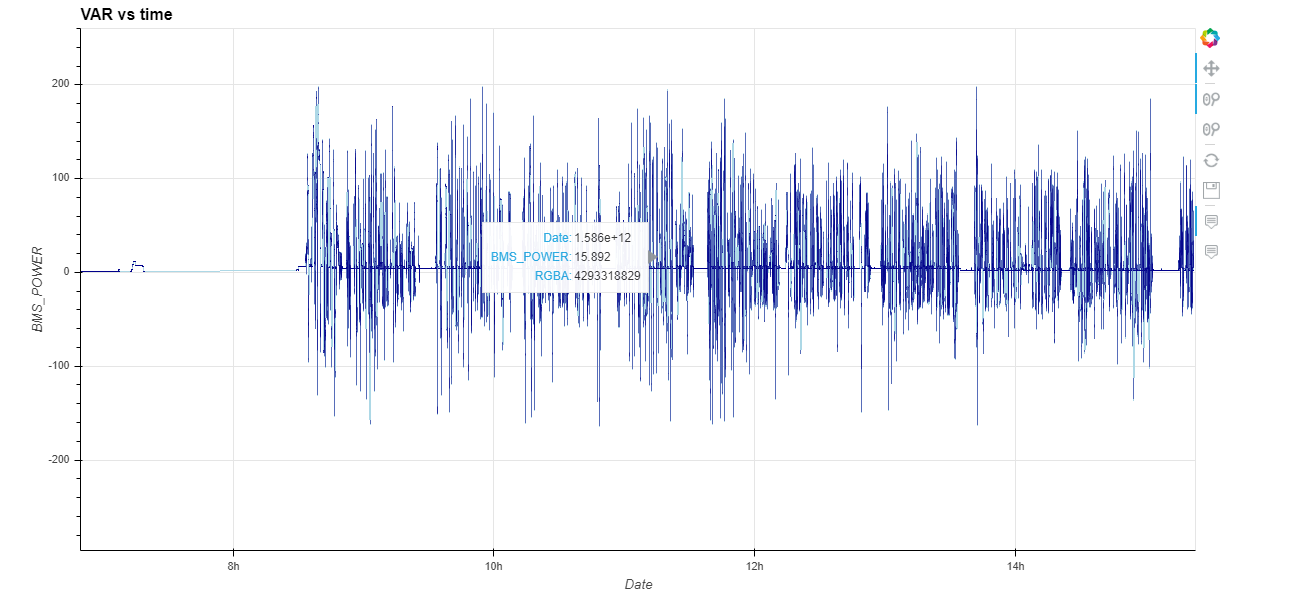
And using the default one this is shown:
I would like at least to have formated Datetime.
Thak You in advice,
Josu Catalina.
So to set the range on the initial plot I would suggest supplying an explicit x_range and y_range to the datashade call.
In terms of the hover tool there are numerous issues here, the first is that the default hover tool should definitely be formatting the datetimes correctly. For your custom HoverTool there are a few other issues:
There is no more 'Value' or 'Date' in the data once it’s been rendered as an Image, you can instead use $x and $y which will report the current value along the x- and y-axis, I would expect this to work:
hover = HoverTool(
         tooltips=[('index', '$index'), ('datetime', '$x{%Y-%m-%d:%H:%M:%S}'), ('Valor', '$y{0.00}')],
         formatters={'$x': 'datetime'},
         mode='mouse')
We should be doing this automatically though, so again an issue would be appreciated.
Issue submitted
opened 10:11AM - 16 May 20 UTC
As suggested in:
https://discourse.holoviz.org/t/change-axis-range-over-datashaded-dynamic-map-in-bokeh-serve-implementation/673
Would be nice that the default HoverTool implements automatically the datetime formatter otherwise this is shown:
Although the solution is...
What I was asking is if there is some way of adjusting the axis ranges once the plot is already created and shown in the server via code.
I tried this but seems not working
def timeseries(data):

    return hv.Curve(dict(Date=data[0], Value=data[1]),
               'Date', (('Value', data[2]))).redim(Date=hv.Dimension('Date', soft_range=(min(data[0]) -
                  timedelta(days=3), max(data[0]) + timedelta(days=3))))


dmap = hv.DynamicMap(timeseries, streams=[pipe])

dsh = datashade(dmap).opts(
    width=1200,  height=600, tools=['xwheel_zoom', 'pan'],
    active_tools=['xwheel_zoom', 'pan'], default_tools= ['reset', 'save', hover, 'hover'])

hvplot = renderer.get_plot(dsh, curdoc())
Neither applying it over datashade object:
dsh.redim(Date=hv.Dimension('Date', soft_range=(data2plot.iloc[0, 1] - timedelta(days=3), data2plot.iloc[-1, 1] + timedelta(days=3))))
Thank You
Josu Catalina.