Color the path according to the value of the vdims column

Hello everyone and thank you very much to all the developers for their contributions to tools such as holoviews bokeh and datashader.
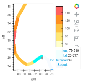
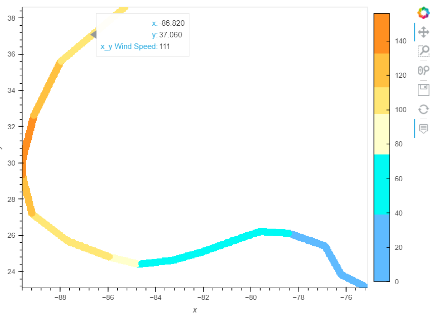
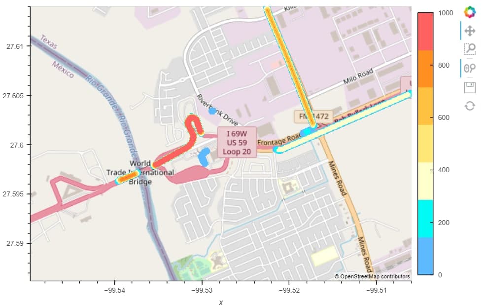
My task is quite simple and clear on the one hand, but I do not understand how to implement it. I have a dataframe with coordinates in the Mercator projection and a magnitude column. I need to build paths according to these coordinates and color them in accordance with the magnitude column. At the same time, there are so many paths that I have to resort to rasterize () and spread to add thickness to the line.

My current code is:
map_tiles*spread(rasterize(hv.Path([path], vdims=‘magnitude’), aggregator=ds.mean(‘magnitude’), precompute=True), px=5).opts(width=700, cmap=colors, height=500, color_levels = 7, colorbar=True,
clim=(0, 1000), tools=[‘hover’]
)

generates the next image

My question is the following:

  1. What do the color bar values ​​mean? in my case, this clearly does not correspond to the value of the magnitude column. I am satisfied with how the paths are painted, but I can not match the colors of the coloring with the magnitude values
  2. how to make the color scale value correspond to the values ​​of the ‘magnitude’ column (at the moment it does not match at all)?
  3. how to make the “magnitude” column value displayed by hovering over the path?

Tanks!

For 1 and 2: I think your spread is missing the arg how="source"
For 3: opts(tools=[“hover”])

import holoviews as hv
levels = [0, 38, 73, 95, 110, 130, 156, 999]  
colors = ['#5ebaff', '#00faf4', '#ffffcc', '#ffe775', '#ffc140', '#ff8f20', '#ff6060']

path = [
    (-75.1, 23.1, 0),   (-76.2, 23.8, 0),   (-76.9, 25.4, 0),   (-78.4, 26.1, 39),  (-79.6, 26.2, 39),
    (-80.3, 25.9, 39),  (-82.0, 25.1, 74),  (-83.3, 24.6, 74),  (-84.7, 24.4, 96),  (-85.9, 24.8, 111),
    (-87.7, 25.7, 111), (-89.2, 27.2, 131), (-89.6, 29.3, 156), (-89.6, 30.2, 156), (-89.1, 32.6, 131),
    (-88.0, 35.6, 111), (-85.3, 38.6, 96)
]

path = hv.Path([path], kdims=["lon", "lat"], vdims=['Wind Speed'])
raster = rasterize(path, aggregator="mean")
raster_spread = spread(raster, how="source", px=5)
raster_spread.opts(tools=["hover"], cmap=colors, color_levels=len(colors), colorbar=True)

image

Fabulous! THIS worked for me!
Please ask one more question: how do I display any additional hover information?

pass more vdims=[“Wind Speed”, “Wind Direction”]

Yes. I did it. But it does not work.

path = [
(-75.1, 23.1, 0, ‘a’), (-76.2, 23.8, 0, ‘a’), (-76.9, 25.4, 0, ‘b’), (-78.4, 26.1, 39, ‘c’), (-79.6, 26.2, 39, ‘c’),
(-80.3, 25.9, 39, ‘d’), (-82.0, 25.1, 74, ‘d’), (-83.3, 24.6, 74, ‘d’), (-84.7, 24.4, 96, ‘v’), (-85.9, 24.8, 111, ‘v’),
(-87.7, 25.7, 111, ‘v’), (-89.2, 27.2, 131, ‘f’), (-89.6, 29.3, 156, ‘f’), (-89.6, 30.2, 156, ‘f’), (-89.1, 32.6, 131, ‘g’),
(-88.0, 35.6, 111, ‘g’), (-85.3, 38.6, 96, ‘g’)
]
spread(rasterize(hv.Path([path], vdims=[‘Wind Speed’,‘level’]), aggregator=‘mean’), how=‘source’, px=5).opts(width=700, cmap=colors, color_levels=levels, height=500,colorbar=True, tools=[‘hover’])

Might be a limitation of datashader