geoviz
December 8, 2021, 7:27am
1
Hi,
Here are two links that indicate what I would have loved to have in holoviz:
https://doc.arcgis.com/en/web-appbuilder/create-apps/widget-swipe.htm
Would it not be perfect if this was a widget in panel?
1 Like
Marc
December 8, 2021, 11:38am
2
Hi @geoviz
I’ve been thinking about this one for so long. Could you create a feature request on Github?
Things that could help would be
List of requirements
An analysis of potential js widgets that we could use and a proposal for which one to use
A minimum reproducible example. Some pseudo code on how this should work.
Personally I would like it to be for comparing any two panels. They could be plots, images or anything else. Some js “before/ after” widgets are for images only.
1 Like
Marc
December 11, 2021, 11:48am
3
Hi @geoviz
Here is a Proof of Concept for images. I hope this could be turned into a general widget for Panel one day.
import panel as pn
import param

pn.extension(sizing_mode="stretch_width")

ACCENT_COLOR="#D2386C"

CSS = """
.before-after-container {
    position: relative;
    height:100%;
    width:100%
    border: 2px solid white;
}
.before-after-container .img {
    position: absolute;
    top: 0;
    left: 0;
    width: 100%;
    height: 100%;
}

.before-after-container .slider {
    position: absolute;
    -webkit-appearance: none;
    appearance: none;
    width: 100%;
    height: 100%;
    background: rgba(242, 242, 242, .3);
    outline: none;
    margin: 0;
    transition: all 0.2s;
    display: flex;
    justify-content: center;
    align-items: center;
    --track-width: 0;
}
.before-after-container .slider:hover {
    background: rgba(242, 242, 242, .1);
}
.before-after-container .slider::-webkit-slider-thumb {
    -webkit-appearance: none;
    appearance: none;
    width: 8px;
    height: 99%;
    background: white;
    cursor: pointer;
    border-radius: 0
}
.before-after-container .slider::-moz-range-thumb {
    width: 8px;
    height: 99%;
    background: silver;
    cursor: pointer;
    border-radius: 0
}
.before-after-container .slider-button {
    pointer-events: none;
    position: absolute;
    width: 30px;
    height: 30px;
    border-radius: 50%;
    background-color: silver;
    left: calc(50% - 18px);
    top: calc(50% - 18px);
    display: flex;
    justify-content: center;
    align-items: center;
}
.before-after-container .slider-button:after {
    content: '';
    padding: 3px;
    display: inline-block;
    border: solid #5d5d5d;
    border-width: 0 2px 2px 0;
    transform: rotate(-45deg);
}
.before-after-container .slider-button:before {
    content: '';
    padding: 3px;
    display: inline-block;
    border: solid #5d5d5d;
    border-width: 0 2px 2px 0;
    transform: rotate(135deg);
}
"""

pn.config.raw_css.append(CSS)

class BeforeAfterLayout(pn.reactive.ReactiveHTML):
    value = param.Integer(50, bounds=(0,100))
    left = param.String('https://i.imgur.com/PfIWek4.jpg')
    right = param.String('https://i.imgur.com/s08MkXC.jpg')


    _template = """
<div class='before-after-container'>
    <div id="right" class='img background-img' style="background-image: url('${right}');background-size: 900px 100%;"></div>
    <div id="left" class='img foreground-img' style="background-image: url('${left}');background-size: 900px 100%;"></div>
    <input type="range" min="1" max="100" value="${value}" class="slider" name='slider' id="slider" oninput="${script('handle_change')}"></input>
</div>
"""
    _scripts = {
        "render": """
function setImageWidth(){
    width=view.el.offsetWidth
    left.style.backgroundSize=`${width}px 100%`
    right.style.backgroundSize=`${width}px 100%`
}
setImageWidth()
window.addEventListener("resize", setImageWidth);

adjustment = parseInt((100-data.value)/100*18)
left.style.width=`calc(${data.value}% - ${adjustment}px)`
""",
        "handle_change": """
const sliderPos = parseInt(event.target.value);
adjustment = parseInt((100-sliderPos)/100*18)
left.style.width=`calc(${sliderPos}% - ${adjustment}px)`
data.value=parseInt(sliderPos)
""",
        "value": """
const sliderPos = data.value
adjustment = parseInt((100-data.value)/100*18)
left.style.width=`calc(${sliderPos}% - ${adjustment}px)`
"""
    }

before_after = BeforeAfterLayout(value=20, height=800, )
controls = pn.Param(before_after, parameters=["value", "left", "right"])
pn.template.FastListTemplate(
    site="Awesome Panel", title="Image Slider",
    sidebar=[controls], main=[before_after],
    accent_base_color=ACCENT_COLOR, header_background=ACCENT_COLOR
).servable()
If you like this example feel free to share on Twitter https://twitter.com/MarcSkovMadsen/status/1469636565248917507?s=20 or Linked In Marc Skov Madsen, PhD, CFA on LinkedIn: #datascience #python #datascience . Thanks.
7 Likes
Marc
December 11, 2021, 7:10pm
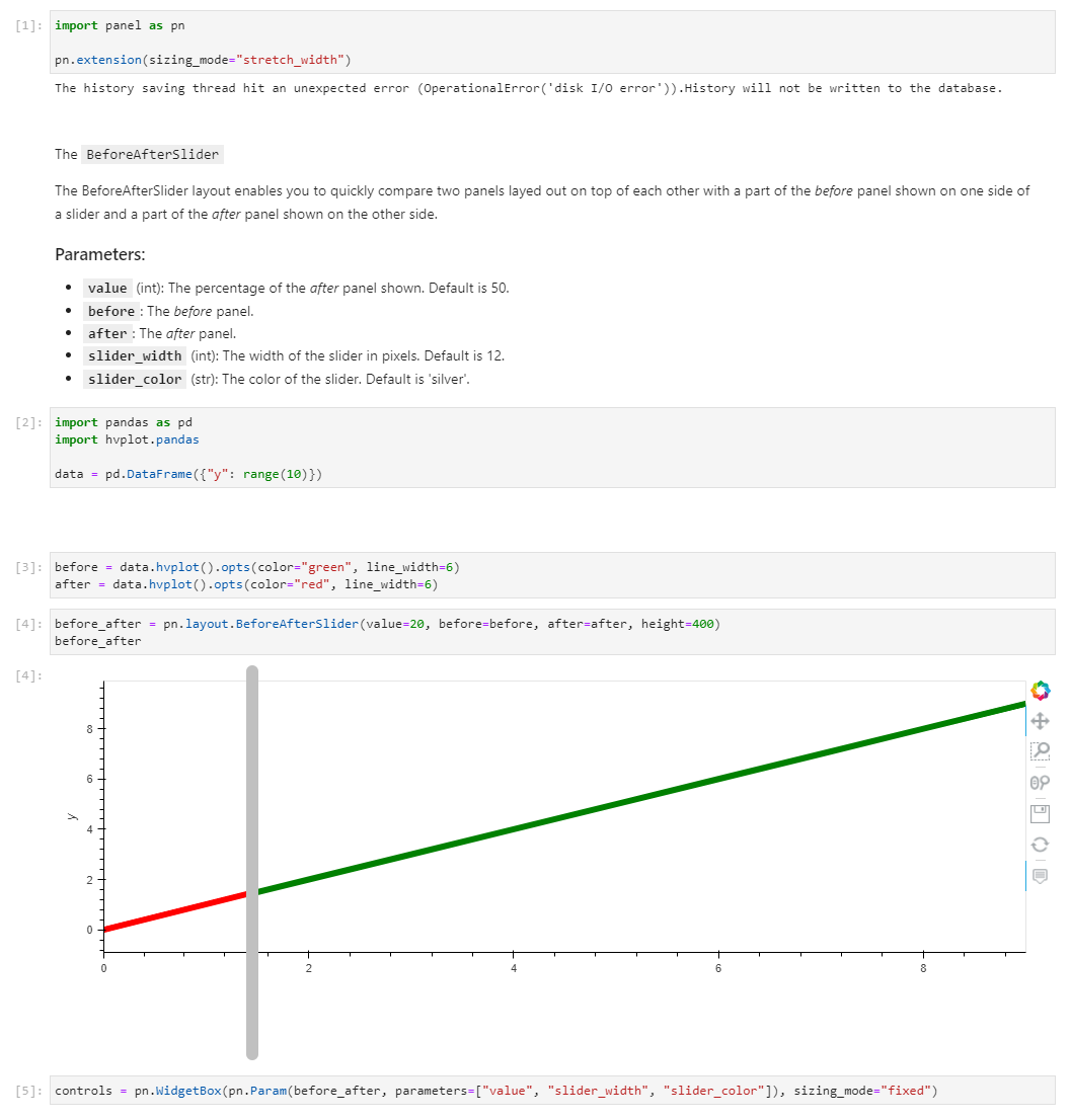
4
I continued a bit and created this for comparison of any panels: Images, Plots, Maps, Tables etc. I’m just a little bit happy about it
after = data.hvplot().opts(color="red", line_width=6, responsive=True, height=700)
before = data.hvplot().opts(color="green", line_width=6, responsive=True, height=700)

before_after = BeforeAfterSlider(
    value=20,after=after,before=before, height=800
)
import panel as pn
import param
import hvplot.pandas

pn.extension(sizing_mode="stretch_width")

ACCENT_COLOR="#D2386C"

CSS = """
.before-after-container {
    position: relative;
    height:100%;
    width:100%
}
.before-after-container .outer {
    position: absolute;
    top: 0;
    left: 0;
    width: 100%;
    height: 100%;
}
.before-after-container .inner,
 {
    height: 100%
}

.before-after-container .slider {
    position: absolute;
    -webkit-appearance: none;
    appearance: none;
    width: 100%;
    height: 100%;
    outline: none;
    margin: 0;
    transition: all 0.2s;
    display: flex;
    justify-content: center;
    align-items: center;
    --track-width: 0;
}
.before-after-container .slider::-webkit-slider-thumb {
    -webkit-appearance: none;
    appearance: none;
    width: 12px;
    height: 99%;
    background: silver;
    cursor: pointer;
    border-radius: 8px
}
.before-after-container .slider::-moz-range-thumb {
    width: 12px;
    height: 99%;
    background: silver;
    cursor: pointer;
    border-radius: 8px
}
"""

pn.config.raw_css.append(CSS)

class BeforeAfterSlider(pn.reactive.ReactiveHTML):
    value = param.Integer(50, bounds=(0,100))
    before = param.Parameter(allow_None=False)
    after = param.Parameter(allow_None=False)

    slider_width = param.Integer(default=12, bounds=(0,100))
    slider_color = param.Color(default="silver")


    _template = """
<style>
.before-after-container .slider::-webkit-slider-thumb {
    width: ${slider_width}px;
    background: ${slider_color};
}
.before-after-container .slider::-moz-range-thumb {
    width: ${slider_width}px;
    background: ${slider_color};
}
</style>
<div id="container" class='before-after-container'>
    <div id="before" class='outer'>
        <div id="before_inner" class="inner" >${before}</div>
    </div>
    <div id="after" class='outer' style="overflow:hidden">
        <div id="after_inner" class="inner">${after}</div>
    </div>
    <input type="range" min="1" max="100" value="${value}" class="slider" name='slider' id="slider" oninput="${script('handle_change')}"></input>
</div>
"""

    _scripts = {
        "render": """
state.before_inner=before.children[0]
state.after_inner=after.children[0]
function setImageWidth(){
    width=view.el.offsetWidth-12
    state.after_inner.style.width=`${width}px`
    state.before_inner.style.width=`${width}px`
}
setImageWidth()
window.addEventListener("resize", setImageWidth);

adjustment = parseInt((100-data.value)/100*18)
after.style.width=`calc(${data.value}% - ${adjustment}px)`
""",
        "handle_change": """
const sliderPos = parseInt(event.target.value);
adjustment = parseInt((100-sliderPos)/100*18)
after.style.width=`calc(${sliderPos}% - ${adjustment}px)`
data.value=parseInt(sliderPos)
""",
        "value": """
const sliderPos = data.value
adjustment = parseInt((100-data.value)/100*18)
after.style.width=`calc(${sliderPos}% - ${adjustment}px)`
"""
    }

import pandas as pd
data = pd.DataFrame({"y": range(10)})
after = data.hvplot().opts(color="red", line_width=6, responsive=True, height=700)
before = data.hvplot().opts(color="green", line_width=6, responsive=True, height=700)

before_after = BeforeAfterSlider(
    value=20,after=after,before=before, height=800
)
controls = pn.Param(before_after, parameters=["value", "slider_width", "slider_color"])
pn.template.FastListTemplate(
    site="Awesome Panel", title="Before After Slider",
    sidebar=[controls], main=[before_after],
    accent_base_color=ACCENT_COLOR, header_background=ACCENT_COLOR
).servable()
4 Likes
Jhsmit
December 18, 2021, 12:26pm
6
Nice, this would I have a use case for this with the NGL viewer where users compare two sets of colors.
How does this work, you need two panes one of the before one after? If it works with pretty much anything including reactivehtmls then all you would need a synchronized orientation between two NGL viewer instances?
1 Like
Marc
December 18, 2021, 7:07pm
7
Hi @Jhsmit
You should be able to use anything Panel supports. The api looks like below.
I’ll probably add a before and after title to top left and right corners.
Some random feedback:
I wonder if that gray line can have an icon <|> in the center?
Could the gray line be less thick? Because of its width, I feel like it’s the focus of the plot.
Perhaps the default slider color can be black or maybe whitesmoke so the colors can be more in sync with the rest of the plot?
Can there be annotations too e.g. left label defaults to Before and right labelAfter (modifyable)
Can there be a modifyable height?
But really awesome work!!
1 Like
geoviz
December 26, 2021, 5:29pm
9
Really great work @Marc ! Sorry for not following up before! This will really be a great addition and will make a difference. In addition to the options added it could be useful with an option regarding the orientation of the swipe line, i.e. it could be useful to be able to set it as vertical or horizontal depending on rhe setting where to apply it. Very nice indeed!
I do not quite understand how the PR system works. I found the PR for the BeforeAfterSlider component and it sounds like exactly what I am contemplating - the ability to perform a left/right slider compare of two arbitrary panel objects.
The last activity on the PR is 6 months ago (January). Is this component stuck in testing? If so, where can I find documentation on supporting such testing?
Thanks
1 Like
Marc
July 14, 2022, 10:55am
11
I Think @philippjfr rejected the PR. Think it was not working in all environments? Was working fine for me though.
I’m definitely going to revive it but there were indeed some significant limitations.