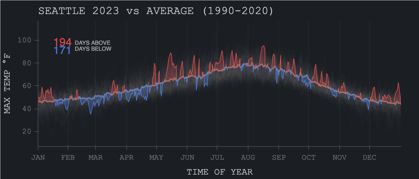
I recently read a post by CarbonPlan and was impressed by how polished the figures looked. That inspired me to see if I could replicate it, and while doing so, explore how Seattle 2023 highs compare to climatology.
This inspired me to try reproducing that style using hvPlot, and along the way, explore how Seattle’s daily highs (max temperatures) in 2023 compared to the climatology (average) from 1990 to 2020.
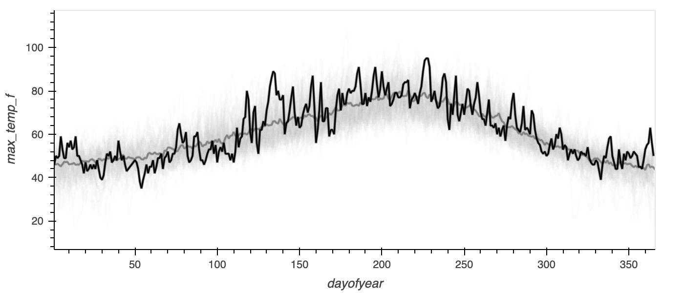
We will be starting off with this base plot:
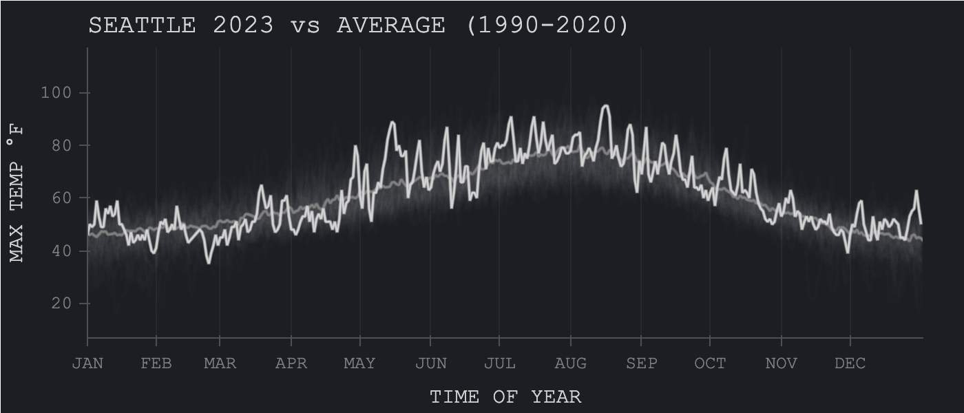
To this updated plot:
And finally, to this: