Curve where you can select multiple lines to be highlighted

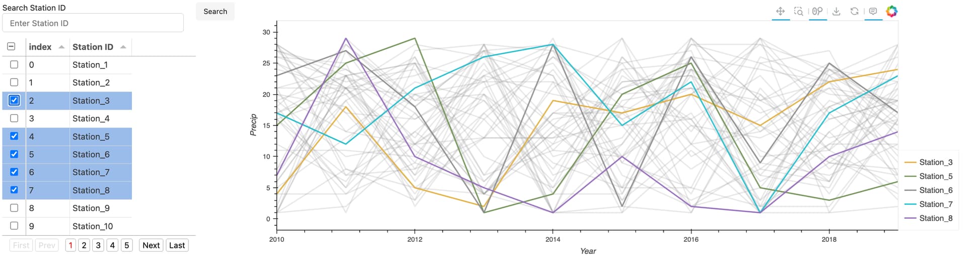
I have the following code, which plots a bunch of timeseries for different stations, and also makes a widget with which you can select a line to be highlighted.

import numpy as np
import pandas as pd
import hvplot.pandas  
import holoviews as hv
hv.extension('bokeh')

num_years = 10
num_stations = 5

data = {
    'Year': np.tile(np.arange(2010, 2010 + num_years), num_stations),
    'Station ID': np.repeat([f'Station_{i}' for i in range(1, num_stations + 1)], num_years),
    'Precip': np.random.randint(1, 30, size=num_years * num_stations)
}

df = pd.DataFrame(data)

all_lines_plot = df.hvplot(
    y='Precip',
    x='Year',
    by='Station ID',
    color = 'grey',
    alpha = .2,
    legend=False
)

sel_lines_plot = df.hvplot(
    y='Precip',
    x='Year',
    groupby='Station ID',
)

all_lines_plot*sel_lines_plot

This almost gets me what I want. However, I want the ability to select multiple different Station IDs with the widget. When multiple lines are selected, they should be plotted in different colors, and a legend should appear which ties the colors to the selected stations.

In the actual use case, there are thousands of Station IDs, so ideally, the widget should allow one to easily find Station IDs they want to be highlighted. Something where you can start typing in a Station ID, and it comes up with possible options based on what you typed so far, would be perfect.

Thanks!

This is far from being a finished app, but here is a start to one approach. Hopefully, you can adapt to make it work for your use case:

import numpy as np
import pandas as pd
import hvplot.pandas  
import holoviews as hv
import panel as pn
from panel.widgets import TextInput, Button
pn.extension('tabulator')
hv.extension('bokeh')

num_years = 10
num_stations = 50

data = {
    'Year': np.tile(np.arange(2010, 2010 + num_years), num_stations),
    'Station ID': np.repeat([f'Station_{i}' for i in range(1, num_stations + 1)], num_years),
    'Precip': np.random.randint(1, 30, size=num_years * num_stations)
}

df = pd.DataFrame(data)

station_ids_df = pd.DataFrame({'Station ID': df['Station ID'].unique()})
original_station_ids_df = station_ids_df.copy()

tabulator = pn.widgets.Tabulator(station_ids_df, selectable='checkbox', pagination='local', page_size=10)

# If you need to scale up considerably, try rasterizing the background lines:
# all_lines_plot = df.hvplot(
#     y='Precip',
#     x='Year',
#     by='Station ID',
#     rasterize=True
# ).opts(cmap='greys', alpha=.2, colorbar=False, tools=[])

all_lines_plot = df.hvplot(
    y='Precip',
    x='Year',
    by='Station ID',
    color='grey',
    alpha=.2,
    legend=False,
    min_width=800,
    min_height=400,
    responsive=True)

def plot_selected(indexes):
    if indexes:
        selected_stations = station_ids_df.iloc[indexes]['Station ID'].tolist()
        filtered_df = df[df['Station ID'].isin(selected_stations)]
        return all_lines_plot*filtered_df.hvplot(
            y='Precip',
            x='Year',
            by='Station ID',
            cmap='Category20',
            legend='top_right',
            responsive=True
        ).opts(toolbar='above')
    else:
        return all_lines_plot*hv.Curve([])


def search_table(event):
    search_query = search_input.value.lower()
    if search_query:
        filtered_data = original_station_ids_df[original_station_ids_df['Station ID'].str.lower().str.contains(search_query)]
        tabulator.value = filtered_data
    else:
        tabulator.value = original_station_ids_df

search_input = pn.widgets.TextInput(name='Search Station ID', placeholder='Enter Station ID')
search_button = pn.widgets.Button(name='Search')
search_button.on_click(search_table)

dynamic_plot = pn.bind(plot_selected, tabulator.param.selection)

layout = pn.Row(
    pn.Column(pn.Row(search_input, search_button), tabulator),
    pn.Column(dynamic_plot)
)

layout.servable()

Alternatively, you could use a DynamicMap from HoloViews