Datashader renders all the data series in the same color

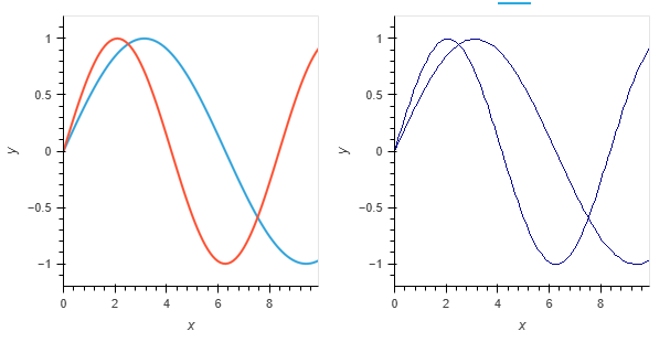
When I use DataShader to render the plot all the style information is lost, in particular all the serieses are shown in the color. How can i change the series colours / style in the datashader plot?

import holoviews as hv
from holoviews.operation.datashader import datashade
hv.extension('bokeh')

xs = [0.1* i for i in range(100)]
curve1   = hv.Curve((xs, [np.sin(0.5*x) for x in xs])) 
curve2   = hv.Curve((xs, [np.sin(0.75*x) for x in xs])) 
overlay = hv.Overlay([curve1,curve2])
shaderplot = datashade(overlay)
display(overlay + shaderplot)

image

This is because datashader default aggregator is count, which is the same for both curves. You can do two things to get the desired behavior:

import datashader as ds
import numpy as np

import holoviews as hv
from holoviews.operation.datashader import datashade

hv.extension("bokeh")

xs = [0.1 * i for i in range(100)]
curve1 = hv.Curve((xs, [np.sin(0.5 * x) for x in xs]))
curve2 = hv.Curve((xs, [np.sin(0.75 * x) for x in xs]))
# Option 1
overlay = hv.NdOverlay({"A": curve1, "B": curve2})
datashade(
    overlay, aggregator=ds.by("Element", ds.count()), cmap=["blue", "red"], line_width=1
)

# Option 2
datashade(curve1, cmap=["blue"], line_width=1) * datashade(curve2, cmap=["red"], line_width=1)

image

image

1 Like