Different range for y-axis in NdLayout plots

Hi,
I like to use NdLayout to plot timeseries for different dimensions in my dataset.
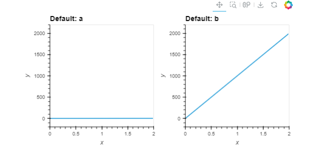
All works well, except when dimensions are in different scales they all get same y-range which makes the plot with smaller scale not to show well. Here’s an example:

l = {'a' : hv.Curve([0, 1, 2]), 'b' : hv.Curve([0, 1000, 2000])}
hv.NdLayout(l)

which will show
image
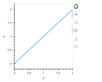
while I rather to see following for the curve on the left (‘a’):
image
Actually, if I just plot l[‘a’], it will show as I desired.
It should have a simple setting, but I wasn’t able to find it.
Any tip is appreciated.

Hi Mana,

Thanks for providing a mini example!

This might work hv.NdLayout.opts(shared_axes=False)

1 Like

Thanks a lot @ahuang11 . That works.
And yes, I’m learning from the community how to post here to get the best result.

Follow up question. Where could I find the answer? I mean which document had it that I missed to look at?

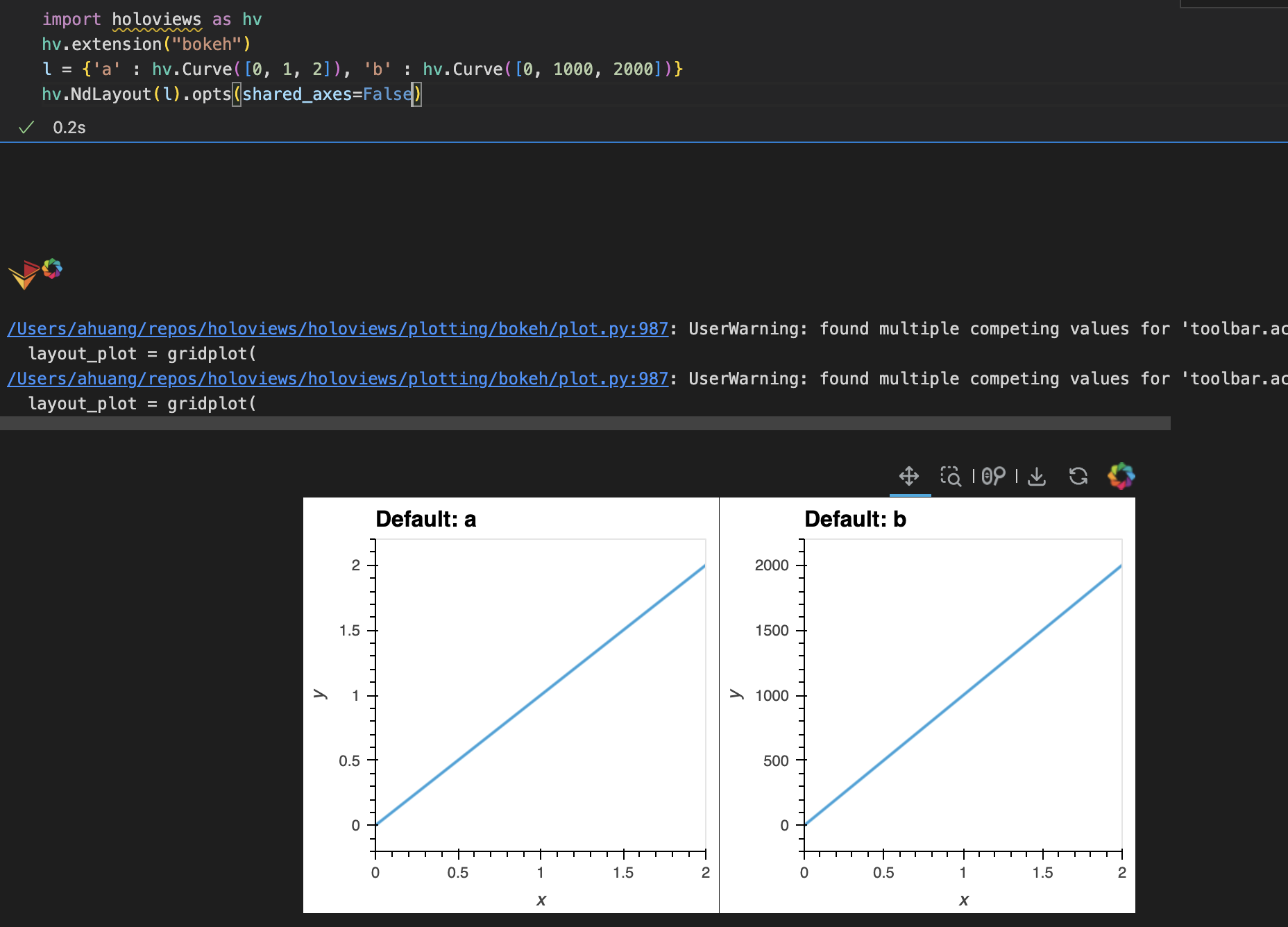
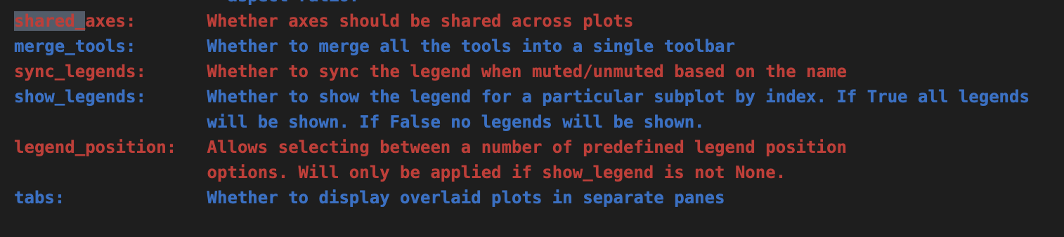
That’s a good question; I couldn’t find it on HoloViews docs that explicitly mentions it, but I think reading through hv.help(hv.NdLayout) might show it.

1 Like

Thanks for the response. I had look into help() document. It wasn’t able to find it there.
Thanks to you, it’s documented here now.

Strange, I see it in hv.help(hv.NdLayout)

1 Like

I was running help(hv.NdLayout) not hv.help(hv.NdLayout).
Thanks for sharing that with me.

1 Like