Hello Everyone, I used the above code inspiration from Is there a way to create a Dynamic Layout Based on user input? - #3 by Marc to create the following.
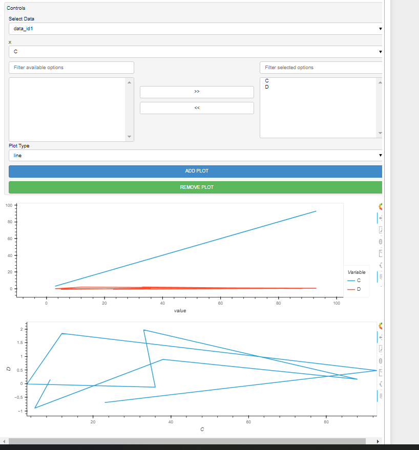
I have created the option to select the dataset I want to view, the dropdown to select what I would like to have on my x-axis and cross-select filter to select what signals I would like to plot on y-axis. I am stuck exploring two things
- I would like to make multiple plots stacked below each other based on my selections of signals for the filtered options on the right i.e. Whatever I select on the right, should stack a new plot and plot it in that object. Alternatively, I thought it would be easier if I could “add” new empty plot, select that plot window and then populate what I select. This facilitates what I want to plot and where. If I do this, I would probably not need the option of “add” or “remove” plot option.
- Add a vertical line moving cursor that indicates the “y” values as the Vline moves/hovers over the plot. Similar to Stumpy Timeseries Analysis
import numpy as np
import pandas as pd
import panel as pn
pn.extension(sizing_mode="stretch_width")
#pd.options.plotting.backend = "holoviews"


data1 = pd.DataFrame({"C" : np.random.randint(low=1, high=100, size=10),
                     "D"  : np.random.normal(0.0, 1.0, size=10)
                     })
data2 = pd.DataFrame({"C" : np.random.randint(low=1, high=300, size=10),
                     "D"  : np.random.normal(0.0, 1.0, size=10)
                     })

trace_datasets = {'data_id1':data1, 'dataid2':data2}


cols_X = list(data1.columns)
cols_Y =  list(data1.columns)

widget_x = pn.widgets.Select(name='x', options= cols_X)
#widget_y = pn.widgets.MultiSelect(name='y', options= cols_Y) #add default signals to plot

#not using widget_y. instead using cross_selector to filter options and plot what we want
cross_selector = pn.widgets.CrossSelector(name='y', options=list(data1.columns))


plot_type = pn.widgets.Select(name="Plot Type", value="line", options=["line", "scatter"])

dataset_selector = pn.widgets.Select(name="Select Data",  options= list(trace_datasets.keys()))


@pn.depends(dataset_selector)
def get_plot_analyze(cols_X, cols_Y, plot_type ='line',dataset_selector = dataset_selector.value):

    if plot_type == "line":

        curve_ds_analyze = trace_datasets[dataset_selector].hvplot.line(x=cols_X, y=cols_Y, width = 500)

        return curve_ds_analyze

    elif plot_type == "scatter":

        scatter_ds_analyse = trace_datasets[dataset_selector].hvplot.scatter(x=cols_X, y=cols_Y,width = 500)

        return  scatter_ds_analyse


@pn.depends(widget_x, cross_selector, plot_type, dataset_selector)
def get_plot(cols_X = widget_x.value, cols_Y=cross_selector.value, plot_type = 'line',dataset_selector = dataset_selector.value):

    return get_plot_analyze(cols_X, cols_Y, plot_type, dataset_selector)

# Accordion, Column, Row, Tabs, WidgetBox
container = pn.Column()

@pn.depends(widget_x, cross_selector, plot_type, dataset_selector)
def add_plot(*events):
    container.append(get_plot(cols_X=widget_x.value, cols_Y=cross_selector.value, plot_type = 'line',dataset_selector = dataset_selector.value))
add_plot()

add_plot_button = pn.widgets.Button(name="ADD PLOT", button_type="primary")
add_plot_button.on_click(add_plot)

def remove_plot(*events):
    if len(container)>0:
        container.pop(len(container)-1)

remove_plot_button = pn.widgets.Button(name="REMOVE PLOT", button_type="success")
remove_plot_button.on_click(remove_plot)


#pn.Row(pn.Column(pn.WidgetBox(dataset_selector, widget_x, widget_y, plot_type,add_plot_button, remove_plot_button),width=200), get_plot, container)
pn.Column(pn.WidgetBox(
                'Controls',
                dataset_selector, widget_x, cross_selector, plot_type,add_plot_button, remove_plot_button,
                width=1000,
                sizing_mode='fixed',),get_plot, container)