I’m attempting to run the gapminder example.
I’m running it inside of a notebook. I got what appears to be a helpful warning when running the code to execute panel.extension() when running in a notebook, which I did.
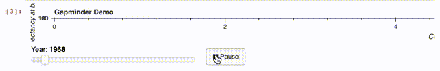
However, the plot renders without showing all the charting elements (see attached).
I’m running in jupyter lab with the pyviz extension installed with the code below.
import pandas as pd
import numpy as np
import holoviews as hv
import panel as pn

from bokeh.sampledata import gapminder
from holoviews import dim, opts
pn.extension()
renderer = hv.renderer('bokeh')

# Declare dataset
fertility = gapminder.fertility.reset_index().melt(id_vars='Country', var_name='Year', value_name='Fertility')
population = gapminder.population.reset_index().melt(id_vars='Country', var_name='Year', value_name='Population')
life_expectancy = gapminder.life_expectancy.reset_index().melt(id_vars='Country', var_name='Year', value_name='Life Expectancy')
gapminder_df = pd.merge(pd.merge(pd.merge(fertility, population), life_expectancy), gapminder.regions, on='Country')
gapminder_df.Year = gapminder_df.Year.astype('int')
ds = hv.Dataset(gapminder_df)

# Apply dimension labels and ranges
kdims = ['Fertility', 'Life Expectancy']
vdims = ['Country', 'Population', 'Group']
dimensions = {
    'Fertility' : dict(label='Children per woman (total fertility)', range=(0, 10)),
    'Life Expectancy': dict(label='Life expectancy at birth (years)', range=(15, 100)),
    'Population': ('population', 'Population')
}

# Create Points plotting fertility vs life expectancy indexed by Year
gapminder_ds = ds.redim(**dimensions).to(hv.Points, kdims, vdims, 'Year')

# Define annotations
text = gapminder_ds.clone({yr: hv.Text(1.2, 25, str(int(yr)), fontsize=30)
                           for yr in gapminder_ds.keys()})

# Define options
# Combine Points and Text
hvgapminder = (gapminder_ds * text).opts(
    opts.Points(alpha=0.6, color='Group', cmap='Set1', line_color='black',
                size=np.sqrt(dim('Population'))*0.005,
                tools=['hover'], title='Gapminder Demo', responsive=True,
                show_grid=True),
    opts.Text(text_font_size='52pt', text_color='lightgray')
)

# Define custom widgets
def animate_update():
    year = slider.value + 1
    if year > end:
        year = int(start)
    slider.value = year

# Update the holoviews plot by calling update with the new year.
def slider_update(event):
    hvplot.update((event.new,))

def animate(event):
    if button.name == '► Play':
        button.name = '❚❚ Pause'
        callback.start()
    else:
        button.name = '► Play'
        callback.stop()

start, end = ds.range('Year')
slider = pn.widgets.IntSlider(start=int(start), end=int(end), value=int(start), name="Year")
slider.param.watch(slider_update, 'value')

button = pn.widgets.Button(name='► Play', width=60, align='end')
button.on_click(animate)
callback = button.add_periodic_callback(animate_update, 200, start=False)

# Get HoloViews plot and attach document
hvplot = renderer.get_plot(hvgapminder)
hvplot.update((1964,))

# Create a Panel layout and make it servable
pn.Column(
    hvplot.state,
    pn.Row(slider, button),
    sizing_mode='stretch_both'
).servable('Gapminder Demo')