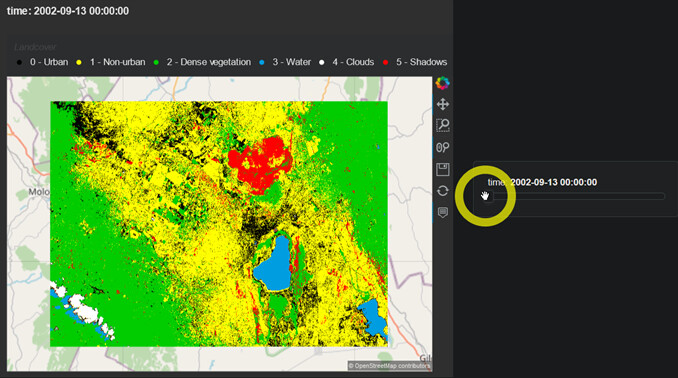
The second example uses hvPlot to visualise a time series of supervised classifications.
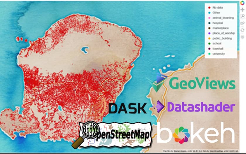
A more elaborate piece of work for my MSc thesis compared different geospatial Python libraries for visualising large vector data, with datashader and hvPlot doing extremely well along many indicators. You can find the results on this repo.
Let me know what you think! Still got plenty to learn
Yes, geo=True (coastlines=True not needed for this particular use case). Both the hvplot and gv-only use cases were run in the same environment (Cartopy was 0.18.0 at the time and GeoViews 1.9.1).