Hello,
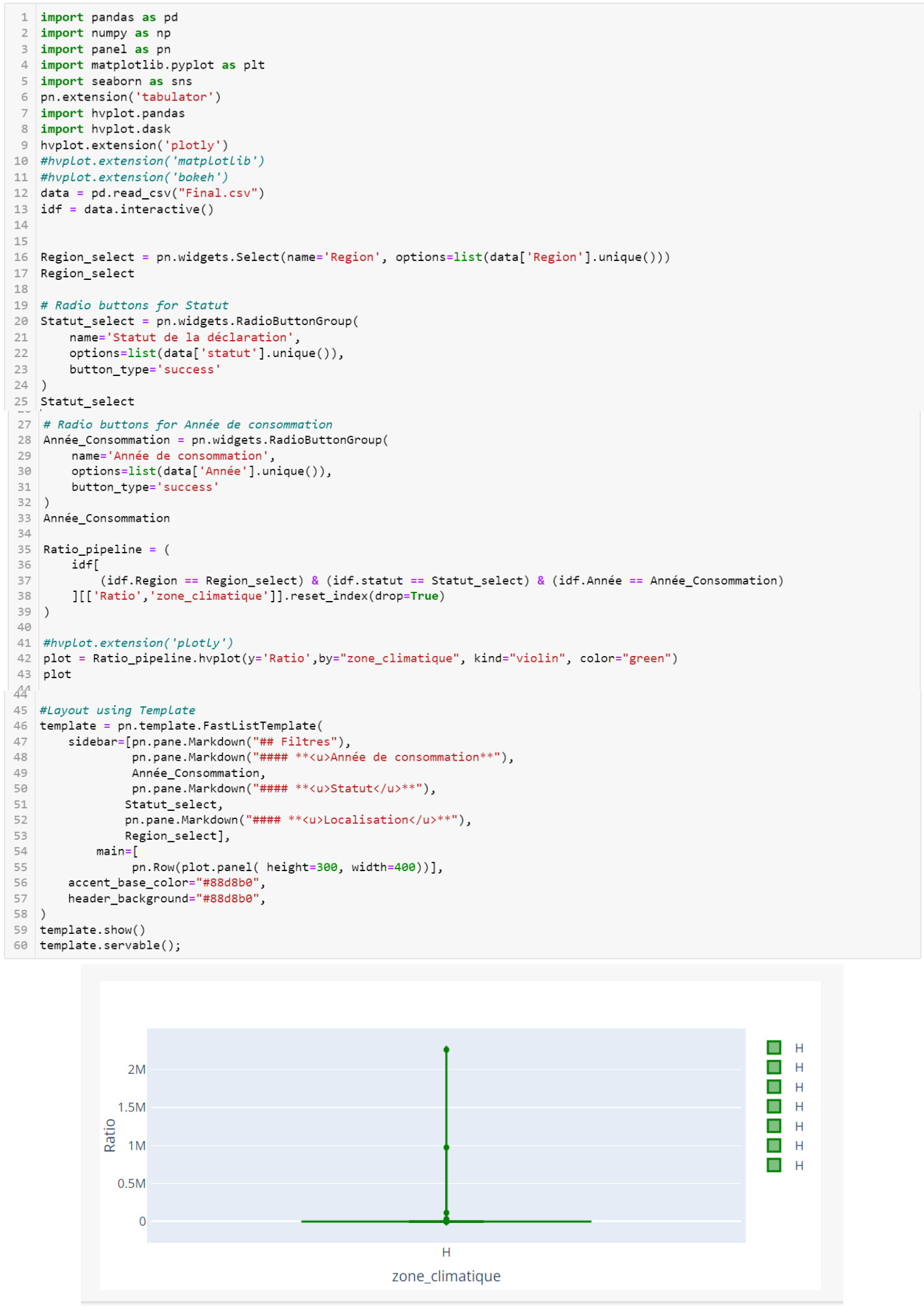
I created a dashboard using Panel to plot a “Violin” graph using the “Plotly” extension. The goal is to represent the “Ratio” based on “climatic zones”. However, all “climatic zones” start with the letter “H”, which led to the display of all violins superimposed on top of each other.
Therefore, I want to reframe my approach to avoid this overlap and improve the readability of the graph.