Any solutions for this? List of tuples showing positions instead of the label as per attached screenshot.
On a side note. Is there a way in hvPlot Heatmap to set up custom gridlines? For example to have thick red gridlines at xticks?
Any solutions for this? List of tuples showing positions instead of the label as per attached screenshot.
On a side note. Is there a way in hvPlot Heatmap to set up custom gridlines? For example to have thick red gridlines at xticks?
I don’t understand the first part of your question.
For the grid, you can look up the bokeh gridstyle parameters, e.g.,
set .opts(gridstyle={'grid_line_color':'magenta', 'grid_line_width':20})
@ea42gh
That changes the style for the whole grid. What I’m looking for is an option to set up mark lines if that makes sense. To be more specific the screenshot I’ve posted shows staff working in a pick to light system, indicating when they are working and when they are absent from the machinery. I’d like to have specific style of grid lines only at specific times to make it easier to read when there’s break time.
In regards my main question. Xticks with list of tuples should show the second values of the tuple at the first values’ position, however it shows the position number instead, if that makes sense. So, at 10, 70, 130 it should show datetimes as per snippet below indicates, but it doesn’t.
xticks=[(10, cc[10]), (70, cc[70]), (130, cc[130]), (190, cc[190]), (250, cc[250]), (310, cc[310]),
(370, cc[370]), (430, cc[430]), (480, cc[480])]you may need to show me an example: the way I understand your question now,
you are looking for something like the following:
data = [(i, j,  i*j) for i in range(5) for j in range(5) if i!=j]
ticks = [(0, '1'), (1, '3'), (2, 8), (3, 12), (4, 16)]
hv.Overlay([hv.HeatMap(data).opts( xticks=ticks )]+[hv.VLine(k).opts(color='magenta') for k in [1,3,6]] )
Works, but it’s using holoviews not hvplot. Due to the type of data I’m working with I trying to avoid using holoviews.
I’m wondering if the same can be done in hvplot somehow?
Just realised how easy it is to composing plots.
Although, the main question / issue is still there. For some reason xticks still don’t display the second values of the tuple.
Nothing I can do if you do not show us a (small) piece of code that exhibits the problem…
Please, see code below.
   def hmap_x(data):
cc = data.columns
hm = data.hvplot.heatmap(
    x='columns',
    y='index',
    grid=True,
    cmap=['#5b5b5b', '#00e696'],
    responsive=True,
    colorbar=False,
    flip_yaxis=True,
    xaxis='bottom',
    width=3600,
    height=len(data) * 20,
    xticks=[(10, cc[10]), (70, cc[70]), (130, cc[130]), (190, cc[190]), (250, cc[250]), (310, cc[310]),
            (370, cc[370]), (430, cc[430]), (480, cc[480])],
).opts(
    toolbar=None,
    fontsize={'title': 10, 'xticks': 12, 'yticks': 12},
)

hm = hm * hv.VSpan(130, 145) * hv.VSpan(310, 340)
pn.panel(hm).show()so what is data?
Be that as it may, data.columns is presumably a list of the column names rather than an index of a row?
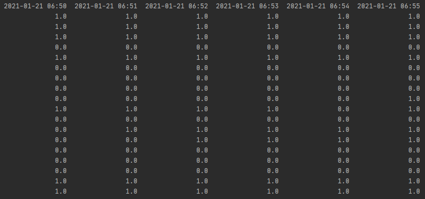
A list of 481 dates + times as per snippet below.
Index(['2021-01-21 06:50', '2021-01-21 06:51', '2021-01-21 06:52',
   '2021-01-21 06:53', '2021-01-21 06:54', '2021-01-21 06:55',
   '2021-01-21 06:56', '2021-01-21 06:57', '2021-01-21 06:58',
   '2021-01-21 06:59',
   ...
However, even if I try doing something like xticks=[(0, 'zero'), (50, 'fifty'), (100, 'one hundred')] the result is “0”, “50” and “100” xtick labels on positions 0, 50 and 100. Also, if I use xticks=5, then I will get 5 xticks at the expected positions, but instead of the column names I get numbers.
The only way, I see the column names along xaxis is when I don’t use xticks at all. In that case 481 column names are being displayed, which is overkill, even with 45 or 90 degree rotation. I only need one for each hour.
Any thoughts?
This still does not show me what structure you have for ‘data’.
I’d like to see a snippet
data = ???
hmap_x(data)
that exhibits the problem. Note it does not have to be your actual data,
nor does it have to be large!
Just ran https://hvplot.holoviz.org/reference/pandas/heatmap.html#pandas-gallery-heatmap from the reference gallery. The bottom one from the link, the unemployment 1948 example. Checked it in PyCharm with Holoviz Panel and also in Jupyter Classic Notebook and xticks arg doesn’t behave as expected in either, so I don’t think the issue is related to my dataframe.