Hi riziles,
I have two Panel widgets:
data_set_sel = pn.widgets.IntSlider( name='Data Set', start=0, end=int(data_set-1), step=1, value=0)
afe_btn = pn.widgets.RadioButtonGroup(name='AFE', options={'AFE1': 0, 'AFE2': 1, 'AFE3': 2, 'AFE4': 3}, button_type='success')
I am using hvplot.bind to bind the function and the widgets value:
d_set = data_set_sel.value
afe = afe_btn.value

def filt_df(d_set, afe):
    df2 = df[['EL', 'CB1 Window', 'CB1 Delay', 'CB2 Window', 'CB2 Delay']]
    return df2[(df2.index < (el_0[d_set] + afe*16)+16) &   (df2.index >= (el_0[d_set] + afe*16))]

df_output = hvplot.bind(filt_df, data_set_sel, afe_btn).interactive()
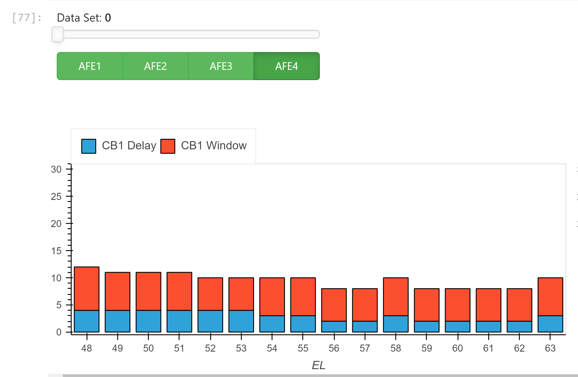
It works great with plotting in Jupyter lab:
CB1 = df_output.hvplot.bar(x='EL', y=['CB1 Delay', 'CB1 Window'], stacked=True, width=600, legend='top', ylim=[0, 31])
CB2 = df_output.hvplot.bar(x='EL', y=['CB2 Delay', 'CB2 Window'], stacked=True, width=600, legend='top')

CB1 + CB2
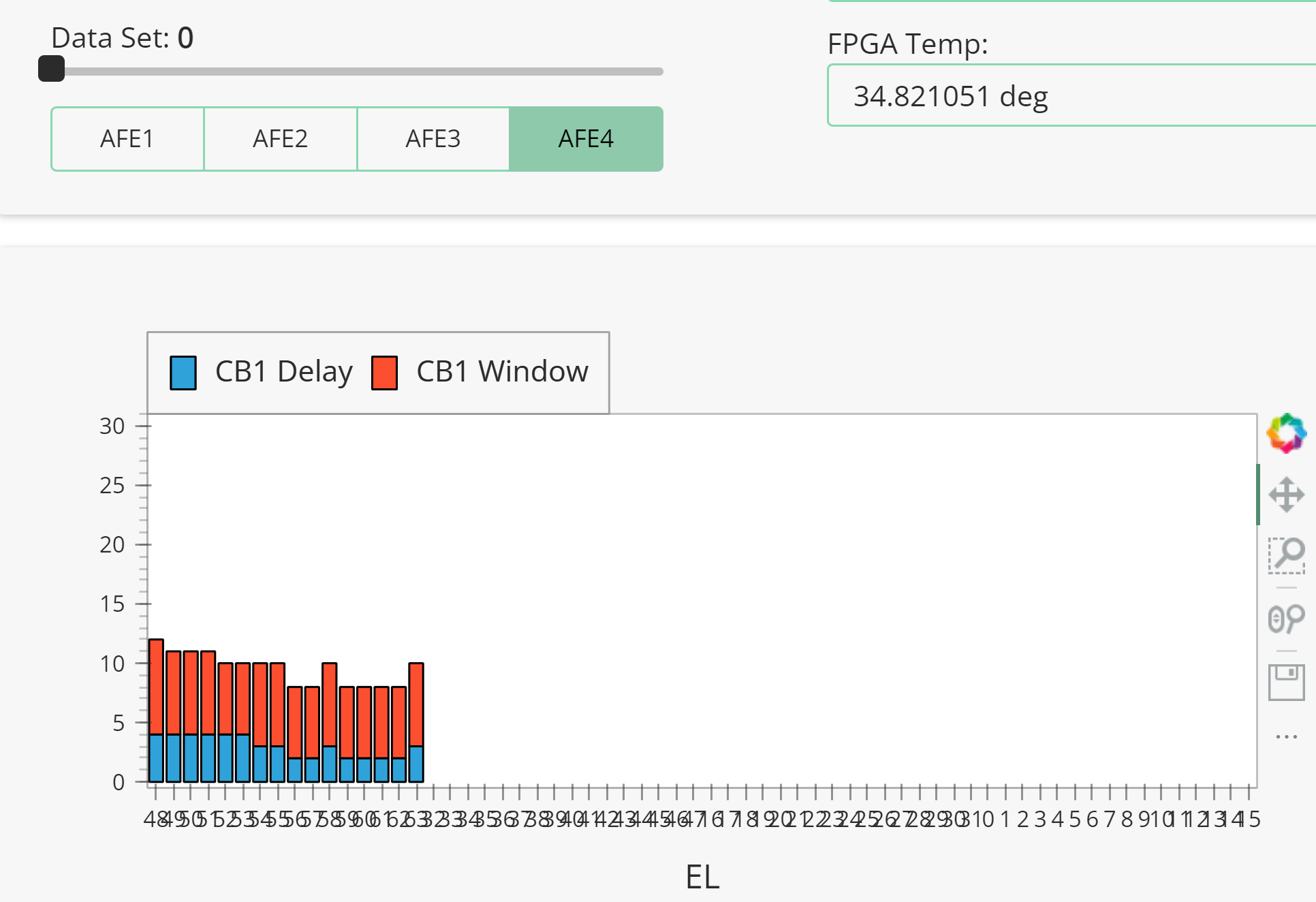
But, it got problem with Panel dashboard:
#Layout using Template
template = pn.template.FastListTemplate(
    title='LVDS Locking Analysis',
    sidebar=[pn.pane.Markdown("# LVDS LOCKING"),
             pn.pane.Markdown("#### descriptin here......"),
             # pn.pane.PNG('climate_day.png', sizing_mode='scale_both'),
             pn.pane.Markdown("## Open Log File"),
             logfile],
    main=[pn.Row(pn.Column(fn,
                           data_set_sel,
                           afe_btn), pn.Spacer(width=50),
                 pn.Column(LVDS_Status1,
                           FPGA_Temp),pn.Spacer(width=50),
                 pn.Column(LVDS_Status2)),
          pn.Row(CB1.panel(width=600), CB2.panel(width=600), margin=(0,25)),
          pn.Row(pn.Column(table.panel(width=600)))],
    accent_base_color="#88d8b0",
    header_background="#88d8b0",
)
template.show()
template.servable();
You may notice that I have “template.show()” here. When run this cell in Jupyter, it will auto open panel dashboard on browser.
Thanks,
Jeff