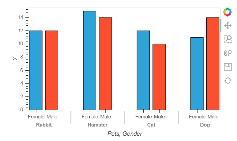
I am looking for an option to do the histogram with side by side bars for each bin instead of the overlay (typically with alpha to show through other vales).
Bar plot example supports this, I wonder if it is possible for histograms?
This is currently not possible, and I’m having some trouble figuring out what exactly this would look like. How do you put multiple bars side by side on a continuous axis? I suppose you could split the bar area in two?
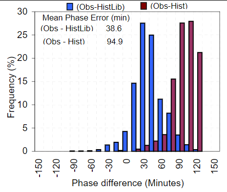
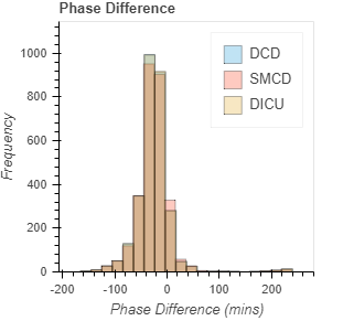
Thanks for the quick response. Here is a sample from an old excel workbook
Thanks, I have seen plots like this before but I guess I always had trouble interpreting them. The gaps in continuous space are imo definitely odd, and I’d have to think about how to implement this in a sensible way.
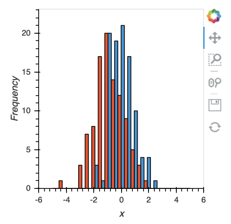
I agree, however the current overlay if unclear as well. The fig below used alpha=0.3 for the bars but the overlay causes color shifts. Also not great for users with near color blindness
I wonder if histograms can be treated as bar charts and then plotted that way
Could do something like this yourself:
import numpy as np

hist1, bins = np.histogram(np.random.randn(100), range=(-5, 5), bins=21)
hist2, bins = np.histogram(np.random.randn(100)-1, range=(-5, 5), bins=21)

def stacked_hists(hist1, hist2, bins):
    diff = np.diff(bins)/2.
    bins = np.insert(bins, np.arange(1, len(bins)), bins[:-1]+diff)
    hist1 = np.insert(hist1, np.arange(0, len(hist1)), np.zeros(len(hist1)))
    hist2 = np.insert(hist2, np.arange(1, len(hist2)+1), np.zeros(len(hist2)))
    return hv.Histogram((bins, hist1)) * hv.Histogram((bins, hist2))

stacked_hists(hist1, hist2, bins)
Also not opposed to adding something like this to the histogram operation though.
2 Likes