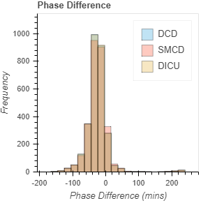
I agree, however the current overlay if unclear as well. The fig below used alpha=0.3 for the bars but the overlay causes color shifts. Also not great for users with near color blindness
I wonder if histograms can be treated as bar charts and then plotted that way