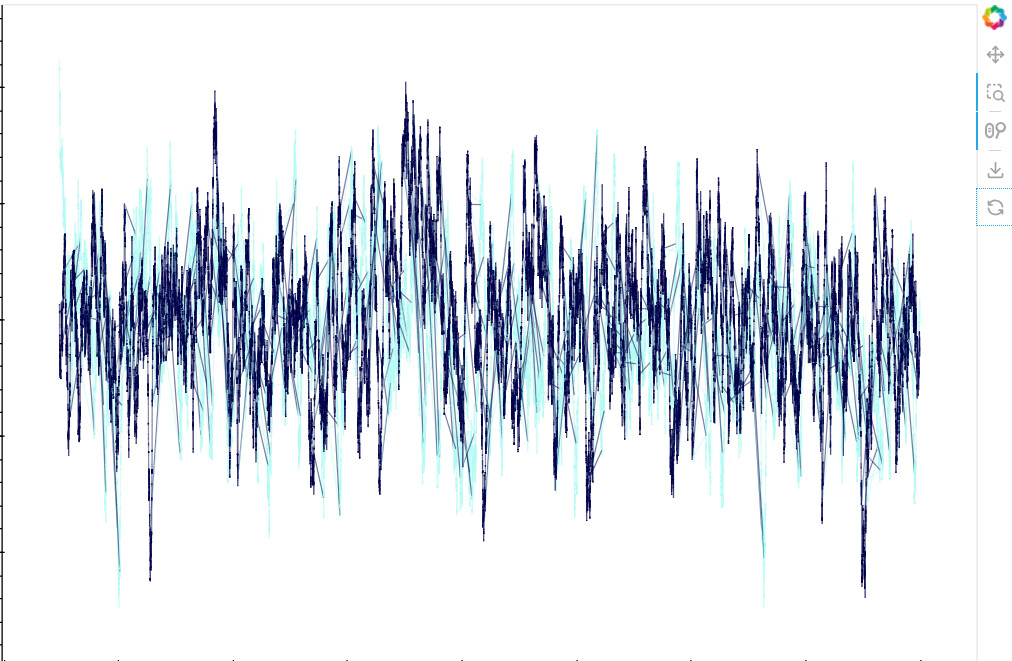
When I plot my data I want to group by a measnurand and color all data by ID.
In theory this works but I get some really bad artefacts and I do not know why. With Streamlit I do not get the artefacts but the HV toolbar is nice. In the end I use Panel for display.
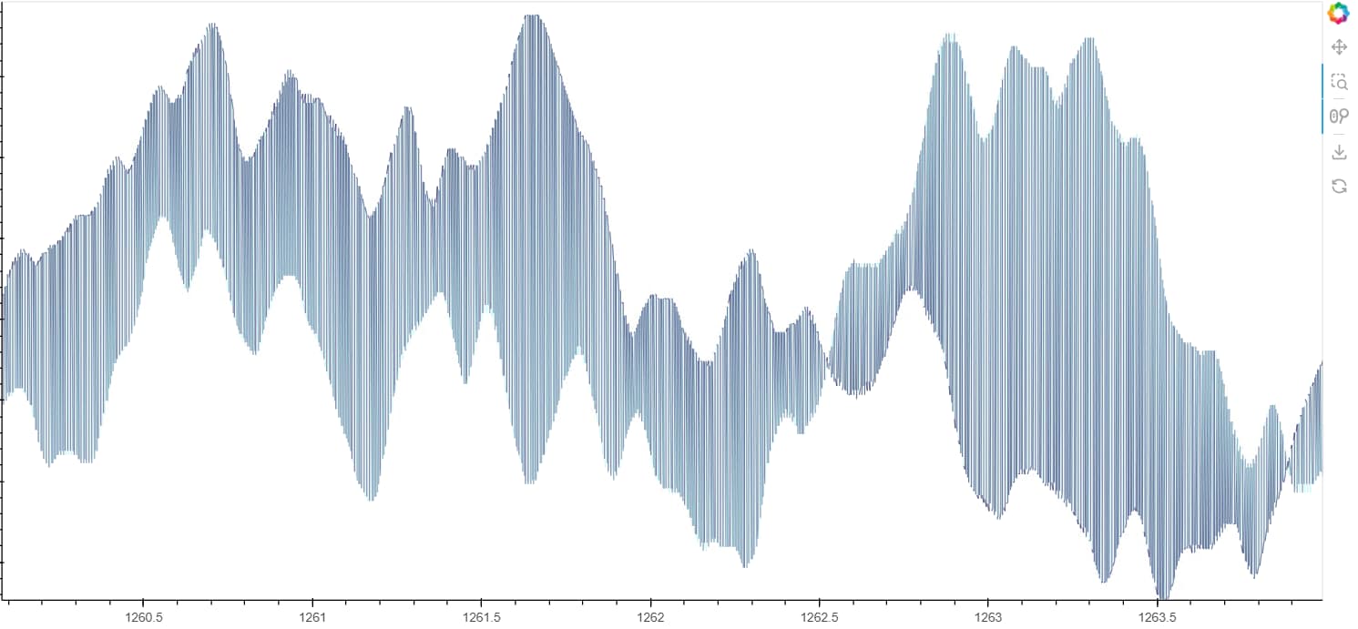
When I plot only one ID everything is fine.
The code is like this
path_plots = []

for measurand, group_df in filtered_df.groupby('measurand'):
    dataset = hv.Dataset(group_df, kdims=['x_frequency', 'y_signal'], vdims=['ID'])
    path_plot = hv.Path(dataset, label=f"'measurand': {measurand}").opts(width=900, height=600, alpha=0.5, color= 'ID')
    path_plots.append(path_plot)

# Create a Layout with a single column
layout = hv.Layout(path_plots)

# Define a Panel app
def create_plot():
    return path_plot