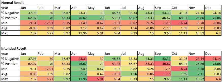
I would like to have a different conditional formatting for each row shown in the heatmap - that is, colors should be the same but the scale should be applied independently for each row.
Picking up on the example in this link: Us Unemployment — HoloViews v1.15.1
from bokeh.sampledata.unemployment1948 import data

data = pd.melt(data.drop('Annual', 1), id_vars='Year', var_name='Month', value_name='Unemployment')
heatmap = hv.HeatMap(data, label="US Unemployment (1948 - 2013)")

colors = ["#75968f", "#a5bab7", "#c9d9d3", "#e2e2e2", "#dfccce", "#ddb7b1", "#cc7878", "#933b41", "#550b1d"]
heatmap.opts(
    opts.HeatMap(width=900, height=400, xrotation=45, xaxis='top', labelled=[],
                 tools=['hover'], cmap=colors))
What I would like is for January’s row color scale to be independent of the other months in the y-axis. So that different values in December, for example, don’t affect the colors of January’s row.
Is it possible?
I provide a further example below: