I’m trying to generate a Heatmap in Holoviews with custom color values for each point, in order to specify different alpha color values.
Currently I’m generating two Holoviews plots with different alpha values and overlay them like so:
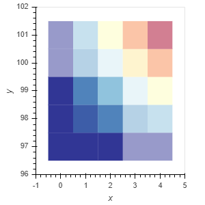
data = pd.DataFrame([(i, 97+j,  i*j) for i in range(5) for j in range(5)],
                columns=['x', 'y', 'val'])
data_filtered = data[(data.x < 3) & (data.y < 100)]

hm_opts = dict(kdims=['x', 'y'], vdims=['val'])
hm = hv.HeatMap(data, **hm_opts).opts(alpha=0.5)
hm_filtered = hv.HeatMap(data_filtered, **hm_opts).opts()
hm * hm_filtered
This however, gives me a Holoviews Overlay object, where I’d like to have a single HeatMap object instead.
My idea was to map each x/y coordinate to a specific color value in hex form, which has the needed alpha already calculated into it. My DataFrame would therefore look something like this (example):
    x    y  val    color
0   0   97    0  #00FF00
1   0   98    0  #00FF00
2   0   99    0  #00FF00
...
22  4   99    8  #FFD29F
23  4  100   12  #FFB89F
24  4  101   16  #D3AFF4
Is there a way to tell Holoviews to use these colors?
When I pass the list of colors to the “cmap” parameter it interpretes it as color intervals, passing the name of the column raises an error as it cannot find the specified cmap.
When I pass the list to the “color” parameter, the plot is not displayed at all anymore in the Jupyter Notebook.
I also posted this question at StackOverflow.
