holoviews.Labels customisation issues (for Bokeh & Plotly extensions)

Hi,

Can I ask how to turn off scientific notation for Labels (bokeh ext)?
This is a pd.DataFrame.hvplot.bar * hv.Labels overlayed/composed object

Also can I can ask why switching to Plotly messes the graph so much? It shouldn’t be this bad though?
Also, I’m unable to use text or autotext options which Plotly.express graphs use to easily give a value for the bar graphs.
p.s. Unable to embed more than 1 SS.

I am able to resolve my issue by iteratively creating hv.Text objects instead and forcing a string value for the Label; p.s. this also solves the yoffset issue (which when specified, magically poofs away all graphs and has been an unresolved issue since 2019)

But I am pretty sure… it should have been a simple one parameter change to be able to do what I required :confused:

1 Like

Hi @kayden

It is very difficult to help you without some working code. Could you provide a Minimal, Reproducible Example?

1 Like

A look at the Labels page documentation informs us that
If the value dimension of the data is not already of string type it will be formatted using the applicable entry in Dimension.type_formatters or an explicit value_format defined on the Dimension.

So they are basically three possibilities.

  1. you preformat your data by adding a string column to your dataframe. You then have full control to transform the strings into the labels as you want them to appear.

  2. You delegate this to the Dimension global formatter. Check out the output of hv.Dimension.type_formatters and modify the dictionnary entry as you need.

  3. You delegate that to a local dimension formatter with value_format.

If you do nothing, then hv.Dimension.type_formatters will apply according to the type of your data. In your case, I guess it is numpy.float64 so the '%.5g' formatter applies. If you don’t want the scientific notation but let say 2 digits after the dot you can use '%.2f'.

Since 2) and 3) are both subject to the yoffset bug you mentionned, I recommend 1) in your case for now.

import holoviews as hv
hv.extension('bokeh')
import pandas as pd
import numpy as np

df = pd.DataFrame(dict(x=[0,1],y=[1000000.324,1345500.454]))
df['labels'] = (df.y).astype(str)

bars = hv.Bars(df,'x','y')

string_labels = hv.Labels(df,kdims = ['x','y'],vdims='labels').opts(ylim=(0,1.1*df.y.max()),yoffset=40000)

hv.Dimension.type_formatters[np.float64]='%.2f'
globalformat_labels = hv.Labels(df,kdims=['x','y'],vdims='y').opts(ylim=(0,1.1*df.y.max()))

label_dimension = hv.Dimension('y', value_format=lambda x: '%.1f' % x)
localformat_labels = hv.Labels(df,kdims=['x','y'],vdims=label_dimension).opts(ylim=(0,1.1*df.y.max()))

(bars*string_labels)+(bars*globalformat_labels)+(bars*localformat_labels)

1 Like

As for plotly, I suspect you consider it messes the graph in the case x=[0,1](as plotly then infers a continuous axis maybe?), but if you replace it with x=['A','B'] then plotly knows the axis is discrete.
newplot
newplot (1)
The good news is that all 1), 2) and 3) work ok with the plotly backend.

2 Likes

This works!!
thank you so much for your guidance on the scientific notation :))) you are awesome!

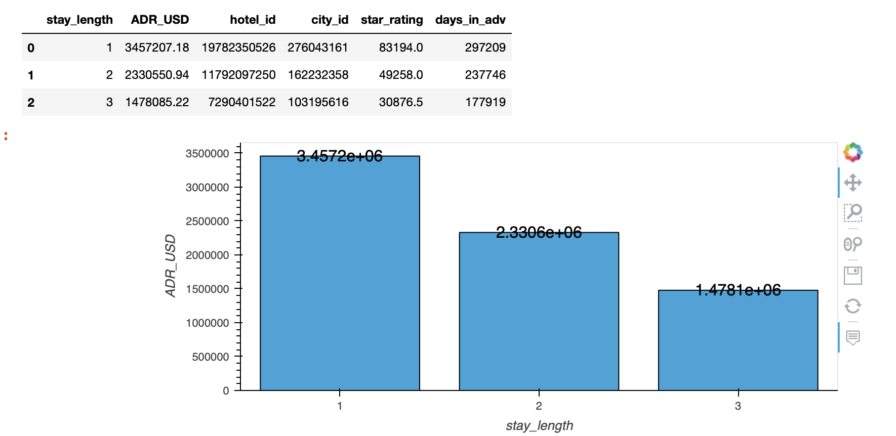
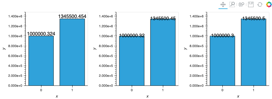
but unfortunately overlaying (with the * operator) makes the graph super duper wonky so I will just avoid Plotly all together (string column as suggested will make Labels & line plot become truncated unlike the bar plot which Plotly will align to)! (see ss)

just posting my code here for any1 who wants to reference:

# whole_df is just a pd.read_csv('on some file i have :(')
# some preprocessing of my df before plotting
whole_df.loc[:, 'ADR_USD'] = whole_df.ADR_USD.apply('{0:.2f}'.format).astype(float)
whole_df.loc[:, 'ADR_USD_mean'] = whole_df['ADR_USD']  # this is only for the formation of avriable df

df = whole_df.sort_values(["stay_length", "ADR_USD"], ascending=False).groupby(
    "stay_length").agg({'ADR_USD': 'sum', 'ADR_USD_mean': 'mean'}).reset_index()
df.loc[:, 'ADR_USD_text'] = (df.ADR_USD + 150000)
df.loc[:, 'ADR_USD_text1'] = (df.ADR_USD_mean + 5)
df.loc[:, 'stay_length_str'] = df.stay_length.astype(str)

# barplot
a1 = df.hvplot.bar(
    x='stay_length_str', y="ADR_USD", title='Total revenue per stay length'
    ).opts(height=350, width=450,
          )  

# line plot
a2 = df.hvplot.line(
    x='stay_length_str', y="ADR_USD",
    line_dash='dashed', # different parameters for different extensions, sigh, expected
#     dash='dashdot',
    ).opts(height=350, width=450, padding =0.2, color='orange'
          )
# another bar plot
a3 = df.hvplot.bar(x='stay_length', y="ADR_USD_mean", title='Average Daily revenue per stay length',
                   color='orange'
    ).opts(height=350, width=450, padding=1
          )
# labels
df['labels'] = (df.ADR_USD).astype(str)
# value_dimension = hv.Dimension('ADR_USD', value_format=lambda x: '%.1f' % x)
label = hv.Labels(df, ['stay_length', 'ADR_USD'],
#                   value_dimension,
                  'labels',
                 ).opts(ylim=(0,1.1*df.ADR_USD.max()), yoffset=100000)

# display
hv.extension('bokeh')
final = a1 * label * a2 + a3
# ls(final)
pn.Column(final).servable()

Also just to note using ls() = hv.link_selections.instance() will lead to no attribute error: ‘Labels’ object has no attribute ‘_empty_region’.