HoloViews - NdOverlay/Curve - Legend

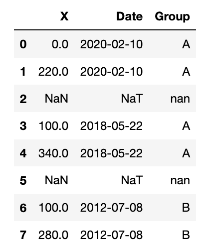
Hello everybody! I wanted to ask if someone has a solution for this problem:
I have a hv.NdOverlay plot of multiple holoviews.Curve objects. The Curve objects belong to a group (in this case either group ‘A’ or group ‘B’). How do I set up the hv.NdOverlay plot to show a legend which shows the two groups?
What I tried is to generate a curve_dict and then executing hv.NdOverlay(curve_dict), which did not display the legend I was looking for. Meanwhile, I found a great example here:
https://nbviewer.jupyter.org/github/poplarShift/pyviz-recipes/blob/master/notebooks/styling_by_attribute.ipynb (Option 2). This comes very close to what I’m after. Unfortunately, in my plot, all lines are connected.

Code example (holoviews version: 1.13.5):

import holoviews as hv
import numpy as np
import pandas as pd
from datetime import datetime
from holoviews import opts, dim

hv.extension('bokeh')

x_start = [0, 100, 100, 0, 120, 200]
x_end = [220, 340, 280, 120, 290, 400]
date = [datetime(2020, 2, 10, 0, 0, 0), datetime(2018, 5, 22, 0, 0, 0),
        datetime(2012, 7, 8, 0, 0, 0), datetime(1999, 12, 28, 0, 0, 0), 
        datetime(2004, 3, 21, 0, 0, 0), datetime(1992, 11, 23, 0, 0, 0)]
group = ['A', 'A', 'B', 'A', 'A', 'B']

df = pd.DataFrame({
    'X': np.dstack((x_start, x_end)).flatten(),
    'Date': np.dstack((np.array(date, dtype='datetime64'), np.array(date, dtype='datetime64'))).flatten(),
    'Group': np.dstack((group, group)).flatten()})

curves = hv.Dataset(df, ['X']).to(hv.Curve, 'X', ['Date'], 'Group')
curves.overlay('Group').opts(
    opts.Curve(color=dim('Group').categorize({'A': 'red', 'B': 'green'})),
    opts.NdOverlay(legend_position='right',show_grid=True, height=300, responsive=True))
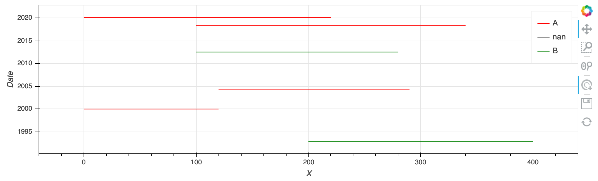
What I get is this:


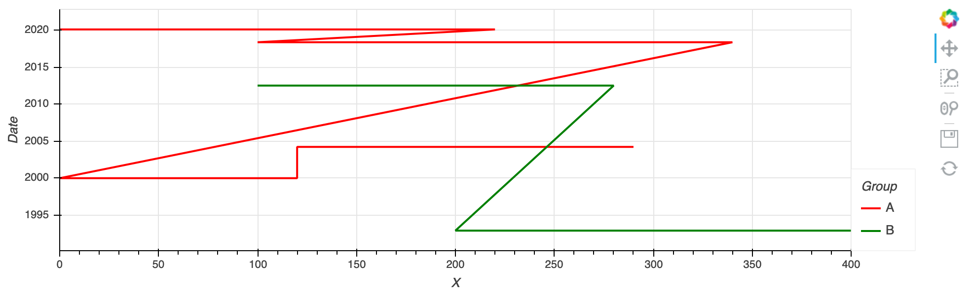
What I would like to get are horizontal lines only (to display in which area I acquired data in which year and of what kind of group). The shape of the dataframe is similar to the one of the example (see link above). So probably I’m not calling hv.Curvecorrectly. Does anybody have an idea how it’s done right?

Hello,
welcome in this community !

Since you have two object it will be difficult (impossible ?) to remove transversal line.

Do you try to do horizontal Spikes? http://holoviews.org/reference/elements/bokeh/Spikes.html

overlay = hv.NdOverlay({i: hv.Spikes(np.random.randint(0, 100, 10), kdims='Time').opts(position=0.1*i)
                       for i in range(10)}).opts(yticks=[((i+1)*0.1-0.05, i) for i in range(10)])
overlay.opts(
    opts.Spikes(spike_length=0.1),
    opts.NdOverlay(show_legend=False))

Or more simply with Contours (I tried with Path but it is a geometric object I can find how to show a legend).

N, NLINES = 100, 10
paths = hv.Contours((np.arange(N), np.random.rand(N, NLINES) + np.arange(NLINES)[np.newaxis, :]), label='Blue')
paths2 = hv.Contours((np.arange(N), np.random.rand(N, NLINES) + np.arange(NLINES)[np.newaxis, :]), label='Red')

overlay = paths * paths2
overlay.opts(opts.NdOverlay(show_legend=True))

Dear slamer59,
Thank you very much for your suggestions! But so far I haven’t been able to achieve what I was looking for.

Thank you for mentioning hv.Path ! With hv.Path I managed to get the plot I wanted (99%). It’s important to set up the Dataframe correctly like so:

import holoviews as hv
import numpy as np
import pandas as pd
from datetime import datetime
from holoviews import opts

hv.extension('bokeh')

x_start = [0, 100, 100, 0, 120, 200]
x_end = [220, 340, 280, 120, 290, 400]
date = [datetime(2020, 2, 10, 0, 0, 0), datetime(2018, 5, 22, 0, 0, 0),
        datetime(2012, 7, 8, 0, 0, 0), datetime(1999, 12, 28, 0, 0, 0), 
        datetime(2004, 3, 21, 0, 0, 0), datetime(1992, 11, 23, 0, 0, 0)]
group = ['A', 'A', 'B', 'A', 'A', 'B']

num_elements = len(x_start)
df = pd.DataFrame({
    'X': np.dstack((x_start, x_end, np.repeat(np.nan, num_elements))).flatten(),
    'Date': np.dstack((np.array(date, dtype='datetime64'),
                       np.array(date, dtype='datetime64'), 
                       np.array(np.repeat(np.nan, num_elements), dtype='datetime64'))).flatten(),
    'Group': np.dstack((group, group, np.repeat(np.nan, num_elements))).flatten()})
df.head(8)


Then it’s straightforward to execute hv.Path:

paths = hv.Path(df, ['X', 'Date'], ['Group'])
paths.opts(tools=['tap'], show_legend=True, color='Group', cmap=['red', 'grey', 'green'],
           height=300, responsive=True, show_grid=True)

Result:


It’s even possible to select single lines with the ‘tap’ tool. I just need to find a way to get rid of the ‘nan’ label in the legend…

Another solution in which the “nan” doesn’t appear can be found here:


However, I couldn’t get the “tap” tool to work with this solution. Furthermore, when plotting 50+ lines the execution gets a bit slow. (Apologies for the negativity )