How do I get hv.Histogram to work like .histogram?

Why why do

hv.Scatter(src, x, y) << hv.Histogram(np.histogram(src[y], 20)) << hv.Histogram(np.histogram(src[x], 20))

and

hv.Scatter(src, x, y).hist(num_bins=20, dimension=[x, y])

behave differently with respect to axis and hover labeling? What arguments do I need to supply to the former to get it to behave like the latter?

Specifically, if I lave the code MWE below,

scatter_hist(ds, [('x', 'Apples')], [('y', 'Oranges'), ('z', 'Sauce')], ['x', 'y'])

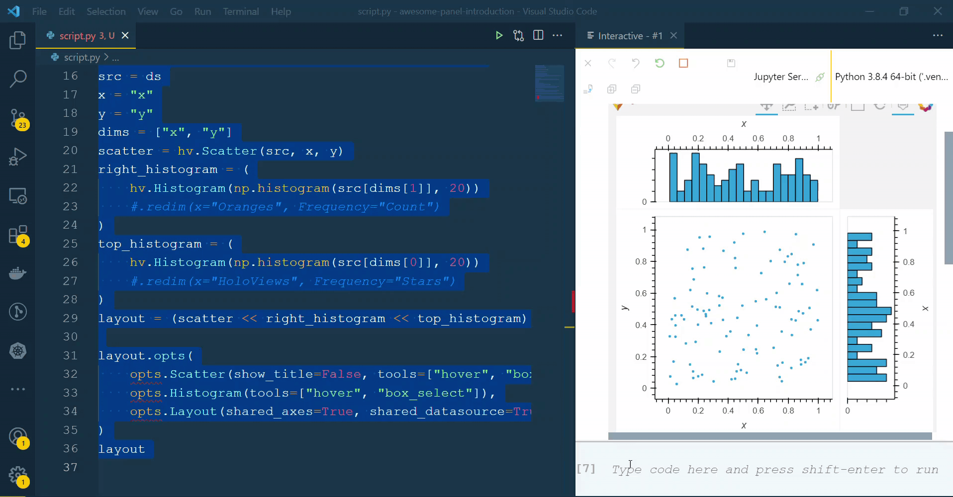
which uses .histogram produces the result on the left while

scatter_hist2(ds, [('x', 'Apples')], [('y', 'Oranges'), ('z', 'Sauce')], ['x', 'y'])

which uses << hv.Histogram produces the result on the right:

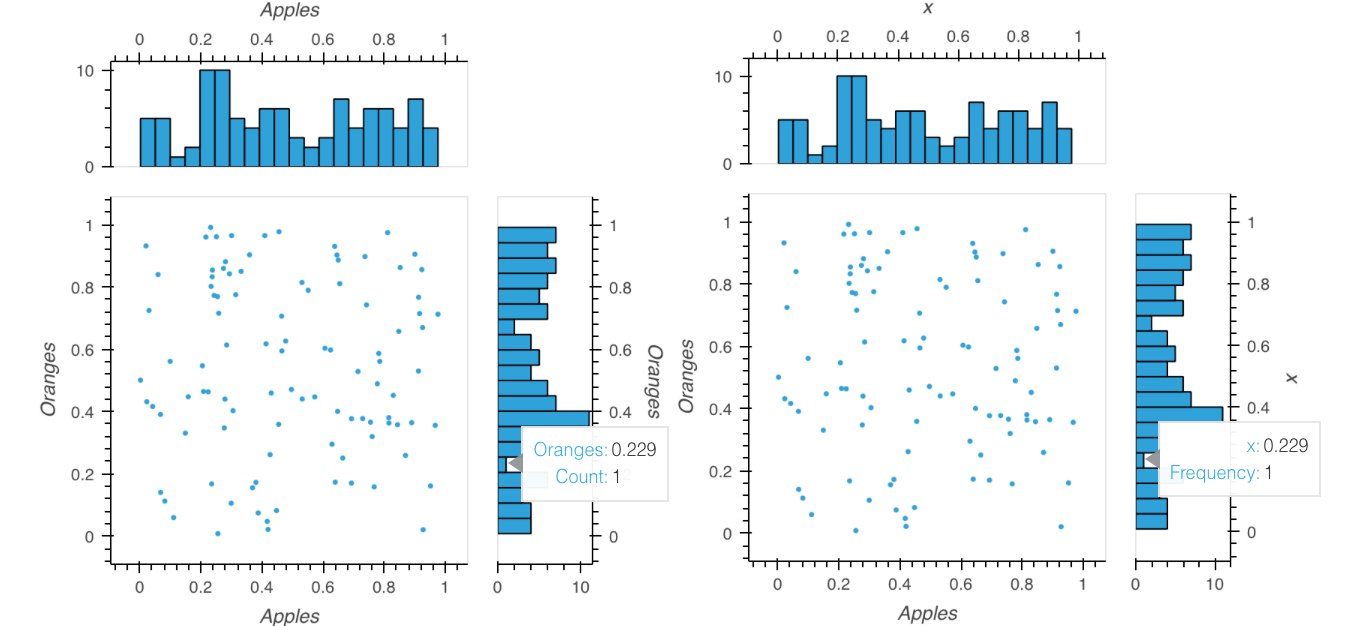
Note that the axes and hover in the latter do not use the provided labels for the data, giving x instead of Oranges or Apples.


import numpy as np
import pandas as pd
import holoviews as hv

from holoviews import opts 

hv.extension('bokeh')

xs = np.random.rand(100)
ys = np.random.rand(100)
df = pd.DataFrame({'x': xs, 'y': ys, 'z': xs*ys})
ds = hv.Dataset(df)

def scatter_hist(src, x, y, dims):
    p = hv.Scatter(src, x, y).hist(num_bins=20, dimension=dims).opts(
            opts.Scatter(show_title=False, tools=['hover','box_select']), 
            opts.Histogram(tools=['hover','box_select']),
            opts.Layout(shared_axes=True, shared_datasource=True, merge_tools=True)
        )
    return p

def scatter_hist2(src, x, y, dims):
    p = (hv.Scatter(src, x, y) << hv.Histogram(np.histogram(src[dims[1]], 20)) << hv.Histogram(np.histogram(src[dims[0]], 20)) ).opts(
            opts.Scatter(show_title=False, tools=['hover','box_select']), 
            opts.Histogram(tools=['hover','box_select']),
            opts.Layout(shared_axes=True, shared_datasource=True, merge_tools=True)
        )
    return p
1 Like

Hi @orome

You can redim as done below

import numpy as np
import pandas as pd
import holoviews as hv

from holoviews import opts

hv.extension("bokeh")

xs = np.random.rand(100)
ys = np.random.rand(100)
df = pd.DataFrame({"x": xs, "y": ys, "z": xs * ys})
ds = hv.Dataset(df)

# HoloViews
# Customizing hover labels of adjoint histograms
src = ds
x = "x"
y = "y"
dims = ["x", "y"]
scatter = hv.Scatter(src, x, y)
right_histogram = (
    hv.Histogram(np.histogram(src[dims[1]], 20))
    .redim(x="Oranges", Frequency="Count")
)
top_histogram = (
    hv.Histogram(np.histogram(src[dims[0]], 20))
    .redim(x="HoloViews", Frequency="Stars")
)
layout = (scatter << right_histogram << top_histogram)

layout.opts(
    opts.Scatter(show_title=False, tools=["hover", "box_select"]),
    opts.Histogram(tools=["hover", "box_select"]),
    opts.Layout(shared_axes=True, shared_datasource=True, merge_tools=True),
)
layout
1 Like

@Marc Thanks.

In short then, if all I have is

src = hv.Dataset(pd.DataFrame({'x': xs, 'y': ys, 'z': xs*ys}), [('x','Apples')], [('y','Oranges'), ('z','Sauce')] )

then the equivalent of

hv.Scatter(src).hist(num_bins=20, dimension=['x','y'])

is

hv.Scatter(src) 
         << hv.Histogram(np.histogram(src['y'], 20)).redim(x=src.vdims[0].label, Frequency='Count') 
         << hv.Histogram(np.histogram(src['x'], 20)).redim(x=src.kdims[0].label, Frequency='Count')  

If so then that raises some further questions (at least for this novice):

  1. Is the use of convenience methods like hist (or to) preferred (unless more complex customization is required) over lower level things like Histogram? In this case for example, hist effectively fills in a lot of defaults that are a chore to fill in with Histogram.
  2. Is there better documentation the relationship between hist and Histogram, especially some that provides the information deduced above: what defaults for the latter are provided by the former? If a design goal of HoloViz is to be “layered” then such things should be much better explained. At least for me, I find the transition too abrupt: hist does a lot of things conveniently, but the least bit of customization opens up a whole can of worms, requiring a lot of parameters (critically a lot beyond those being customized, and involving a lot of repetition; see 3) to be filled in. This feels less like Matplotlib and more like (god forbid) Mathematica in that regard.
  3. Am I missing some idiom for leveraging the labels defined in vdims and kdims for my Datasource? Though this is probably a distinct question, the lack of an obvious automatic way to do this with Histogram (as opposed to the way hist uses this information) is the source of much of added complexity and repetition of parameters in the second example above.
2 Likes