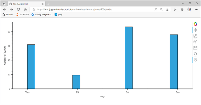
Related to this showcase I need hist plot. I cannot use a bar plot because it does not work with Linked Brushing.
My question is: how do I make the bars wider, so that it looks like a bar plot instead of the below?
import panel as pn
import plotly.express as px

import hvplot.pandas

pn.extension(sizing_mode="stretch_width")

DAY_TO_INT = {"Thur": 4, "Fri": 5, "Sat": 6, "Sun": 7,}
DAY_TICKS = [(val, key) for key, val in DAY_TO_INT.items()]
HEIGHT = 400

def load_dataset():
    df = px.data.tips()
    df["count"] = 1
    df["size"] = df["size"].astype(str)
    df["day_int"] = df["day"].map(DAY_TO_INT)
    return df

df = pn.state.as_cached("tips", load_dataset)

day_figure = df.hvplot.hist(
    "day_int", xlabel="day", ylabel="number of orders", responsive=True, height=HEIGHT
).opts(xticks=DAY_TICKS)
pn.panel(day_figure).servable()
