I have a pandas DataFrame and want to make a scatter plot colored by the categories (integer number) with hvplot. The plot’s zorder is set such that a larger category value has a higher zorder value. I’m wondering whether it is possible to reverse (or control) the zorder of the plot with hvplot or otherwise other packages (e.g., holoviews).
Here is a code to make a plot.
import holoviews as hv
import hvplot.pandas # noqa need to run pandas.DataFrame.hvplot
import numpy as np
import pandas as pd
hv.extension("bokeh")
n_points = 10000
rng = np.random.default_rng(seed=42)
df = pd.DataFrame(
{
"x": rng.normal(size=n_points),
"y": rng.normal(size=n_points),
"z": rng.integers(low=1, high=10, size=n_points),
}
)
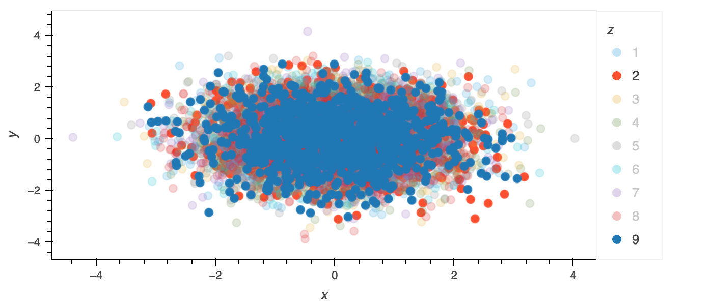
scatter = df.hvplot.scatter(x="x", y="y", by="z", marker="o", s=60)
scatter
The plot generated by the code above with the category 2 and 9 being highlighted. As you can see, the category 2 is mostly hidden by the category 9.