I would like to have a heatmap which meets the following requirements:
Specify limits and colors within the limits.
Ticks on the colorbar should be the limits specified above and depend on the data. For example, even if the data lies in [5, 10], if I specify a limits as [0, 100], then the colorbar should extend from 0-100.
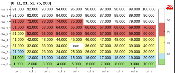
The above screenshot, but instead of the red 200.
The code for the panel is:
import holoviews as hv
import hvplot.pandas  # NOQA
import pandas as pd
import numpy as np

hv.extension("bokeh")

liststr_col = [f"col_{ind}" for ind in range(10)]
liststr_row = [f"row_{ind}" for ind in range(10)]
listfloat_quantities = np.arange(1, 101, 1).astype(float).reshape(10, 10)
listfloat_quantities[3, 4] = np.nan
df = pd.DataFrame(listfloat_quantities
    , columns=liststr_col, index=liststr_row
)

listfloat_color_levels = [0, 11, 21, 51, 75, 200]
liststr_cmap = ["#79de79", "#a8e4ef", "#fcfc99", "#fb6962", "#ffffff"]

dict_heatmapopts = dict(color_levels=listfloat_color_levels, cmap=liststr_cmap)

heatmap = df.hvplot.heatmap(shared_axes=False).opts(
    title=str(listfloat_color_levels),
    **dict_heatmapopts,
)
hvdim_value = hv.Dimension("value", value_format=lambda x: "%.3f" % x)
label = hv.Labels(heatmap, vdims=hvdim_value).opts(
    padding=0, text_color="black", text_alpha=1.0, text_font_size="11pt"
)
listplots = []
listplots.append(heatmap * label)
# listplots.append(heatmap * label)
gc.collect()
hv.Layout(listplots).cols(2)
Hoxbro
September 9, 2022, 7:00am
2
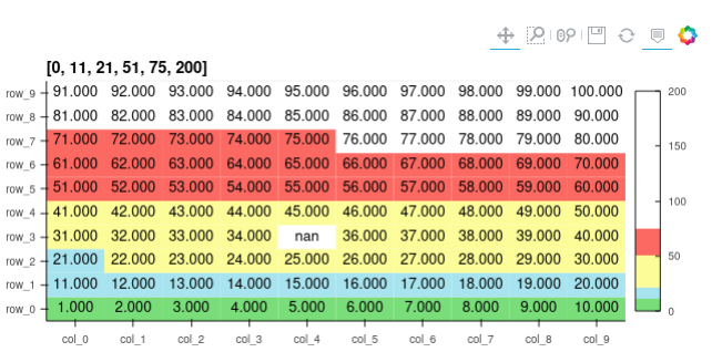
I think you are looking for clim in heatmap like:
...
heatmap = df.hvplot.heatmap(shared_axes=False).opts(
    title=str(listfloat_color_levels), clim=(0, 200),
    **dict_heatmapopts,
)
...
1 Like
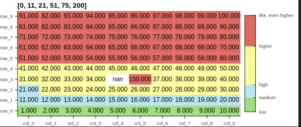
Thank you very much @Hoxbro - that worked. I guess I left this part out of my question earlier: is it possible to control the xticks in the colorbar? I would like for the xticks to be at the levels I specify in listfloat_color_levels.
@Hoxbro Nevermind, I figured it out. I ended up following python - How do I manually set the tick locations of a colorbar for a Points plot in HoloViews? - Stack Overflow and doing the following
liststr_col = [f"col_{ind}" for ind in range(10)]
liststr_row = [f"row_{ind}" for ind in range(10)]
listfloat_quantities = np.arange(1, 101, 1).astype(float).reshape(10, 10)
listfloat_quantities[3, 4] = np.nan
listfloat_quantities[3, 5] = 150
df = pd.DataFrame(listfloat_quantities, columns=liststr_col, index=liststr_row)

listfloat_color_levels = [0, 11, 21, 51, 75, 200]
liststr_cmap = ["#79de79", "#a8e4ef", "#fcfc99", "#fb6962", "#ffffff"]

dict_heatmapopts = dict(color_levels=listfloat_color_levels, cmap=liststr_cmap)

heatmap = df.hvplot.heatmap(shared_axes=False).opts(
    title=str(listfloat_color_levels),
    clim=(0, 75),
    colorbar_opts={
        "major_label_overrides": {
            0: "low",
            11: "medium",
            21: "high",
            51: "higher",
            75: "like, even higher",
        },
        'ticker': FixedTicker(ticks=listfloat_color_levels)
    },
    **dict_heatmapopts,
)
hvdim_value = hv.Dimension("value", value_format=lambda x: "%.3f" % x)
label = hv.Labels(heatmap, vdims=hvdim_value).opts(
    padding=0, text_color="black", text_alpha=1.0, text_font_size="11pt"
)
listplots = []
listplots.append(heatmap * label)
# listplots.append(heatmap * label)
# gc.collect()
hv.Layout(listplots).cols(2)
2 Likes