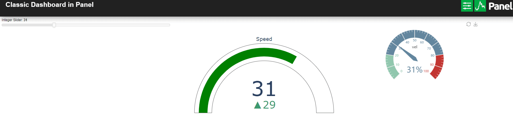
I continue exploring gauges, Now I embedded the echarts library in a HTML pane to obtain another gauge.
import time
import panel as pn
import param

pn.extension("plotly")

import plotly.graph_objects as go

pn.config.js_files["echart1"] = "https://cdn.bootcss.com/echarts/3.7.2/echarts.min.js"

pn.config.sizing_mode = "stretch_width"


STYLE = """
body {
margin: 0px;
min_height: 100vh;
}
.bk.app-bar {
background: #212121;
border-color: white;
box-shadow: 5px 5px 20px #9E9E9E;
color: #ffffff;
z-index: 50;
}

"""


pn.config.raw_css.append(STYLE)

top_bar = pn.Row(pn.pane.Markdown("# Classic Dashboard in Panel ", margin=(10, 5, 10, 25)),
                        pn.Spacer(height=0),
                        pn.pane.PNG(
                            "https://panel.holoviz.org/_static/logo_horizontal.png",
                            width=200,
                            sizing_mode="fixed",
                            align="center",
                            margin=(10, 50, 10, 5),
                        ),
                        css_classes=["app-bar"],
                    )


### slider to control the value of the gauges  ###

int_slider = pn.widgets.IntSlider(name='Integer Slider', start=0, end=100, step=1, value=4, width=200)


# initialization of plotly pane

fig = go.Figure()
fig.add_trace(go.Indicator(
                value = 2,
                delta = {'reference': 1},
                gauge = { 'axis': {'visible': False} },
                domain = {'row': 0, 'column': 0}
                        )
            )
fig.update_layout(
grid = {'rows': 1, 'columns': 1, 'pattern': "independent"},
template = {'data' : {'indicator': [{
    'title': {'text': "Speed"},
    'mode' : "number+delta+gauge",
    'delta' : {'reference': 45}}]
                     }})
plotly_pane = pn.pane.Plotly(fig)


### initialization of echarts gauge ###

html = """
<div id="855be12876564e2fb3fd5fe122d3d221" class="chart-container" style="width:500px; height:300px;"></div>
"""

script = """
<script>
var myScript = document.currentScript;
var myDiv = myScript.parentElement.firstElementChild;
var myChart = echarts.init(myDiv);
myDiv.eChart = myChart;

var option = {
tooltip: {
    formatter: '{a} <br/>{b} : {c}%'
},
toolbox: {
    feature: {
        restore: {},
        saveAsImage: {}
    }
},
series: [
    {
        name: 'Echarts velocimeter',
        type: 'gauge',
        detail: {formatter: '{value}%'},
        data: [{value: 50, name: 'vel'}]
    }
]
};

option.series[0].data[0].value = 25;
myChart.setOption(option, true);

myDiv.after_layout = myChart.resize; // Resizes the chart after layout of parent element

</script>

"""

ech = pn.pane.HTML(html+script, margin=15)


### Here I create a dummy HTML pane to send commands to update the echarts gauge ###
ech_dummy = pn.pane.HTML("")


@pn.depends(int_slider.param.value, watch=True)
def update_gauges(e):
# update plotly pane
    fig.data = []
    fig.add_trace(go.Indicator(
                value = int_slider.value ,
                delta = {'reference': 2},
                gauge = { 'axis': {'visible': False} },
                domain = {'row': 0, 'column': 0}
                        )
            )
    fig.update_layout(
    grid = {'rows': 1, 'columns': 1, 'pattern': "independent"},
    template = {'data' : {'indicator': [{
    'title': {'text': "Speed"},
    'mode' : "number+delta+gauge",
    'delta' : {'reference': 45}}]
                     }})

    plotly_pane.object = fig.to_dict()

# update echarts HTML pane
    part1 = " <script> option.series[0].data[0].value = "
    part3 = " ; myChart.setOption(option, true); </script> "
    ech_dummy.object = part1 + str(int_slider.value) + part3


pn.Column(top_bar,
      pn.Row(int_slider,
             plotly_pane,
             ech),
      ech_dummy).show()
Here you have a screenshot of the gauges working
Thank you very much to the panel developers,
it’s an amazing library to present my scientific results !!!