For anyone needing to create a ‘stem plot’, here’s how I did it:
I have the result of a Fourier transform of some data (‘sine_sig’) in a dataframe called ‘freq_df’. It has columns ‘period’ and ‘power’. I create a scatter plot of the data and then overlay polygons that are plotted (approximately) correctly. Making the width of the polygons very small makes the offset almost unnoticeable but you could adjust the polygon function to make everything suit.
Or you could do that (yeah, did not see hv.Spikes)
I’m wondering if it might be possible to work ‘stem plot’ in to the documentation. I did a search on ‘stem plot’ and did not see it for Holoviews … most links (all?) are to matplotlib. It’s really only that I like Holoviews that I tried to figure something out whereas someone else might just have given it a pass and resigned themselves to matplotlib. How would I get something like ‘stem plot’ in to the gallery? Or is it there and I missed that too?
Sure! All it takes is to launch the reference gallery notebook for Spikes in your local Jupyter, add an example like the above that makes a stem plot, add the words “stem plot” in the description of that cell, clear the notebook, and make a PR. At first you’d just do that for your favorite backend (e.g. Bokeh as above), then once the PR is reviewed, either you or we can add the same example for the other backends (where the options are usually equivalent but slightly different).
The same plots sometimes go by many names, so if you spot any other case where we have the graphics right but don’t use the name you expect, we’re happy to have PRs that simply insert the other name into the text of the example notebook. This is definitely a case for the benefits of crowdsourcing!
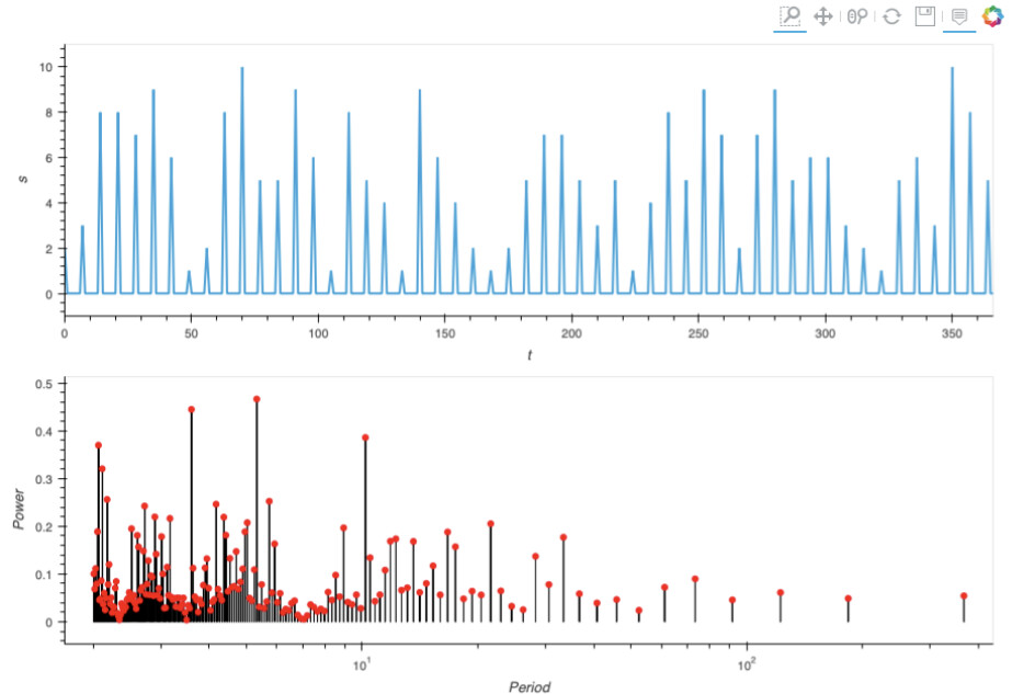
 (yeah, did not see hv.Spikes)