How to disable scientific notation in bar plots? And in fact, all plots?

I have just started using hvPlot today, as part of Panel.

I am having a difficult time figuring out how to disable scientific notation in my plots. For example here is a simple bar plot. The axis and the tootltip are in scientific notation. How can I change the format to a simple int?

image

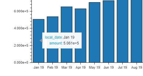
I am showing this to non numerical and non techy management. They would rather see just basic integers and I don’t want to have to explain to them what scientific notation is.

I could not find anything in the docs to help me: https://hvplot.holoviz.org/user_guide/Customization.html

I’ve also tried to cobble together suggestions from Bokeh docs.

I can’t figure it out. Please help! Thanks

My simple df:

   local_date      amount
0      Jan 19   506124.98
1      Feb 19   536687.28
2      Mar 19   652279.31
3      Apr 19   629440.06
4      May 19   703527.00
5      Jun 19   724234.08
6      Jul 19   733413.32
7      Aug 19   758647.44
8      Sep 19   782676.16
9      Oct 19   833674.28
10     Nov 19   864649.74
11     Dec 19   849920.47
12     Jan 20   857732.52
13     Feb 20   927399.50
14     Mar 20  1152440.49
15     Apr 20  1285779.35
16     May 20  1431744.76
17     Jun 20  1351893.95
18     Jul 20  1325507.38
19     Aug 20  1299528.81

And code:

df.hvplot.bar(height=500,width=1000)

Hi @pipo123, this could help:

df.hvplot.bar(height=500, width=1000).opts(tools=[HoverTool(tooltips=[('Amount', "@amount{1.11}")])])

Changing {1.11} to this {int} will provide just integers in tooltips.

If you do not want scientific notation in another place than hover tooltips, then you should check the topic of bokeh formatters.

Finally, in order to make life easier, please provide code with reproducible example next time :slight_smile:

1 Like

Thanks. Very helpful.

Sorry yes next time I will create a dictionary from the dataframe so people can use pd.DataFrame.from_dict().

Do you know how to change the yaxis to int also?

df.to_dict()

{'Jan 19': 506124.9799999949,
 'Feb 19': 536687.2799999975,
 'Mar 19': 652279.3100000002,
 'Apr 19': 629440.0599999926,
 'May 19': 703526.9999999941,
 'Jun 19': 724234.0799999909,
 'Jul 19': 733413.3199999926,
 'Aug 19': 758647.4399999848,
 'Sep 19': 782676.1599999912,
 'Oct 19': 833674.2799999871,
 'Nov 19': 864649.7399999864,
 'Dec 19': 849920.469999986,
 'Jan 20': 857732.5199999866,
 'Feb 20': 927399.4999999877,
 'Mar 20': 1152440.4899999893,
 'Apr 20': 1285779.349999981,
 'May 20': 1431744.7599999688,
 'Jun 20': 1351893.9499999757,
 'Jul 20': 1325507.3799999757,
 'Aug 20': 1299528.8100000026}

edit: Found a solution on stack overflow. To edit the yaxis:

df.hvplot.bar(height=500,width=1000, yformatter=BasicTickFormatter(use_scientific=False))

2 Likes