Sorry, I stopped and shared when I saw the dataframe used in the tabulator filter correctly using the range slider.
The update_plot used in the row would be a function pointer added to the row. I think that’s why the plot doesn’t show up. I’d first try to make the plot outside of the functions (“global”) and then recreate it with the new dataframe every time range slider is updated.
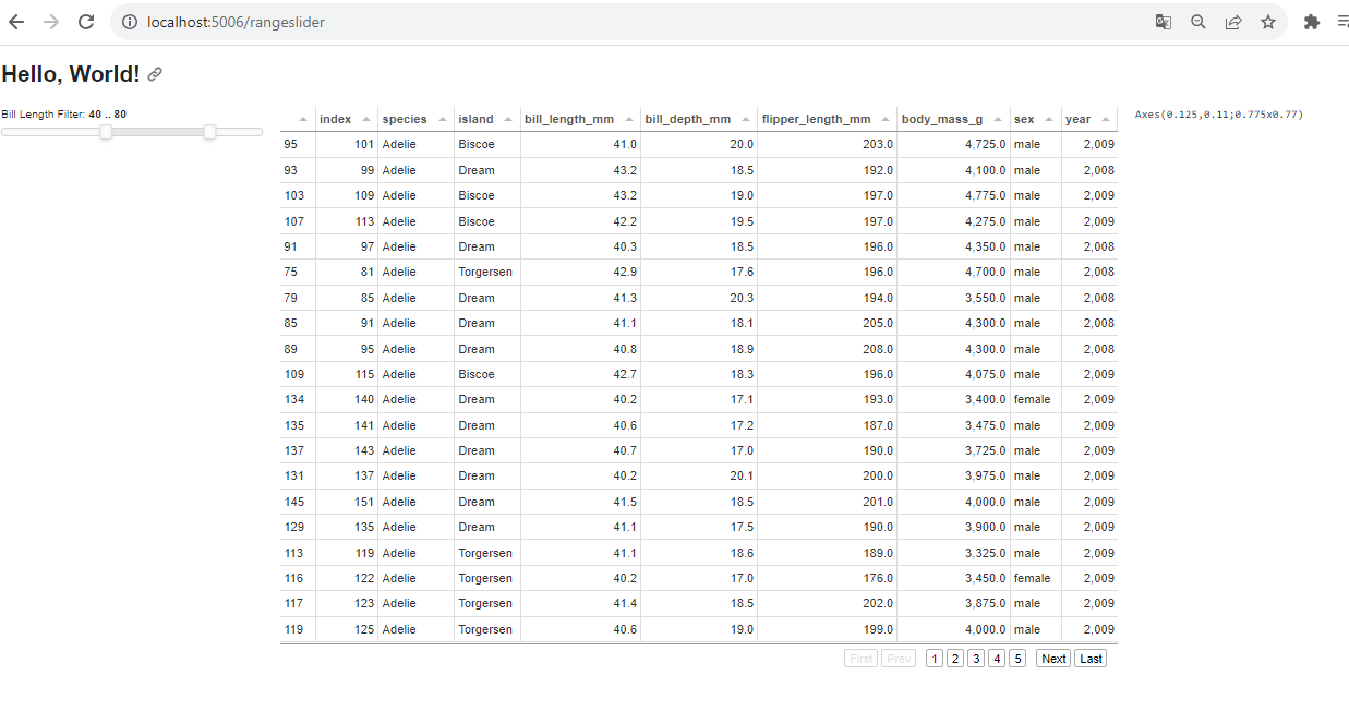
Here’s a full and cleaner solution, more like your original and after some ChatGPT digging. The solution is using Plotly and showing the Tabulator also:
import pandas as pd
import numpy as np
import plotly.express as px
import panel as pn

# Ensure Panel works with Plotly in a notebook
pn.extension('plotly')

penguins = pd.read_csv('https://datasets.holoviz.org/penguins/v1/penguins.csv')
penguins = penguins[~penguins.sex.isnull()].reset_index().sort_values('species')

# Create DataFrame
df = pd.DataFrame(penguins)

table_of_penguins = pn.widgets.Tabulator(df)

# Create a RangeSlider for the 'X' axis
x_range_slider = pn.widgets.RangeSlider(
    name='bill_length_mm Range',
    start=df['bill_length_mm'].min(),
    end=df['bill_length_mm'].max(),
    value=(df['bill_length_mm'].min(), df['bill_length_mm'].max()),
    align='center'
)

# Function to create the scatter plot
def create_scatter_plot(x_range):
    filtered_df = df[(df['bill_length_mm'] >= x_range[0]) & (df['bill_length_mm'] <= x_range[1])]
    table_of_penguins.value = filtered_df
    fig = px.scatter(filtered_df, x='bill_length_mm', y='flipper_length_mm', color='sex', title='Sample Plotly Scatter Plot of Penguines')
    return fig

# Create a reactive function that updates the plot based on the RangeSlider
@pn.depends(x_range_slider.param.value)
def update_plot(x_range):
    return create_scatter_plot(x_range)

# Create a Panel layout with the RangeSlider and the scatter plot
scatter_plot_row = pn.Column(pn.Row(x_range_slider, update_plot), table_of_penguins)

# Show the app (use .show() if running outside of a Jupyter environment)
layout = pn.Column()
layout.append(scatter_plot_row)
layout.servable()
hi @petegordon awesome, thanks alot for your help and digging via chatgpt. Perfect.
using another plot (hvplot) can be like this
import hvplot.pandas
import pandas as pd
import numpy as np
import plotly.express as px
import panel as pn

pn.extension('tabulator')

penguins = pd.read_csv('https://datasets.holoviz.org/penguins/v1/penguins.csv')
penguins = penguins[~penguins.sex.isnull()].reset_index().sort_values('species')

# Create DataFrame
df = pd.DataFrame(penguins)

table_of_penguins = pn.widgets.Tabulator(df)

# Create a RangeSlider for the 'X' axis
x_range_slider = pn.widgets.RangeSlider(
    name='bill_length_mm Range',
    start=df['bill_length_mm'].min(),
    end=df['bill_length_mm'].max(),
    value=(df['bill_length_mm'].min(), df['bill_length_mm'].max()),
    align='center'
)

# Function to create the scatter plot
def create_scatter_plot(x_range):
    filtered_df = df[(df['bill_length_mm'] >= x_range[0]) & (df['bill_length_mm'] <= x_range[1])]
    table_of_penguins.value = filtered_df
    fig = filtered_df.hvplot.scatter(x='bill_length_mm', y='flipper_length_mm', color='sex', title='Sample Hvplot Scatter Plot of Penguines')
    return fig

# Create a reactive function that updates the plot based on the RangeSlider
@pn.depends(x_range_slider.param.value)
def update_plot(x_range):
    return create_scatter_plot(x_range)

# Create a Panel layout with the RangeSlider and the scatter plot
scatter_plot_row = pn.Column(pn.Row(x_range_slider, update_plot), table_of_penguins)

# Show the app (use .show() if running outside of a Jupyter environment)
layout = pn.Column()
layout.append(scatter_plot_row)
layout.servable()
hi @petegordon , I just found which one make the previous code not showing the plot, first we don’t import hvplot, second is in the definition of plot function, here is same code with the previous original one and change the defintion as per your solution: