Hi,
I am deciding to migrate from a plotting library built on plotly to build apps in panel later. I know I could use pn.pane.Plotly but I would like to have the full capabilities of this framework (access easily to datasets of elements, composing layouts, streams etc…)
Here the problem
I have a dataframe with 4701 rows
line_id unique entries are 340
category unique entries are 1 (in this example)
the dataframe contains x,y lines to display grouped by line_id and category.
I would like to use line_id to group lines (like plolty express line_group arg) and ‘category’ to have separated colors + traces in the legend
but I obtain each line with color given by (line_id, category) tuple (so not color given by only category as in px.express) Morover the rendering is quite slow (17 seconds VS 0.8 seconds in plotly)
Rendering time is the part that concerns me the most about migrating to the Holoviz framework. Any help would be greatly appreciated.
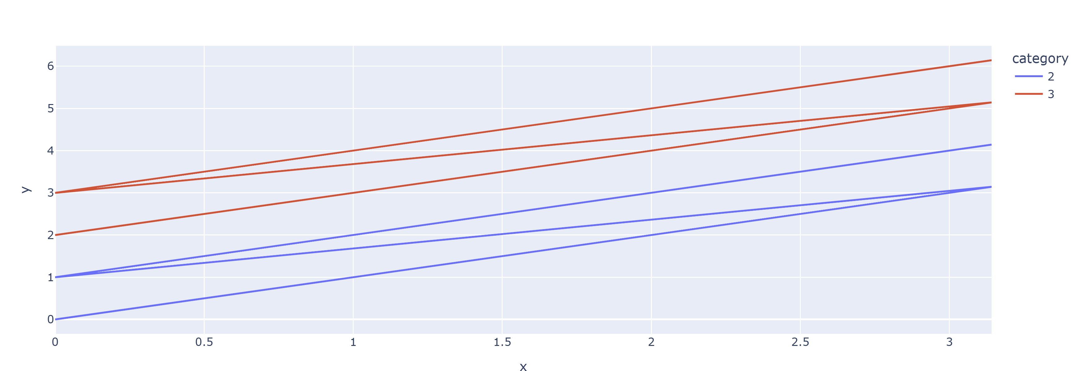
Here the example: only category must be a color + appear in the legend, line_id must be used only to separate the lines (same color, given the category, no in the legend)
data = []
x = np.linspace(0,np.pi,100)
# create the groups
category = 1
for i in range(4):
    d = dict()
    if i % 2 == 0:
        print(i, category)
        category += 1
    d['x'] = x
    d['y'] = x + i
    d['line_id'] = i
    d['category'] = category
    data.append(d)
df = pd.concat([pd.DataFrame.from_dict(d) for d in data])
px.line(
    df,
    x='x',
    y='y',
    color='category',
    # line_group='line_id' # uncomment to get separated lines -> I want the same behaviour using hvplot or holoviews
)
import numpy as np
import pandas as pd
import plotly.express as px

data = []
x = np.linspace(0,np.pi,100)
# create the groups
category = 1
for i in range(4):
    d = dict()
    if i % 2 == 0:
        print(i, category)
        category += 1
    d['x'] = x
    d['y'] = x + i
    d['line_id'] = i
    d['category'] = category
    data.append(d)
df = pd.concat([pd.DataFrame.from_dict(d) for d in data])
px.line(
    df,
    x='x',
    y='y',
    color='category',
    # line_group='line_id' # uncomment to get separated lines -> I want the same behaviour using hvplot or holoviews
)
import numpy as np
import pandas as pd
import holoviews as hv

hv.extension("bokeh")

# --- data ---
x = np.linspace(0, np.pi, 100)
df = pd.concat([
    pd.DataFrame({"x": x, "y": x + i, "line_id": i, "category": (i // 2) + 1})
    for i in range(4)
], ignore_index=True)


def pack(group):
    """Insert NaN rows between lines so one Curve = one multi-line glyph."""
    sep = pd.DataFrame({"x": [np.nan], "y": [np.nan]})
    return pd.concat(
        [pd.concat([g[["x", "y"]], sep]) for _, g in group.groupby("line_id")],
        ignore_index=True,
    )


overlay = hv.Overlay([
    hv.Curve(pack(g), label=f"cat {cat}")
    for cat, g in df.groupby("category")
])

overlay.opts(
    hv.opts.Curve(width=800, height=400),
    hv.opts.Overlay(legend_position="right"),
)