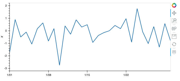
Using python 3.7.3 and hvplot 0.7.0, this code:
pd.DataFrame({'x': np.random.randn(30)}, index=pd.date_range(start='2021-01-01', periods=30, freq='1D')).hvplot()
creates this image in jupyter:
Is there a way to force it to show every date in the x-axis?
mcav
2
Two ways which work. There might be prettier ways, but these will do the trick:
1. Specify number of ticks
nb_days = 30
(pd.DataFrame(data={'x': np.random.randn(nb_days)},
              index=pd.date_range(start='2021-01-01', periods=nb_days, freq='1D'))
 .hvplot()
 .opts(xticks=nb_days))
2. Specify ticks explicitly
nb_days = 30
index = pd.date_range(start='2021-01-01', periods=nb_days, freq='1D')
(pd.DataFrame(data={'x': np.random.randn(nb_days)},
              index=range(nb_days))
 .hvplot()
 .opts(xticks=[(i,x.strftime('%Y-%m-%d')) for i,x in enumerate(index)],
       xrotation=90))
Also, have a look at the docs: http://holoviews.org/user_guide/Customizing_Plots.html#Axis-ticks