I’m plotting some data in a histogram and find that I have too much to see in 1 graph.
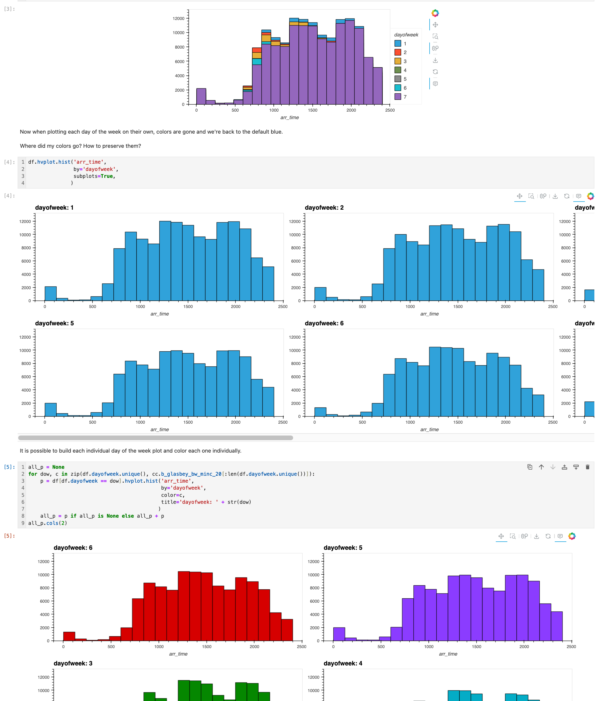
When I add the subplots=True parameter, I can see my a plot per category, but now every plot has the same color. Preserving color helps viewers identify similar categories across plots.
Is it possible to use subplots=True and keep the automatic color by category?
Not sure if this is a case of not understanding the documentation, a missing feature, or something else.
Below I do show one example of how to color a plot by creating a unique plot per category in a for loop then using Colorcet to set a color. Seems to me there should be a better way. Is there?
Code example available at hvplot_example.ipynb · GitHub
# load hvplot and default bokeh extension
import hvplot.pandas
# load some sample data
import hvplot.sample_data
# colormaps
import colorcet as cc

df = hvplot.sample_data.airline_flights.read()

# Notice how each day of the week automatically is assigned a unique color?
df.hvplot.hist('arr_time',
               by='dayofweek'
              )

# Now when plotting each day of the week on their own, colors are gone and we're back to the default blue.
#
# Where did my colors go? How to preserve them?
df.hvplot.hist('arr_time',
               by='dayofweek',
               subplots=True,
              )

# It is possible to build each individual day of the week plot and color each one individually.
all_p = None
for dow, c in zip(df.dayofweek.unique(), cc.b_glasbey_bw_minc_20[:len(df.dayofweek.unique())]):
    p = df[df.dayofweek == dow].hvplot.hist('arr_time',
                                            by='dayofweek',
                                            color=c,
                                            title='dayofweek: ' + str(dow)
                                           )
    all_p = p if all_p is None else all_p + p
all_p.cols(2)