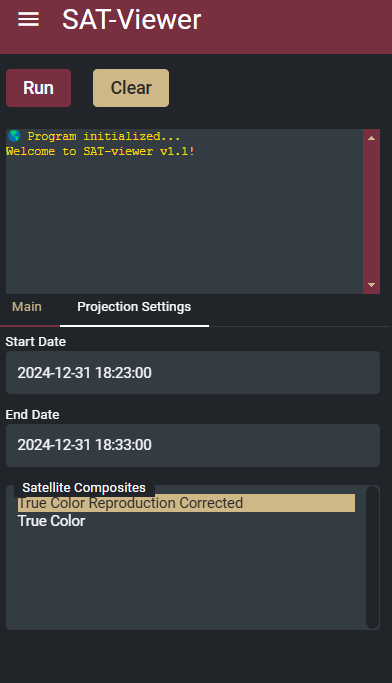
I understand how to stylize the selected item background by doing something like this:
/* Ensure the active option retains the desired color */
option:checked {{
    background-color: {theme_settings['secondary_color']};
    color: {theme_settings['dark_font']};
}}
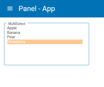
Thanks for the reply! This did allow me to stylize the necessary component. As a follow up, how can I also stylize the font color? When the widget is not actively selected, it works as intended:
However, when I actively select the component, it changes the font color to white:
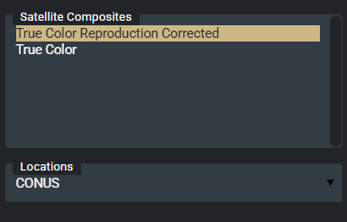
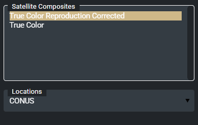
One last question. How can I also stylize the dropdown arrow for the select widget (currently black)? Looking in the CSS, it appears to be a svg css element that is set to black color: