Hi @rh1
There are several things that need to change.
- The YoY_Sales values are NaN in your calculation. Thus the chart will look empty.
- You need to use named arguments. I.e.
value=data. - By default the columns
'x'and'y'will be plotted. You need to specifyplot_xandplot_yto change this. - Change
styletostylesfor this to work with Panel 1.3.6 or later. - For some unknown reason the
date_rangedoes not work as x-axis values. Use numbers instead. See #6158 · holoviz/panel
The below works
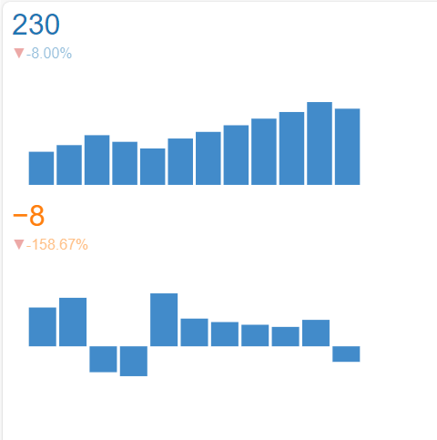
import pandas as pd
import panel as pn
import numpy as np

data = pd.DataFrame(
    {
        "Date": pd.date_range(start="2020-01-01", periods=12, freq="M"),
        "Sales": [100, 120, 150, 130, 110, 140, 160, 180, 200, 220, 250, 230],
    }
)
data["YoY_Sales"] = data["Sales"].pct_change() * 100

# Hack. For some reason the Date column does not work for the x-axis
data["x"] = list(range(len(data["Date"])))

trend_indicator = pn.indicators.Trend(
    data=data,
    plot_x="x",
    plot_y="Sales",
    styles={"color": "#1f77b4"},
    height=200,
    width=400,
)
yoy_trend_indicator = pn.indicators.Trend(
    data=data,
    plot_x="x",
    plot_y="YoY_Sales",
    styles={"color": "#ff7f0e"},
    height=200,
    width=400,
)

app_layout = pn.Column(trend_indicator, yoy_trend_indicator)

app_layout.servable()