Hello everyone, I was hoping that someone could help me with an issue I’m having in my code with holoviews and bokeh. First, here is a github link for a jupyter notebook with my code: https://github.com/andresberejnoi/PublicNotebooks/blob/master/Live%20Chart%20From%20Coinbase%20Pro.ipynb
I’m streaming real time Bitcoin price data from Coinbase Pro API using the cbpro Python package and that part is working well.
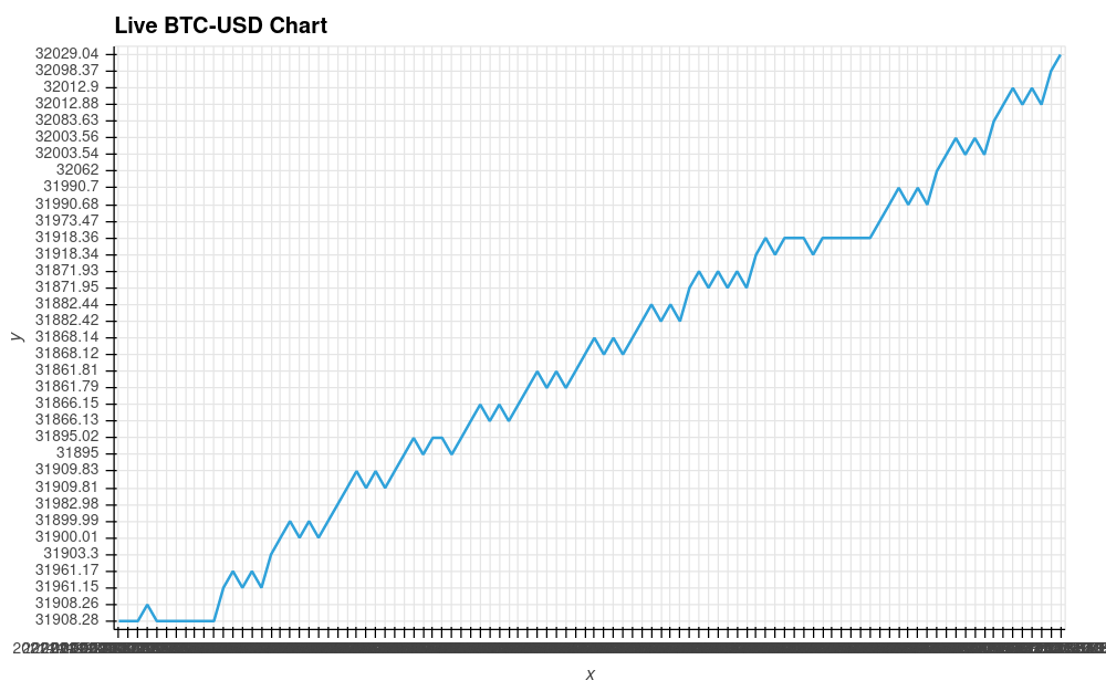
I’m collecting that data into a holoviews Buffer object and then creating a hv.DynamicMap with it using hv.Curve. I mainly learned how to do it from here: http://holoviews.org/user_guide/Streaming_Data.html (the asynchronous part at the end). One of my issues is that the y-axis labels are out of order. It seems they are added linearly in the order they are received.
I tried creating the buffer object with a numpy array and also with a pandas dataframe as reference but it has not helped.
My goal is to have a price chart with constantly streaming data, where the x-axis is the datetime returned from the Coinbase Pro API and the y-axis is the price. I tried looking at the documentation, and after trying many different things, I’m still getting the same issues.
I would appreciate any help or link to tutorials that can help with my case. Below is an image of the chart my code is currently producing. The x-axis at the bottom is all cramped because I’m leaving the dates as strings. That problem was gone when using a pandas dataframe instead of a numpy array.